
Report section
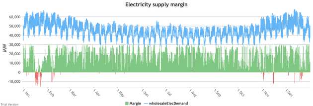
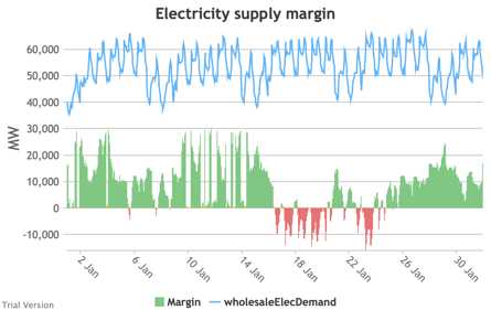
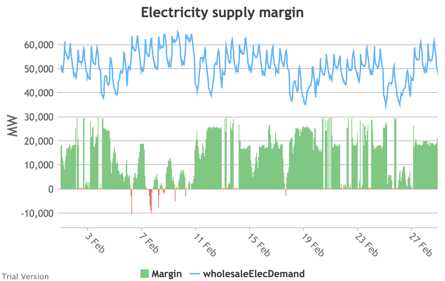
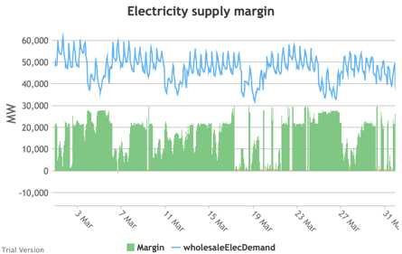
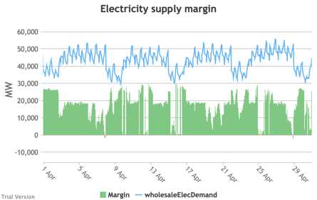
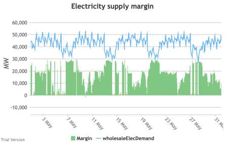
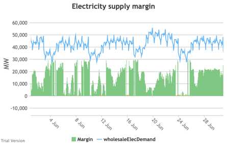
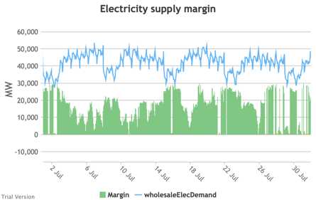
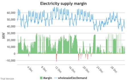
3.3.9 Electricity supply margin
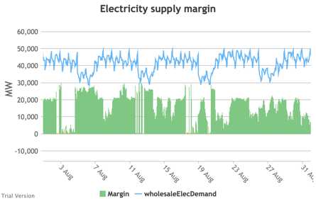
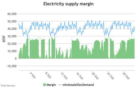
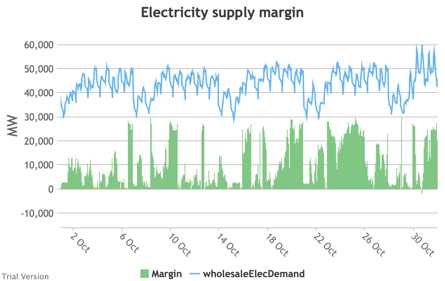
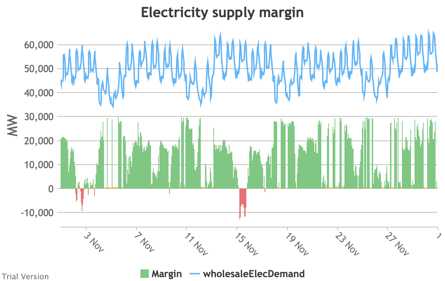
- The supply margin is the excess capacity in green (or deficit between demand and total capacity as negative margin, i.e. demand shedding, in red) in each period.
|
||
|
|
|
|
|
|
|
|
|
|
|
|
- The distribution of the margins over the year looks like:
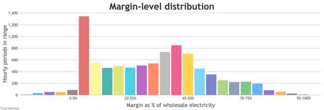
- The margin is negative for 232 hours in the year (2.6%). In another 1,335 hours (15% of the year), the margin is between zero and 5%. At the other extreme, the margin is over 50% for 1,872 hours in the year (21%). This is material inefficiency at both ends of the distribution. It means that too often (a) we are unable or close to being unable to meet the demand, or (b) a lot of capacity is standing idle (which will be reflected in the costs, as the fixed costs have to be covered by fewer MWh). You would prefer the distribution to be a tight bell curve centred around 30-40%, as it has been for the past decade.[1]
[1] Chart from BEIS, UK Energy in Brief 2019, p.17. https://assets.publishing.service.gov.uk/government/uploads/system/uploads/attachment_data/file/857027/UK_Energy_in_Brief_2019.pdf