Labour's energy policies 2019 - Part 2: Impacts
This is a first run out for our Future Scenarios model, available for you to try yourself on our Energy Data sub-site. Part 1 assessed what Labour's proposals would mean in practice, as far as one can divine from their manifesto, on the basis of practical constraints and reasonable assumptions from what we know about our energy options.
Energy supply and demand in 2030 under Labour
Electricity
The model reflects the reality of the market, that consumption determines the amount of generation required (plus adjustments for losses, storage etc).
Downstream demand
Some electricity is lost in transmissions and distribution. We can distringuish between downstream demand, which is the electricity used for various purposes, and upstream demand, which is the amount of electricity generators (etc) have to supply to the system to meet the downstream demand, allowing for losses en route.
The downstream demand on the grid is referred to as INDO within the industry. Our model allows for embedded energy (i.e. produced and used on site without being distributed over the grid) and therefore is a little higher than historic INDO.
We start from downstream demand, as it determines upstream demand etc. This is how it would look if we experienced 2017's weather with the levels of uses on the system in mid-2019 (i.e. before we allow for all the changes Labour plan to make).
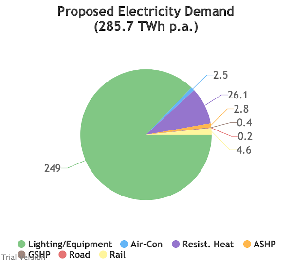
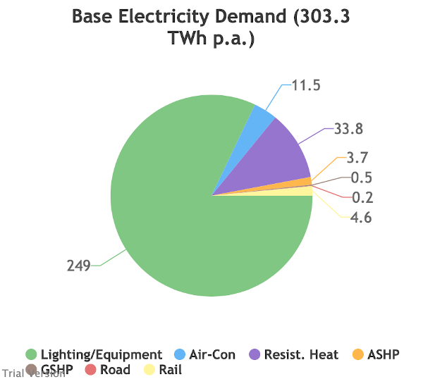
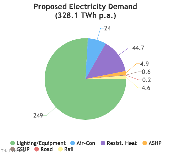
This is the the annual demand for various purposes under the status quo, depending on weather conditions.
Mild
Normal
Severe
Variation from one year to another due to the weather is relatively limited because electric heating and cooling are relatively limited.
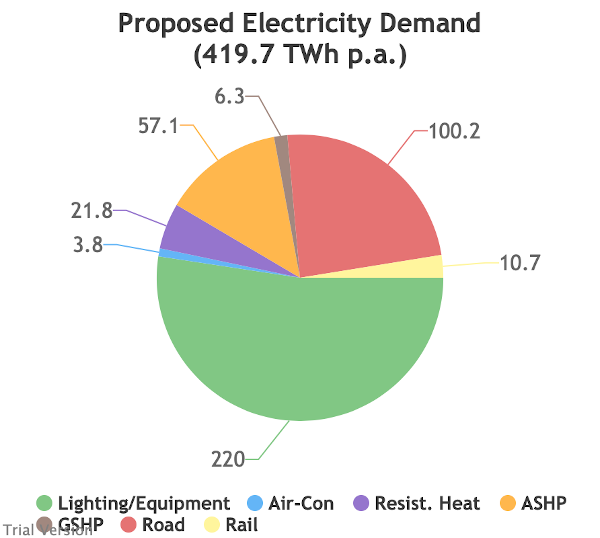
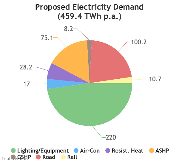
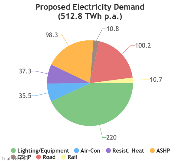
Now here is the equivalent picture for 2030 under Labour's plans.
Mild
Normal
Severe
Demand is not only much higher in absolute terms, but also significantly more variable from one year to another because of the higher penetration of electric heating and cooling. The difference in demand between a mild year and a severe year is equal to around one-third of total annual demand at the moment. That requires a lot of standby capacity whose cost needs to be covered even though it may not be used for years at a time. Even storage as notionally-competitive as Compressed-Air technology cannot economically address that range of variability.
Annual sums hide a variety of sins. They are popular amongst technology protagonists, as the aggregation obscures much of the balancing challenge. They are also much easier to estimate and to digest than the granular picture of 8760 hourly periods in a year. But to really understand how a system will work, it is necessary to model the short-interval picture.
This is how our hourly downstream demand currently looks in a normal-weather year. Notice how the vertical scale changes from one month to another, but nevertheless, the seasonal, weekly and hourly variation is relatively modest at the moment.
[We have used an animation to view successive months, as the picture is too cramped to read when a whole year is compressed into a single chart. If you use our Future Scenarios page to model scenarios yourself, you can drill into and navigate these data in as much detail as you like (to precision of hourly intervals).]
And here is the hourly picture in 2030 under Labour if the weather is relatively normal:
The absolute level is higher and the variation is greater seasonally and hourly. The peaks are almost double the current level, although total demand is only 50% higher, indicating a large increase in peak-lopping capacity.
And here is the impact of severe weather on Labour's planned electricity systems:
The peaks are around 40 GW higher than in a normal year. That is around 2/3 of current capacity, which has to be kept available to meet demand in a severe-weather year, but may not be used at all in normal years.
Upstream demand
The combined downstream demand must be met by upstream supply. The amount of generation (or supply from storage or interconnectors) required is determined by the downstream demand plus transmission and distribution losses.
The upstream demand on the grid is referred to as ITSDO within the industry. Our model allows for embedded energy (i.e. produced and used on site without being distributed over the grid) and therefore is a little higher than historic ITSDO. ITSDO also takes into account the ability of our (currently-limited) storage capacity to time-shift supply and demand to a certain extent to reduce the peaks and raise the troughs. And it allows for any (also currently-limited) demand-side management that occurs. We take account of these further along in our model, so upstream demand in our model represents all the demand that could need to be satisfied in each hour (ignoring ways of mitigating peaks at this point) plus distribution losses.
In a normal weather year under the current arrangements, this upstream demand looks like:
In the Labour 2030 scenario, in a normal year, it looks like:
And under the same scenario in a severe-weather year, it looks like:
Peak upstream demand is 160 GW in these circumstances, whereas it is currently around 60 GW. We will come on to what this means in terms of supply capacity, but it is worth noting immediately that intermittent generators like wind and solar provide little secure capacity, and that around 160 GW of dispatchable supply (generation or storage) or contracted demand-curtailment would therefore be required under Labour's plans, additional to their planned massive expansion of wind and solar. We would need to build around 3X more dispatchable (ie not low-carbon) capacity than we currently have. But that capacity would be unused most of the time.
By contrast, with our current systems, a severe-weather year only increases peak upstream demand by around 15 GW (from just under 60 GW to just under 75 GW). That is because we currently have only modest amounts of electric heating. It is close enough as it is to current margins (with 15 GW of coal still on the system), but manageable.
With our energy systems as they currently are, upstream demand peaks at around 75 GW, which is close enough to current margins (with 15 GW of coal still on the system), but manageable.
Inflexible generation
Inflexible generation (nuclear plus most renewables exc. hydro) takes priority on meeting demand. Flexible generation supplies the balance and ramps up/down as required.
How does inflexible output compare with upstream demand at the moment? This is in a normal-weather year.
In our model, inflexible output in normal weather never quite exceeds demand. In reality, inflexibles are already curtailed sometimes when supply exceeds demand. The flexible technologies do not reduce to zero. In a mild year, our model illustrates this occasional overlap.
Now visualise a world where Labour have added 7,000 offshore and 2,000 onshore wind turbines, 22,000 football pitches of solar, etc, as well as the increases in demand covered earlier in this thread. This is how it looks in normal weather.
Demand net of inflexibles
In a severe-weather year, demand and inflexible output are both higher in total, but their peaks may not coincide, so volatility is increased.
In a mild year, the opposite applies.
This shows the net effect (demand minus inflexible output) for a normal year under Labour's plan.
When the chart goes below zero, the excess must be exported over interconnectors, absorbed by charging storage units, or curtailed. We'll come on to these. But we mentioned the higher volatility in severe years. Here is how it looks for a hot summer and cold winter like 2010.
Compare that with the current picture. We need much less capacity of flexible generation (or storage/interconnectors) and their load factors are much higher, reducing the cost per unit. "Mid merit" and "peak lopping" still mean something. In the Labour plans, they are extinct.
Those periods of excess inflexible supply in a mild year under the current arrangements show up in our model as negative figures, mirroring the existing reality occasionally on our network.
Electricity supply by type
So how do we balance this out? For now, primarily with flexible generation. We have small amounts of storage (primarily pumped-hydro) and interconnector capacity, whose flows are as much for the convenience of those at the other end as ours. This is how a normal year might look.
The Labour 2030 scenario is *much* more complicated. To get to anything approaching a balance, we make some heroic assumptions (set out here) about the viability & scale of unproven technologies, in line with the manifesto assumptions. This is a normal year.
This is a severe-weather year under the Labour 2030 scenario. If you look closely, you will see some of the highest peaks during the winter are not filled to the top, indicating that all the inflexible, flexible, storage & interconnector output available could not meet demand.
Periods of imbalance would be managed by voluntary (demand-side management) or involuntary (brown-outs) demand curtailment. We designed our Labour 2030 scenario to maximise the chance of the former being sufficient, but it depends on optimistic assumptions of tech/econ progress.
Generating capacity margin
Inadequate supply is easier to spot if we look at the margin - the amount of spare dispatchable power available each hour. We can view insufficient supply as negative margin. They are highlighted here in orange (positive margin in green). First, current margins in normal year.
There are no orange bars - we always have enough supply. (ITSDO is upstream demand, to put the margin into proportion.)
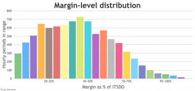
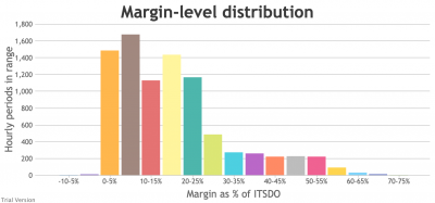
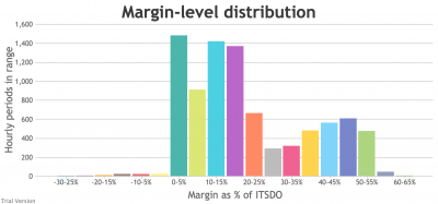
We can view this as a distribution - the number of hours in the year that the margin is x% of ITSDO, where x is grouped in 5-percentage-point blocks.
Now the same charts for Labour's 2030 plan in a normal-weather year. The hourly chart shows a few orange bars below zero.
And the distribution chart shows that the number of sub-zero periods is only around 20 in normal weather (unsurprisingly as this is an attempt to make Labour's model work, including generous assumptions to make that possible.)
But in a year with severe weather, like the 2010 winter, these sub-zero periods are more numerous and deeper, in the Labour 2030 scenario.
In this case, the margin distribution chart shows around 100 hours per year where demand exceeds our ability to supply, despite a decent effort to make the plan work.
Would the system operator find enough users that were willing to sign a demand-management contract? Possibly.
Total annual electricity supply
These system challenges occur because of the (economically illiterate but politically ubiquitous) dirigiste approach to decarbonisation. Does one set of ambitions (for deployment of various technologies) achieve another (90% low-carbon electricity by 2030)?
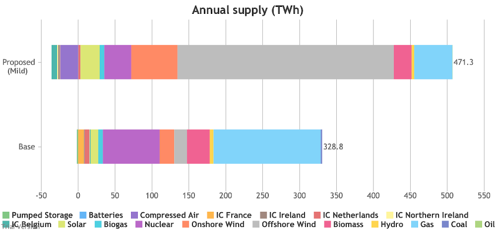
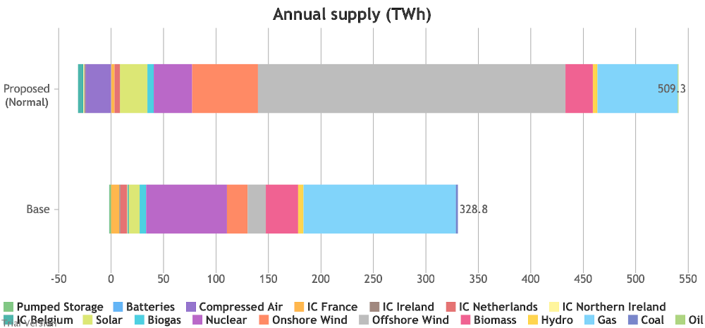
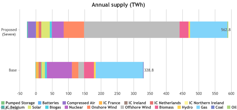
This is how Labour's plans compare in mild-, normal- and severe-weather years with our current system in a normal year.
Mild
Normal
Severe
Low-carbon electricity constitutes 89% of supply in a mild year, 85% in a normal year, and 79% in a severe year.
So close, but no banana.
It would be punitively expensive to try to get closer than this, and this is already very painful, as we will see.
Electricity supply by source
It is the nature of uncorrelated variable demand and intermittent power that the swing will have to be covered by dispatchable (typically fossil-fired) generation.
Still, it's a pretty good effort to cut Fossil-Fired generation that far, when the capacity of FF generators has increased to provide the standby capacity for increased demand when intermittent output is low. This shows how the gaps they are plugging are relatively infrequent.
Capacity factors
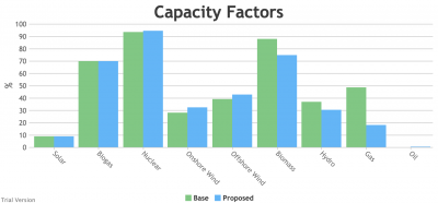
The consequence of increasing standby capacity whilst reducing utilisation is in the capacity factors, which translate into higher costs per MWh for dispatchable power. This chart compares capacity factors in a normal-weather year under the current and Labour's proposed systems.
It's more complicated for intermittents. We assume a higher availability factor for new wind and a lot of storage, which offset increased curtailment when supply exceeds demand. But there is a cost to that. The net effect is load factors higher than now but lower than expected.
Marginal capacity utilisation
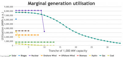
The effect of under-utilised capacity is shown in a marginal analysis. Inflexibles are insulated by their priority and storage, reflected by horizontal lines. Dispatchables slide to the right, reflecting the decreasing utilisation as capacity is added. This is our current system.
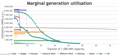
And this is Labour's proposed system in 2030 under the same conditions (normal weather). The current system is shown as dashed lines, and the proposed system is shown as solid lines.
Carbon emissions
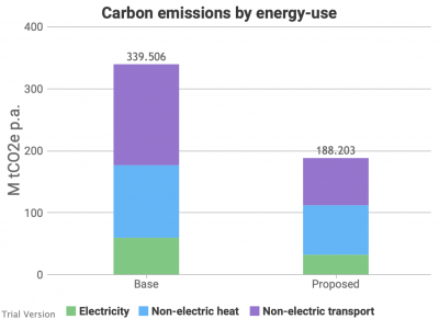
What is the effect of Labour's proposals on carbon emissions from our energy systems? The over-arching assumptions are (almost) 90% low-carbon electricity and roughly 50% low-carbon heat & transport. This plan cuts our CO2e emissions from energy by around 45%.
This is relevant to costs.
Costs
Our model does not yet calculate system costs for heat & transport, so this is electricity only. Decarbonising heat & transport will be *very* expensive, so these figures are only a fraction of the total.
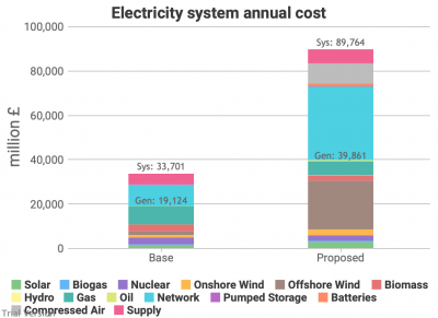
Total annual cost of electricity system
Up from £33.7bn to £89.8bn per year. This does not include a cost for climate change (whether a notional carbon price, or the costs of the various govt interventions), which would close the gap somewhat.
151.3m tCO2e are saved with this plan (see earlier chart). At £50/tCO2e, that would close the gap by £7.6bn. But these are only part of the costs. We haven't priced heat and transport. It's £370/tCO2e if all the savings were from electricity, so probably £500-1000/tCO2e in total.
Electricity system cost per MWh
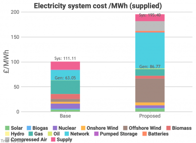
The cost looks worse in total than per unit of electricity, because the plan moves a lot of energy consumption to electricity. This is how it compares with the current system per MWh supplied to customers.
The difference between the Base total and actual prices is the absence of environmental costs. If Labour's proposal roughly halves the carbon footprint, and the missing cost in the Base scenario is about £40/MWh, the true comparison is about £150/MWh now vs £215/MWh under Labour.
Capital costs
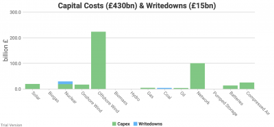
A large part of these costs is recovery of the investment in solar, wind, storage & network reinforcement. This is an estimate of the capital costs (and writedowns). It is v optimistic, particularly on storage, for which we naively accepted proponents' claims of cost reductions.
Nearly £450bn!
What this doesn't include:
- replacing 1/2 our boilers with low-carbon units
- electrifying 1/2 our road fleet and all our railways
- nationalisation
- non-energy emissions
- later, switching the gas grid to hydrogen and dealing with the rest of transport.
The true cost of Labour's energy proposals in their 2019 manifesto is probably around £1 trillion by 2030, and £1.5-2tn for full decarbonisation in the 2030s.
£100bn/year capex in the 2020s is just under 5% of GDP. That's just on this one aspect of the economy.

