The costs of decarbonisation
The costs of decarbonisation Bruno Prior Fri, 11/12/2020 - 02:35The following draft report is written on behalf of Summerleaze Ltd (backers of C4CS). The initial purpose was as a supporting document to a submission to an enquiry by the Commons Select Committee on Business, Energy and Industrial Strategy (BEIS). But it has a separate life, to demonstrate the capabilities and limitations of C4CS's Future Scenarios model. As such, it will hopefully be updated and expanded sporadically to consider alternative scenarios and as capabilities are added to the model.
The first version considered variations on one decarbonisation scenario that seemed to be the political focus for 2030 at the time: the partial electrification of heat and transport combined with further decarbonisation of electricity generation.
The latest version of the report is available to download as a 30MB PDF by clicking on the button below.
Download PDF version of report
The model can be accessed freely at the time of writing at https://ed.c4cs.org.uk/edfutscen. If you scroll to the bottom, there is a button to load a scenario. If you click on the following button, you can download (as a JSON file) the default version of the scenario explored in Section 3, for loading into the model and trying your own variations.
Download JSON file of default scenario for Section 3
Table of Contents
- Introduction – Our Experience
- Design
- Electrification
- Introduction
- Inputs
- Outputs
- Retail electricity demand (2017 base vs this scenario)
- Retail electricity demand profile
- Wholesale electricity demand profile
- Wholesale demand profile vs output from inflexible generators
- Wholesale demand net of inflexible generation
- Electricity storage flows and level of charge
- Electricity supply and demand by type
- Electricity supply and demand by source
- Electricity supply margin
- Electricity generation capacity utilisation (load factors)
- Carbon
- Cost
- Sensitivities
- Random temporal variation
- Weather variation
- Increasing resilience, reducing demand-shedding
- Pushing on towards Net Zero
- Key sensitivities beyond 2030
- Co-variants
- Technologies not considered
- Electrifying 50% of heat
- Electrifying 75% of road and rail transport
- Eliminating fossil fuels from electricity generation
- Replacing fossil fuels in electricity generation
- Switching from gas/oil to biomass/biogas generation
- Switching from gas/oil to nuclear
- Switching from gas/oil to more wind/solar
- Energy efficiency
- Rebuild with district heating and multiple heat sources
- Conclusion
1. Introduction – Our Experience
1. Introduction – Our Experience Bruno Prior Mon, 14/12/2020 - 00:151.1 Context
- After a century of energy that was (roughly) on tap through the simple expedient of burning the fuels when we needed them, we are returning to an earlier era where balancing energy supply and demand is more challenging.
- We could simply internalise the climate externality through a carbon price, and leave it to the price mechanism to discover the best ways to clear the market. But governments are not generally willing to be so laissez-faire. They are determined to set out how the market should clear, not only in terms of the levels (prices and volumes) but also in terms of the technologies and the contributions that they should make.
- Our experience is that this is a mistake. Summerleaze has been involved in renewable energy for 40 years.
1.2 Pre-privatisation
1.2 Pre-privatisation Bruno Prior Mon, 14/12/2020 - 01:47- We (Summerleaze) installed a heat pump to heat our new offices in the 70s. It minimised energy-consumption and maximised output by delivering so little heat that people wore thick jumpers and rushed to get their work done.
- We worked with Warwick University in the mid 80s to develop technology to purify and liquefy landfill gas to power our trucks. Unfortunately the oil-price collapsed and made the technology uneconomic just as it was reaching fruition. C’est la vie for entrepreneurs. We did not ask for nor deserve to be insulated from that risk. We just wanted to be able to profit where we got the risk right. That was not straightforward in a nationalised energy sector.
- We re-applied our knowledge of landfill gas to the production of electricity, and commissioned our first renewable power station in 1988. This preceded privatisation. We were only able to sell (“spill”) our electricity by the good grace of the local electricity board at a price determined by them.
1.3 The Non-Fossil Fuel Obligation (NFFO)
1.3 The Non-Fossil Fuel Obligation (NFFO) Bruno Prior Mon, 14/12/2020 - 01:56- Privatisation was followed in short order by subsidy for low-carbon electricity in order to prop up nuclear energy. Although we were one of the few existing renewable power stations, we were refused a contract under the first tranche of the Non-Fossil Fuel Obligation (NFFO) because we questioned some of the government’s contract terms. We swallowed our objections for NFFO-2, and our deference was rewarded.
- NFFO was designed as a blind Dutch auction but modified almost immediately to give ministers the power to skew the outcome to favour certain technologies. We argued this was a mistake. The design also rewarded those who travelled most hopefully, not those who were most credible.
- We warned that the consequences would be that (a) ministers would not pick the balance of viable projects as effectively as the market would and (b) the incentives, “winner”-picking and depletion of the low-hanging fruit would lead to increasing proportions of non-viable projects being awarded NFFO contracts.
- The deployment levels fell accordingly, to negligible levels for the favoured technologies by the fifth and final tranche, despite a “will secure” test that supposedly ensured this would not happen. Ministers moved on to the next mechanism.
1.4 The Renewables Obligation (RO)
1.4 The Renewables Obligation (RO) Bruno Prior Mon, 14/12/2020 - 02:01- The Renewables Obligation (RO) replaced NFFO in 2002. Most of the supporting analysis assumed that governments would set the level of the obligation at roughly the level that the market would deliver, aligning the cost with the buy-out price and obligation level. We believed (and advised in consultation) that not only would ministers not be able to anticipate correctly the level of deployment, but that the incentives of the RO would discourage investment if compliance levels were expected to be high. The effect would be that the value of the RO to participants would be higher than expected, as would the cost to consumers (who funded the mechanism) per unit of energy delivered. We invested accordingly and very profitably, when the discrepancy between the levels of obligation and compliance exceeded even our expectations.
- Like NFFO, the RO was initially designed to be technology-neutral but was quickly modified (“banded”) to allow ministers to skew the incentives in favour of more expensive technologies and against cheaper technologies. It is obvious that such a modification increases the cost per MWh delivered, but that was evidently a secondary consideration for ministers, intent on pursuing their industrial policy through an unsuitable mechanism. (The worst way to encourage R&D is through revenue support, as that does little to mitigate the risk that is one of the primary purposes of industrial policy.) We argued against “banding”, but were a voice in the wilderness. Not for the first or last time, we collided with a coalition of interests between:
- politicians (who want magic bullets),
- bureaucrats (whose existence is justified by micro-managing policies),
- academics, consultants and pressure groups (whose influence is maximised by advising governments on ways to supposedly do better than the market), and
- rent-seekers (for whom skewed government incentives are useful insulation against competition).
- Landfill-gas power stations like ours converted gas to electricity at around 40% efficiency. The rest was wasted as heat through the exhaust or radiators.
- We looked for opportunities to utilise the waste heat. It was never economic, because the substantial investment to recover the heat was not justified by the value of the heat plus the value of the carbon displaced by substituting for fossil-fired heating. Policy did not treat the carbon benefit of this form of energy equally to electricity, and consequently low-carbon heat was treated as though it had zero carbon benefit.
- Indeed, the low rate of VAT on domestic energy acted as an effective subsidy for fossil-fired heating in that sector. We argued for technology-neutrality in that regard (which effectively meant a carbon price) as well as between renewable-electricity technologies, but again found no interest in government or elsewhere. The energy went to waste. The UK made almost no progress on decarbonising heat.
- Meanwhile, Sweden decarbonised two-thirds of its heat and half of all its energy, with a carbon tax as its main policy lever. UK governments continued to pat themselves on the back for decarbonising at great expense a few percent of the 20% of our final energy consumption that takes the form of electricity.
- Focusing myopically for two decades on renewable electricity through NFFO, RO and Feed-in Tariffs (FiTs) had taken UK renewables to a magnificent 4% of our energy by the early 2010s. Yet the Office for Budget Responsibility projected a cost of around £10bn/year for environmental levies (mainly costs of renewable electricity) by 2020.
1.5 Contracts for Differences (CfDs)
1.5 Contracts for Differences (CfDs) Bruno Prior Mon, 14/12/2020 - 12:46- So ministers moved on again. The new scheme employed Contracts for Differences (CfDs) to try to drive down the costs of certain technology “winners” (primarily offshore wind) in a similar manner to NFFO.
- It is too early to say for sure how that will work out, but there is an eerie parallel between the early tranches of NFFO and CfDs, which were expensive but largely delivered, and the later tranches, where prices fell below what were widely-regarded as the thresholds for viability, and deployment consequently disappointed.
- Whilst CfDs may be different for reasons that are not apparent to those who have looked critically at the economics of the favoured technologies, NFFO should at least be a warning not to count the chickens (projects commissioned and run profitably for a few years) before the eggs (contract prices and volumes) have hatched.
- CfDs left Summerleaze in the cold, because (a) they were focused on intermittent technologies, and Summerleaze had always preferred to invest in energy that was there when it was needed, and (b) they favoured scales of investment that were mainly achievable by the government’s corporate clients, beyond the resources of most entrepreneurial SMEs.
1.6 Renewable energy entrepreneurs - quo vadis
1.6 Renewable energy entrepreneurs - quo vadis Bruno Prior Mon, 14/12/2020 - 12:48- This is just one of the signals that has persuaded us that there is no longer an opportunity in the sector for businesses that want to back their idiosyncratic judgments. The only way to operate is to try to do what the government wants, whether or not you believe in it.
- Even then, you are likely to be side-swiped by a change of government view (for example, see what happened to the photovoltaic and biomass-heat industries when they were over-incentivised and then over-delivered). Better to tend your garden.
- The main investments in the sector nowadays are by people primarily spending other people’s money.
1.7 Anaerobic Digestion (AD)
1.7 Anaerobic Digestion (AD) Bruno Prior Mon, 14/12/2020 - 12:49- In 2005, Summerleaze bought one of the UK’s first, large anaerobic digestion (AD) plants out of administration. It had gone bust because it suffered a number of disadvantages, most of which were inflicted or exacerbated by state incentives:
- Its NFFO contract obliged it to take 80% animal slurry. Animal slurry produces little gas compared to most AD feedstocks, and pays no gate fee (the price paid to dispose of waste). It was irredeemably uneconomic, and yet a condition of the government’s contract. The project became economic when we broke the NFFO contract and switched the plant to take primarily food waste.
- It had been situated in a remote rural location (sub-optimally for sources of viable feedstock such as food waste) in order to please the government’s rural development agenda (in pursuit of grants). This also meant (significant to later government policy) that it was not viable to connect it to the gas grid.
- Its economic model was predicated partly on a report by a large engineering consultancy that advised that it would be able to pipe its heat to sell in the neighbouring town, Holsworthy. This was also hopelessly uneconomic, particularly in the absence of any mechanism to value low-carbon heat.
- Holsworthy’s economics changed rapidly after we bought it, as government efforts to stimulate the technology delivered more AD capacity than there was viable feedstock to fill it.
- The gate fee went from nearly half of income to a negligible contribution. That raises the energy price required to break even, which increases the cost of the subsidy required. Effectively, over-stimulation increased the cost to consumers of supporting the technology without significantly increasing the amount of energy, which was largely bounded by an inelastic resource.
- Governments were persuaded that this was not the case by “research” commissioned by interest groups. Particularly influential was a 2009 report by Ernst & Young for National Grid, which predicted that by 2020, biogas would make up between 5% and 18% of our gas supplies (nearly half of domestic gas).[1] In the event, it constitutes around 0.7% of our gas, and the industry is running well below the installed capacity for wont of viable feedstock even at that level.
- So of course, the interest groups (such as NG’s successor, Cadent) commission more “research”. Governments are persuaded that straw can yet be turned into gold, and announce plans for more alchemical policy to stimulate biogas.[2]
- For as long as all AD projects received similar levels of support, this was as much a public inefficiency as a commercial threat. But governments decided that they needed to skew the resource-allocation decisions in the directions they judged best, and introduced new or modified support mechanisms (FiTs and RHI) that awarded significantly different levels of support for AD depending on scale, feedstock and technology (e.g. generating electricity or feeding the gas grid).
- This introduced the risk that a new AD plant could setup in competition to our plants (we subsequently opened in Bishops Cleeve a second large AD plant, this time producing biomethane for injection into the gas grid) and out-compete us for the feedstock, not by being more efficient, but simply by gaming the rules invented by government after we had made our investment.
- Government has traditionally been careful about “grandfathering” their support promises, but governments found it impossible or undesirable to understand that these policy decisions were effectively “un-grandfathering” existing investments.
- A succession of governments have made the regime uncertainty so great in renewable energy that the only people who are sanguine about investment in the sector are either (a) those who do not understand the risks (amongst whom it is likely are many of the institutional investors lending on incredibly low coupons to large projects of technologies that are favoured by government but otherwise fundamentally uneconomic), or (b) those who believe they have a strong enough connection with government that they are insulated from the risk.
1.8 Renewable heat
1.8 Renewable heat Bruno Prior Mon, 14/12/2020 - 12:54- From 2007, Summerleaze invested significantly in renewable heat (specifically, the supply of wood pellets for heating), in the belief that even the British government would not be able to ignore for much longer the obvious constraint that they would only be able to decarbonise so far by focusing on the 20% of our energy that is electricity.
- We selected wood pellets because it was the only technology that appeared suitable to supply the quality of heat required by the insulation and plumbing in the average, draughty British building, at the scale required to make material progress in decarbonising heat. One advantage of the UK lagging so far behind was that it was not difficult to see what had worked in other countries that had made progress in this sector. Academics and interest groups promoted all sorts of magic bullets as usual, but in the real world, biomass heat dominated because it was the least challenging substitute for the existing fossil-fired heating systems.
- When the Renewable Heat Incentive (RHI) was introduced, this reality asserted itself again, turbocharged by bad decisions in the design of the scheme (not only in Northern Ireland, but also in Great Britain to only a slightly lesser extent).
- Biomass heat would have dominated anyway without these mistakes, because the suitable applications for the other technologies were more limited than the government’s ivory-tower advisers recognised.
- But the government believed, as usual, that when the market did not behave in the way that their advisers had predicted, it was the market that must be wrong. The incentives must be adjusted until the “right” outcome was adequately incentivised.
- Within a limited budget, getting more of what they wanted also meant getting less of what they didn’t want. So support for biomass heat was “degressed” (i.e. cut) rapidly, while support for the “right” technologies was increased to many times the cost of biomass heat. Biomass went from growing at 70% a year (not difficult from a minimal base that had waited two decades for an opportunity) to grinding to a halt three years later, long before achieving the critical mass to sustain an industry.
- This was predictably not compensated by an offsetting increase in the contributions of the “right” technologies, because the reality was that the costs were higher and the opportunities were scarcer than the government’s “experts” and the industry lobbyists claimed.
- The RHI was flawed in too many ways to count. We advised DECC of the flaws before and after the RHI’s introduction, but as usual, predictions of unintended consequences and perverse incentives were unwelcome and ignored during implementation, and then greeted with great surprise when they materialised (“20:20 hindsight…” “who could have predicted…”). Amongst the flaws were:
- The overall budget: heat is twice the size of the electricity sector, and yet the government judged £1bn to be excessively generous to make rapid progress to catch up in this massive component of our energy, whilst happily signing up to £10bn/year to decarbonise 1/3 of our electricity.
- Given a tight budget, it was important to get the best value possible. But that meant the technology they didn’t particularly want (biomass). So they divvied up the budget as though they would get significant contributions from multiple technologies, despite the fact that some were much more expensive than others, and with widely-varying potential. This effectively ring-fenced a fraction of an inadequate budget for the only technology that could deliver a material contribution for the limited funds, and sterilised other parts of the budget by ring-fencing them for technologies that would not materialise.
- There are substantial economies of scale in most energy technologies. The government once again resorted to “banding” to reflect this, despite its illogicality and counterproductive history in earlier mechanisms.
- In the RHI’s case, this meant classifying projects as “small”, “medium” or “large” and paying significantly higher tariffs for “small” than for “large”. But each band encompassed a wide range with big differences in scale economies. For example, “small biomass” covered anything from a 10kW to a 199 kW boiler, even though the latter was an order of magnitude more cost effective than the former. Support was set at the estimated level required for the average. This was exceedingly generous for the largest sizes within the band, which could consequently enjoy a payback period of 4 years on a scheme that ran for 15. Delivery was therefore heavily skewed to 199 kW boilers, not because they were the prevalent size required (heat demand is generally diffuse and smaller than that) nor the most economic if it were not for the mechanism, but because it was the size that gamed the RHI best.
- The tariff for units over 199 kW was much lower, but the sort of application that needs that much heat is often not difficult to sub-divide. So even where the most efficient solution (barring the RHI) would have been a large boiler, this was often sub-divided into multiple smaller, more expensive boilers serving portions of the heat demand each, because this maximised the RHI. Unfortunately, the flip side was that it minimised the value achieved by the RHI.
- The small-biomass tariff was eventually degressed to lower than the medium-biomass tariff, because of the over-deployment that the structure had stimulated. Medium biomass projects at the top end of their band (999 kW) became the new sweetspot, and took off accordingly. Ironically, many of the best opportunities (e.g. keeping chickens warm) had already been developed as multiple smaller (199 kW) boilers. So rent-seekers had to create heat loads to suit the necessary scale. They realised they could dry their own wood, and get paid to do it. In fact, the support was worth more than the fuel cost to do the drying, so the more they could dry, the more money they could make. They could dry the fuel to feed the boilers to dry the fuel to feed the boilers… The medium biomass band was quickly swamped with such applications, and equally quickly degressed to a non-viable level for new projects. Most of the RHI biomass-heat budget was used up on projects that would never have been designed that way, and many that would not have existed at all, if it were not for the stupidities of the mechanism design. Only a fraction of the money went to genuinely displacing fossil fuels. The main renewable-heat technology with the potential to deliver cost-effectively at scale was wasted and discredited thanks to the terrible design of the RHI.
- This effect could easily have been avoided. In consultation, before and after the RHI’s introduction, we set out how to achieve that. It was eventually recognised in a revision to the RHI’s biomethane tariffs. It could have been implemented across the board from the start if policymakers had the humility to consider that their initial policy designs and knowledge might be imperfect, and that experience of earlier mechanisms might count for something.
- The way to avoid that disaster would have been to pay a high tariff for the first X MWh and then a low tariff for all subsequent MWh. X does not vary by scale. For small projects, X constitutes a high proportion of their output, and the weighted average tariff is therefore high. For large projects, X constitutes a small proportion of their output and the weighted average tariff is therefore low. Mid-sized projects get mid-sized tariffs. There are no thresholds, just a sliding scale, and therefore minimal perverse incentives to target certain sizes. It is not complicated maths, but it seemed to be beyond the comprehension of the RHI’s architects.
- Or alternatively, just pay a flat rate (e.g. 4p/kWh) on the basis that projects should get what they are worth, not what they need. Challenge installers of small projects and expensive technologies to find ways to reduce costs, or accept that they do not represent good value for taxpayers and the environment if they cannot. Encourage the large projects and cheap technologies that offer the best bang for the buck.
- Either approach would be more rational than what we got. That is not hindsight; it was predictable and predicted.
- The best value in renewable heat is from large biomass projects. Because heat is usually fragmented, the opportunities are limited. They require a substantial investment and take a considerable period of time to deliver. They need (a) some value for their carbon because the capital cost is not usually justified otherwise, and (b) policy stability so that investors will commit to the long timescale to deliver the project.
- Unfortunately, practically the day before the RHI was due to launch, the government announced that they had to revise the large biomass tariff, supposedly because they had realised at the last minute that it would fail an EU state-aid test. When the revised tariff was eventually announced, it was half the original level, and inadequate to justify almost any investment under any conditions, let alone with the heightened political risk from the abrupt policy change. Consquently, almost no large biomass heat was delivered until this policy was reversed. Deployment focused on the smaller, more-expensive scales. If a government had set out to sabotage its own policy, it could scarcely have done better.
- Most heat is used in buildings, and most of that is in homes. But in another late announcement, the government delayed the introduction of the Domestic RHI from 2011 to 2014.
- When it launched, the budget for the scheme to cover the largest heat sector (domestic) was a small fraction of the overall budget, which was itself inadequate by comparison to the resources devoted to electricity.
- Successful technologies quickly hit the budget limit and were “degressed” to a tariff level that would deliver little, whilst their contribution was barely large enough to be discernible in the national energy statistics.
- Unsuccessful technologies sterilised part of a budget that was already inadequate to achieve anything significant.
- As fast as the RHI (domestic and non-domestic) encouraged the establishment of businesses to support the nascent demand, it shot them down again when degression pulled the plug on further deployment.
- It quickly became apparent that the design and budget of the RHI would limit its contribution. But the government still had to achieve by 2020 a level of renewables across the economy, not just in electricity, under the Renewable Energy Directive. And inadequate delivery would expose a flank for opponents to attack the government’s green credentials. What should a government do, if it needs to claim good progress but is unwilling to fund it?
- Conveniently, government statisticians “discovered” (twice) that they had been under-estimating the amount of domestic wood-burning that was occurring. By changing the model used to estimate this element (reasonably on the first occasion, and then ludicrously on the second), they could not only radically increase the amount of renewable heat that they could claim, but also keep increasing it every year in proportion to the estimated level of stove sales, without spending a penny.
- There were a few problems with this “model”.
- It required us to believe that four times as much wood-fuel was available as was estimated by the Forestry Commission and the industry.
- It relied on a survey that asked us to believe that approximately 40% of the wood-burning occurred in the summer months, contradicting an earlier part of the survey, in which the respondents had been asked to specify the summer months when they did not much use their fires and stoves.
- It also asked us to believe that almost none of the new stoves replaced old stoves or fires (which would otherwise have had a negative effect on the estimates because renewable heat is measured in terms of the fuel inputs not the heat output and the higher efficiency of new appliances would have implied lower fuel consumption). The source of this assumption was supposedly communication from HETAS and the REA, both of whom confirmed that they had been referring to RHI-type biomass boilers, for which it would be true, not wood stoves, for which it is palpably not true.
- Moreover, if it were true, we would have expected continued increases in the levels of air pollution traceable to domestic wood burning, but such an increase was not occurring according to the careful (and scarcely favourable to wood burning) measurements being carried out by researchers from Kings College London.
- Frankly, it is an obvious, convenient fiction to cover the government’s embarrassment at the inadequacies of its renewable-heat policies. It is so excessive that the hypothetical contribution from this source dwarfs the contribution of the RHI across all technologies.
- But it was not enough. One problem with statistical rather than real delivery is that it does not provide for organic growth. The amount of growth that could be assumed by the most optimistic interpretation was not sufficient to achieve the necessary growth rates in renewable heat.
- So government statisticians miraculously “discovered” another overlooked source of renewable heat: commercial air-conditioners. They suddenly realised that these were sometimes run in reverse to provide heat, and carried out some studies to conclude that (a) the scale was substantial (again, more than the contribution of the RHI), and (b) the efficiency of these units in heating mode was higher than previously thought and conveniently just over the threshold required to qualify as renewable heat.
- The units were re-classified as “Renewable Air-to-Air Heat Pumps” (RAAHPs) and a generous contribution was estimated from them. In a stroke of the pen, they added another 10 TWh of renewable heat to the statistics without delivering a single extra kWh in real life.
- Unfortunately, this statistical adjustment contains no logic to ratchet the figures upwards in subsequent years, so the contribution of heat pumps to renewable heat has actually slid backwards a touch since this adjustment was made. Delivering renewable heat through statistical adjustments is not the best way of encouraging an industry to deliver real projects.
1.9 Renewable hydrogen
1.9 Renewable hydrogen Bruno Prior Mon, 14/12/2020 - 17:47- Another of our investments was in renewable hydrogen, from 2004, before it became trendy and recognised in policy circles. We identified a landfill site near Cambridge with substantial gas production but an impossibly-expensive electricity connection cost (at the time, it was later to change). We developed a hydrogen electrolysis plant powered by renewable electricity from the landfill site as an alternative way of using the energy and to learn about a potentially-promising technology.
- Our experience was that it was much more challenging, technically and economically, than is portrayed by its many current advocates. It was eventually (in 2010) broken up and sold abroad.
- Of course, technology advances and the challenges may be less now, but it is noticeable that many hydrogen proponents are not people who have built and run a hydrogen production plant for long enough to learn about its strengths and weaknesses, but rather equipment sellers, hopeful developers, academics or lobbyists.
1.10 Lessons
1.10 Lessons Bruno Prior Mon, 14/12/2020 - 17:48- This is typical of the development process in an interventionist environment.
- In a healthy economy, entrepreneurs identify opportunities and risk their capital to invest in commercial research and development to test if their judgment was right and identify ways to reduce costs in implementation. If they made a good judgment, they use their knowledge to replicate and profit from their investment, linking the means to make further investments to the track record of making good judgments. If not, they learn and move on.
- In an unhealthy economy, the risk of investing ahead of policy is too great (“regime uncertainty”), and businesses focus on persuading the government to back their favoured solutions before investing in them. The investments are then insulated from competition from alternative solutions because their profitability leans heavily on the subsidy that is available only to the government’s “winners” (“de-risked” to use the popular current euphemism). This reduces the competitive pressure to reduce costs. Indeed, cost reductions can be unwise because governments may see them as a reason to remove support. Best to promise lower costs in the future subject to sufficient support now, for as long as governments believe it. This is unattractive to entrepreneurs, who like to back their own judgment, and hostile to them because (a) government is typically seduced by big promises, and targets solutions that require investment beyond enterpreneurs’ capital resources, and (b) lobbying and influence lean heavily on corporate heft. We may term this the “corporatist”, “crony capitalist”, “anti-entrepreneurial” or “Mazzucato” model.[1]
- The way to avoid the corporatist siren is for governments to recognise the knowledge problem, forsake the winner-picking course that reflects interventionists’ delusions of adequacy, and tie themselves to the mast of a policy to “internalise the carbon externality” that is blind to technology, scale or sector, aka: a carbon tax.
- This has been the recommended option of most economists over the years. In the form of the Carbon Dividend proposal, it is backed by over 3,500 current economists including 28 Nobel Laureates.[2] But it has never in three decades of privatised energy been a contender in a UK government consultation on low-carbon energy policy.
- Each time we have been faced with another proposal for a winner-picking mechanism, we have prefaced our consultation response with a proviso that a carbon tax would be preferable (before addressing the minutiae on which the government is pretending to seek opinions before implementing what it always intended to do), but it is whistling in the wind.
- Some people believe that the UK does enjoy a carbon price, in the form of the EU Emissions Trading Scheme (EU-ETS). In reality, this only covers around half of energy, which roughly coincides with the sectors in which the UK government intervenes through other measures as well, and excludes those sectors in which the UK has historically done very little. It has also been serially undermined by gaming by national governments, resulting in very low prices that reflect the design of the scheme rather than the cost of the externality.
- Our Chairman travelled to Brussels for an early discussion on the EU-ETS. After they had set out how it would work, he said to the room “But they’ll cheat”, meaning national governments would find ways to exaggerate existing emissions and allocate existing rights generously, particularly to “national champions”, so that modest, easily-achievable savings would be sufficient to ensure compliance, thereby undermining the price signal. This has, of course, proved to be the case, but the comment was treated with a combination of horror and ridicule at the time. How could anyone think that policy would work in any way other than that intended?
- That is not a phenomenon exclusively confined to meetings in Brussels. We have been greeted by the same attitude repeatedly in the UK, when we have tried to warn of the likely ways that policy would be gamed, or of the perverse incentives and unintended consequences.
- It shouldn’t be a difficult judgment for politicians to make:
- If I say, “scrap the winner picking and implement a carbon price across all uses, technologies and scales”, I am saying “I believe I can reduce carbon at a lower cost than my competitors”. You don’t have to believe I am altruistic or more expert; just notice that my self-interest is aligned with the interests of taxpayers.
- If my competitor says “my technology may be expensive now, but will be plentiful and cheap in the future, so long as you subsidise me disproportionately for now”, they may believe it, but they don’t have much confidence in it or they would back their long-term cost-effectiveness under a carbon-pricing regime. Governments have no idea if the claims are true, but can apply the judgment of Solomon – if you really believed it, you would be aiming to profit from your special knowledge in a competitive market, not asking for special treatment.
- The proposal is effectively to move risk away from corporations and on to taxpayers, but allow corporations to retain the profits should the cost-savings materialise. Politicians should be wise to “privatised profits, socialised risks” by now. But “de-risking” is all the rage again in corporatist circles of whatever political colour.
- The lesson for Net Zero of energy policy since privatisation (and of our experience as one of the last renewable-energy entrepreneurs surviving from the days of privatisation) is: DON’T DO IT. It assumes even more omniscience than was assumed in earlier, failed energy policies. We know enough about energy to know that it is too complex to plan and manage in this way. But in over 30 years of involvement in renewable energy, we have never been able to overcome the Dunning-Kruger effect in energy policy-making. Those who need to recognise their ignorance are too ignorant to realise it. They continue to implement or recommend policy as though they know enough to pick winners, ignoring not only the limitations of their position but also the evidence of every preceding failed policy.
1.11 A model to end all models
1.11 A model to end all models Bruno Prior Mon, 14/12/2020 - 18:17- We offer below an analysis of the type that ought to be ignored by policymakers, but on which they place most faith: a model of our energy systems.
- The objective of the model is to illustrate where many of the assumptions underlying dirigiste energy policy ignore the devilish details. It is not intended to provide a better guide to dirigisme than the basis of current policy. It is to illustrate that:
- Taking some factors into account that are minimised in the analysis underpinning policy raises serious questions about the conclusions of that analysis, and
- This is still sufficiently imperfect that policy-making should be conducted on a different basis. We should assume that policy-makers cannot overcome the knowledge problem, and harness the tools (decentralisation and discovery, coordinated through the price mechanism) that humanity has evolved over millennia to cope with such complexity and uncertainty.
- What follows is a description of that model. If you know a bit about energy, you should spot many places where the assumptions either conceal significant detail or are subject to a significant amount of uncertainty.
- One problem with uncertainty and complexity is that they are multiplicative. Each assumption may be reasonable and not too uncertain. Each element of the model may be the most reasonable simplification of reality available. But when there are hundreds of assumptions or model-elements, as there inevitably are in a subject as complex as energy, the product of all of them is such uncertainty, imprecision and path-dependency that only a charlatan would portray the outcome as sufficiently certain to provide a useful basis to pick winners. And only a fool would not see through that charlatan’s claims, however many letters they have after their name and however lofty their seat of learning or corporate influence.
2. Design
2. Design Bruno Prior Mon, 14/12/2020 - 21:382.1 Granularity
- If we are to ignore the knowledge problem, then we need a very (some might say: impossibly) sophisticated model. A model based on aggregates will not do. The devil is in the detail. As Taleb’s aphorism goes: never cross a river that is on average 4ft deep. On average, the UK:
- temperature is around 9°C,
- wind speed is around 8.5 knots,
- insolation is around 900 kWh/m²,
- electricity consumption is around 33.3 GW and
- energy consumption is around 183.2 GW.
- But this is not very helpful for designing a system that will meet people’s needs as supply and demand vary. Never trust someone who is recommending energy policy on the basis of aggregate or average figures. They are either ignorant or concealing something.
- The granularity matters. Annual figures may be useless, but monthly or daily figures are not much better. Diurnal variations of supply and demand are significant, and storage is a cost (and scarcely available to date).
- On the other hand, very high frequency (intervals of seconds or a few minutes) is not practical (because the data are not available) and the marginal benefit over an intermediate frequency is small relative to the cost.
- The only frequencies that provide reasonable granularity and alignment with data, without excessive complexity, are either hourly or half-hourly. Although a lot of electricity data are available on a half-hourly basis, most other energy and weather data are not. A great virtue of hourly figures is that power (MW) and energy (MWh) are aligned, minimising the risk of a common error. We decided to implement our model with an hourly granularity.
2.2 Seed data and assumptions
2.2 Seed data and assumptions Bruno Prior Mon, 14/12/2020 - 21:592.2.1 The need for seed data
- An hourly model must do its best to represent a realistic scenario hour by hour. It will need to either accept hourly seed data or generate its own.
- It is not realistic to generate the data. Key factors like weather and demand are neither random nor regular. They are not unrelated but not determinant (e.g. temperature and wind affect demand, but so do other human factors). The output of any model based on artificially-generated data would primarily reflect the assumptions used to generate that data.
- The seed data must be based on historic data to provide a realistic pattern of irregular variability amongst several key components, which creates the challenge to balance supply and demand.
- That historic data must be used raw and not aggregated to produce “typical” figures for each period. The aggregate would not be typical. It would be an average that radically dampened the inter- and intra-temporal variability that represent the key challenge in real-life operation.
- The model must encompass all energy, not just electricity as many previous models have done. Net Zero is about recognising that decarbonisation has to cover a lot more than the electricity sector.
- Many of the favoured solutions (e.g. electrification, hydrogen and bioenergy) create large overlaps between what were previously regarded as largely discrete sectors: electricity, transport, heat and non-energy carbon sources. The model and the seed data need to encompass these overlaps, to allow for the allocation of scarce means between alternative uses.[1]
- Which factors are primarily exogenous and require seed data?
2.2.2 Weather
2.2.2 Weather Bruno Prior Mon, 14/12/2020 - 22:03- The external temperature is the most important factor in the levels of heat demand. But the relationship between temperature and heat demand is revealed primarily by comparing temperatures with the use of the primary heating fuel: gas. Unfortunately, unlike electricity, most gas is not metered on a frequent basis. Two academic studies attempted to overcome this by estimating daily profiles that could be applied to the daily figures for gas-use available from National Grid to generate synthetic granular heat-demand data:
-
The ground-breaking research of Robert Sansom at Imperial College London generated the first profile of half-hourly heat demand, reflected in the chart to the right that has become famous in energy-policy circles for illustrating the challenge of matching heat demand to inflexible sources:[1]Image

-
Recently, Watson, Lomas and Buswell of Loughborough University made some well-founded modifications to Sansom’s model that reduced its “peakiness”.[2] The observation that heat demand would be spread more widely over the day in cold conditions with high demand (rather than simply increased pro rata in each period) is both intuitive and consistent with the large dataset that they used. The difference with Sansom is illustrated in the chart from their paper to the right.Image

We adopted their “less-peaky” heat-demand profiles to convert National Grid’s daily gas-demand figures into reasonable synthetic hourly figures.[3] The somewhat-flattened profile reduces the balancing challenge, but comparing the two charts above should illustrate that heat demand remains significantly larger and more variable than electricity demand (the grey line in Sansom’s chart).
-
- Temperature is important not only to the heating demand, but also to the cooling demand. This is currently modest in the UK, but is a key determinant of the demand profile in hotter countries, and is likely to become more significant in the UK if the climate warms and if we wish to reduce the number of excess deaths during hot periods. Data are limited, but we have an estimate of the capacity of non-domestic air-conditioning units (a large proportion of the total) from the work done to estimate the contribution of “RAAHPs” (see above) to our renewable heat. We may assume their output for their primary purpose, cooling, is also significant, but have to adjust for the fact that the estimated heat is not the electricity consumption, but the large figure assumed to be produced on the basis of their heating sCOP. Very roughly, this suggests an equivalent usage in summer that might amount to 5 TWh of electricity (1.7% of total electricity demand). It is unlikely to be more, because even this small amount would be quite prominent in the electricity demand figures for the limited number of periods that require cooling in the UK. We allocate this total (which is an input that can be adjusted in the model) to hourly periods according to the extent the temperature exceeds a threshold temperature for cooling, on the basis of Met Office hourly temperature data.[4] We then subtract these synthesised figures from the electricity demand figures, to estimate the demand for conventional uses (lighting, equipment etc) so that the combined total is consistent with Elexon’s demand figures.
- The wind is another key weather input, as wind power is expected to play such a large part in the UK’s future electricity supplies. Fortunately, half-hourly electricity data are available in a cornucopia of details from Elexon’s website.[5] Wind output from Elexon is better as seed data than any figure for UK wind speeds, as it reflects the reality of where wind farms are actually located, and how their output responds (not linearly) to wind strength.
- UK solar capacity has become large enough for insolation to be another important weather variable. Figures for solar power connected to the transmission network are also available from Elexon, but this is complicated by the fact that the majority of solar is embedded. That has a double effect:
- The available solar figures do not reflect national output, and
- The embedded solar is treated as negative demand and affects Elexon’s demand figures
However, the profile of grid-connected solar output is probably reasonably reflective of the profile of total solar output (although the embedded solar is probably somewhat less optimally positioned on average). So we can use Elexon’s solar figures for the hourly solar profile whilst discarding the absolute figures as only a fraction of the true figure. In our model, we treat solar as one homogeneous lump of capacity (undifferentiated as grid-connected or embedded), and likewise electricity demand as a gross figure exclusive of any embedded power, to minimise complexity. That means that the model figures for electricity demand will not match the metered figures and the figures in national statistics. But reverse-engineering these figures (by applying the solar profile to an estimate of embedded capacity based on subtracting the public figures for total capacity from Elexon’s figures for grid-connected capacity) should be reasonably accurate, and produce the same net effect.
- We do not incorporate other weather factors, such as rainfall, which have some impact (e.g. on hydro output and heat demand). These should be internalised approximately in the figures we use to estimate these components.


[4] We extracted this data while the Met Office had made their APIs freely available to the public, enabling us to download hourly data for their measurement points around the country. Unfortunately, they closed the public access in 2019, which is why our model uses data for the years 2016-2018, which were the years for which we obtained complete datasets before the API was closed.
2.2.3 Energy supply and demand (human behaviour)
2.2.3 Energy supply and demand (human behaviour) Bruno Prior Mon, 14/12/2020 - 22:20- The other key exogenous factor is human behaviour, as reflected in patterns of usage.
- We have already explained how we generate estimates for hourly gas demand. To convert this into heat demand, we need to adjust for the other heat sources. Not all heat sources are used equally for the different uses of heat (e.g. space heating, hot water, cooking and industrial uses). Gas, as the predominant form of space heating in the UK, skews more heavily to space heating than some of the other heat sources. We cannot simply therefore apply the gas figures pro rata to the other technologies.
- One of those heat sources (oil) appears from national statistics to have a similar seasonal profile to gas, and we treat accordingly.
- Another heat source (wood fires and stoves) is used almost exclusively for space heating. The Domestic Wood-Use Survey of 2015 identified that (a) very few fires and stoves had back boilers (i.e. they were limited to space heating) and (b) around 40% of their heat was produced in summer, even though the respondents defined the summer period as the months when they did not burn wood.[1] These two “facts” are irreconcilably conflicting. We choose to believe the credible one: that most appliances do not have back boilers and therefore supply heat according to the profile for space-heating demand that can be extracted from the gas figures, not 40% in summer. This is actually an important factor in reducing the stresses of balancing the system, because wood burning is playing the role in this model that it plays in real life – helping to supplement the primary heat source during the coldest periods, when those primary heat sources would otherwise be under greater pressure.
- The other technologies show much less seasonality in the national statistics. There is not great variation between their quarterly splits, and we treat them homogenously. We estimate the residual hourly heat after subtracting gas, oil and wood’s shares on the above basis, and then divide it for each technology and hour pro rata to that technology’s share of the total and the balance between space heating (highly seasonal) and other heating (much flatter) within those residual figures. This is a broad assumption, but as reasonable a basis to allocate figures that are not available hourly as any other way that we could conceive.
- We apply conversion factors to each heating technology to estimate their fuel-use. This is an important difference from the conventional way of dealing with heat in the national statistics. Heat is traditionally treated as synonymous with the fuel used to produce it, in contrast to electricity, which is measured as the output of the conversion process after losses. The difficulty with treating heat this way is that differences in efficiency between some technologies are significant (e.g. heat pumps at one extreme and wood fires at the other), so one cannot simply switch their fuel consumption from one to the other. But it is an important part of the model to test different contributions from various heating technologies. We therefore reverse-engineer figures for heat outputs, i.e. the heat actually used, not the fuel used to produce it, applying reasonable conversion efficiencies for each technology and the hourly shares described above. The default heat demand figures therefore look smaller than in the national statistics, because they are net of conversion losses. When the model is run, it re-applies the conversion efficiencies to the hourly figures calculated from the seed data and the modeller’s choices, to calculate the usage of each fuel.
- For the electricity technologies (direct heating, air-source and ground-source heat pumps) this fuel usage under the default assumptions is deducted from the total demand figures to estimate conventional demand net of heat (and cooling, see below) in the seed data, so that changes to the use of electric heating can be reflected separately in the total electricity figures.
- Electricity demand is based on Elexon’s figures. Their out-turn figures (INDO and ITSDO) are the longest half-hourly series available. They are imperfect representations of demand, but the best we have for demand upstream and downstream of the transmission network.
- Interconnector flows are also based on Elexon’s data. This is a difficult area because the flows are determined not only by the UK’s needs but also by those of our counterparts at the other ends. Flows may be into the UK because we need the electricity and/or because a neighbour (e.g. France) needs to dump its excess. The best we can do is treat the historical figures as an indication of the elasticity (e.g. high export means either the UK really needed to shed load or the neighbour really needed the imports). We marry this to our model’s generated balance taking into account all the other variables, and assume that flows will reflect a balance of the factors. For example:
- If we were historically exporting strongly in a period but our model predicts under different conditions that we would have a high need to import in that period, we assume that the UK would not choose to export, but the neighbour would have its own requirements that prevented substantial export to us, and treat it as a wash.
- If historical flows were not large up or down in a period, and the model calculates that the UK needs to import or export heavily in that period under different conditions, we assume that the neighbour was not stressed and would be able to accommodate the UK’s requirements.
- If the model predicts that the UK will not be under significant stress in a period, but a neighbour (most often Ireland) was relying heavily on us historically in that period, the model assumes that we will continue to accommodate that.
- Another difficulty of interconnectors is predicting the flows where they are planned with other neighbours for whom we have no historic data. The model accepts as an input the assumed capacity of each of the five existing routes under the conditions being modelled (e.g. the modeller can assume that each interconnector has been expanded or closed). It does not (yet) offer a means to add another interconnector with a different profile because there is no obvious way to generate that profile. This will obviously not mirror the real world when these new interconnectors arrive. It is just one more example of the limitations of modelling. Other models may use assumptions to address this problem, but their output will then be significantly conditioned by their assumptions rather than by the data and the model. Garbage In, Garbage Out.
- We have already covered most of the inflexible generation technologies: onshore and offshore wind and solar. We treat two other technologies as inflexible, i.e. their output is determined by their operation more than by demand.
- Nuclear is the key one. Although it can be varied, its economics mean that it rarely is. It does, however, occasionally experience step changes when one of the units has to shutdown for maintenance. Each unit is so large that these steps are material. We reflect this by using Elexon’s figures for nuclear output to determine nuclear’s output profile in the model.
- Biogas (e.g. anaerobic digestion, sewage gas and landfill gas) also tends to run relatively flat, not because it also couldn’t be varied (storage for a few hours of gas would not be too expensive or technically complex), but because of the incentives created by the subsidy regimes make it uneconomic to do anything other than export as the power is produced. We therefore use Elexon’s figures for this technology in the same way as for nuclear.
To date, it is so rare for the output of inflexibles to exceed total demand that there is not a great issue of contention. But it has started to occur, and increasing capacity of some of these technologies means that it is likely to become a significant issue. The model therefore needs a method to decide how the output of inflexibles will vary where there is insufficient demand. Our merit order, based on the economics and engineering issues of de-rating and up-rating the technologies and the history of how this has been handled in the relatively rare cases to date is: nuclear, biogas, solar, onshore wind, offshore wind. This is another case where the assumption is highly imperfect (for instance, in reality, it will vary within technology depending whether the projects are embedded or grid-connected) but some method must be chosen, and no other seems superior.
- The other generation technologies are treated as dispatchable, even though some (e.g. solid biomass) have been in a halfway house to date, created by the tension between their incentives (produce baseload to maximise subsidy) and the network requirements (marginal costs are higher than the inflexibles, so when the latter’s output approaches total demand, biomass has to de-rate). Our cost data (covered below) differentiates between capital, flat-operating (£/period) and variable-operating (£/MWh) costs, and the model can therefore estimate marginal costs for the generating technologies treated as dispatchable (gas, oil, coal, solid biomass and hydro). We do not use seed data for these technologies, as their output has to be treated as one of the key ways to balance the inflexible elements of supply and demand.
- Large volumes of intermittents mean increasing periods where some output has to be constrained. The subtly-different concepts of “load factor” and “capacity factor” both refer to outcomes, not potential. In order to differentiate between what technologies would deliver unconstrained and what they actually deliver having been constrained, the model uses a concept we have termed “availability factor”, meaning the load factor that they would achieve if they were not constrained. We use this to estimate what each technology would like to supply if not constrained. We then apply constraints according to our assumed merit order. Over a year, the load factor is the constrained availability factor. To allow for technical improvements, we differentiate between the historic availability factor for existing capacity and the availability factor for new capacity. The default availability factors for new capacity of most technologies is materially higher than the historic. They can be varied by the modeller.
- There is limited storage in our energy systems at present, but this will be one of the key factors in balancing our future energy systems. The model allows the modeller to specify MW, MWh and round-trip efficiency for each of three technologies: pumped-hydro, batteries and compressed-air storage. But no seed data are used beyond reasonable defaults for these values, as these technologies by definition will be used to respond to the balance, which is a key output of the model.
- Transmission and distribution losses are treated as a function, not as an input. Comparison of Elexon’s INDO and ITSDO data reveals that losses are greatest as a proportion when demand is lowest. Losses are calculated by spreading an assumed annual average loss factor (combined for transmission and distribution) across each hourly figure according to a simple formula that reflects this historic behaviour. The loss factor can be varied by the modeller.
- Heat demand is not only a function of the weather, but also of investments that may be made in future, whether in energy-conservation or the construction of more heat uses (e.g. homes or businesses). There has been a tendency in some models in the past to treat improvements in this factor as a way of magically resolving some of the tensions, by treating demand components as inputs for the user to specify.
- We wanted to ensure a more realistic approach, as this is an important and often-abused factor. The model therefore treats the demand from various uses not as an input, but as an output determined by inputs such as:
- the proportion of the existing building stock that has been improved to modern standards with regard to loft, cavity-wall and solid-wall insulation, and glazing, with an indication of the current proportions that are considered easy or difficult to improve, and
- the number of new houses and flats that have been built and the standards to which they have been built.
- the number of existing buildings demolished can also be accommodated by reducing the total figures under the section for existing buildings. The model relies on the modeller to choose realistic figures for the combined number of existing, demolished and new-build buildings. An unrealistic modeller could skew outcomes by assuming that we shall all live five to a flat in future. But they will then have to explain how that is desirable and deliverable in a democracy.
- These calculations rely on seed data for the cost and efficacy of building improvements and standards, drawn from government statistics, set out in a blog piece on the C4CS website.[2]
2.2.4 Costs
2.2.4 Costs Bruno Prior Mon, 14/12/2020 - 22:24- Our generating-cost data are drawn from a number of sources, and incorporate a significant amount of judgment as the information is rarely consistent. We differentiate between the costs of existing capacity and costs of new capacity to allow the modeller to test learning-curve assumptions. In the case of technologies dominated by old installations (nuclear, biomass, hydro and coal), the existing capital costs reflect an estimated book value, as their main use will be to estimate the cost of decommissioning them. For gas, “existing” is assumed to be CCGTs, but “new” is assumed to be OCGTs or similar, for market reasons, and to allow to differentiate within the model.
- The defaults can be adjusted by the modeller. The variable cost incorporates the fuel cost (after conversion losses), and is therefore likely to be an important factor for sensitivity testing.
Technology
Capital (£/kW)
Fixed (£/kW/yr)
Variable (£/MWh)
Existing
New
Existing
New
Existing
New
Solar
1300
1000
10
10
0.05
0.05
Biogas
4000
3500
300
300
-10
-10
Nuclear
1300
6000
150
140
11
10
Onshore wind
1500
1250
30
25
0.05
0.05
Offshore wind
3600
3200
100
65
0.05
0.05
Biomass
200
3500
40
60
90
110
Hydro
100
3200
5
5
0.05
0.05
Gas
500
350
17
10
45
65
Coal
300
1000
10
10
25
25
Oil
300
300
10
10
135
135
- Defaults for transmission/distribution costs provide the basis for estimates of network costs in choices that increase maximum or change total flows. These currently cannot be modified, simply because we have not provided the interface. They are easy to adjust within the model, and we will provide an interface in due course. For now, they are:
Capacity (MW)
Capital (£/kW)
Fixed (£/kW/yr)
Variable (£/MWh)
Existing
New
Existing
New
Existing
New
Existing
New
60000
0
450
1000
100
150
5
6
We do not yet incorporate equivalent costs for the gas network. This is a significant omission that needs correcting.
- Storage costs are based on published claims from a variety of sources. With so little deployment, these figures must be regarded as highly speculative, particularly for compressed-air storage for which there are almost no cost data from the sustained operation of substantial installations. We have naively accepted the developers’ claims for wont of a reasonable alternative approach, but these figures should be treated with great caution until proven in sustained operation. Pumped storage and batteries have more of a track record, but are limited in the UK and (in the latter case) limited at scale across the world. We do not yet know how learning curves would balance against resource pressures if they are widely deployed beyond the already-massive scale expected for transport. Treat with caution, but FWIW, these are our defaults:
Technology
Capital (£/kW)
Capital (£/kWh)
Fixed (£/kW/yr)
Variable (£/MWh)
Existing
New
Existing
New
Existing
New
Existing
New
Pumped storage
15
160
160
1000
10
10
0.1
0.5
Batteries
300
240
300
240
10
5
0.5
0.05
Compressed air
1500
1000
40
30
2
1
0.1
0.05
- Two components of capital cost are given for storage because, unlike other aspects of our energy systems, storage capacity is defined in terms of both power (kW, momentary flow) and energy (kWh, sustained flow). These components are additive in the model; e.g. if the capital cost is £1500/kW and £40/kWh, a storage unit rated at 1 MW and 6 MWh costs £1,740,000.
- As for nuclear, hydro etc above, the capital-cost values for pumped storage are an estimate of the book value/decommissioning cost, as the main use of the figure is to estimate the cost if the units were closed down.
- The variable operating costs do not include round-trip losses, which are calculated separately based on the import and export prices generated by the model and the assumed round-trip efficiency for the technology. These are one of the most significant factors in the economics of storage systems.
- The model assumes each technology is half-full at the start of the year, to allow for some charging or discharging, depending on the initial conditions.
- The supplier’s margin is a significant component of the total energy cost. For electricity, we incorporate the following defaults that cannot currently be modified, based on the Big Six’s Consolidated Segmental Statements. The same comments apply as in the previous section, vis-à-vis the interface and the need for equivalent figures for other fuels. These are total costs to be spread over the whole system. This implies no change in the suppliers’ combined costs if volumes change significantly (e.g. with electrification), which is obviously an unsafe assumption. But there are insufficient data to judge how they might vary, and the magnitudes within a probable range are not so large that this imprecision is likely to weigh heavily on the outcomes. One would expect significant economies of scale from electrification. It is not obvious why there are substantial capital costs in the supply business, but that’s what their accounts say. It’s a large number, but small when amortized.
- Capital cost: £4bn
- Fixed cost: £1.5bn p.a.
- Variable cost: £10/MWh
- We provide defaults for two cost factors that have wide ramifications:
- The Weighted Average Cost of Capital: 8%
- The Cost of Carbon: £50/tCO2e
- The construction and operating costs above do not include a cost of carbon, which is applied separately so it can be seen as a separate component, to compare the costs of the chosen options with their carbon value. That comparison can be viewed two ways if it is not favourable:
- The investment may not be justified by the carbon benefit, or
- The assumed price for carbon is incorrect if necessary investments are not justified by their notional carbon saving.
- If the latter, the modeller can adjust the carbon price accordingly. This will propagate through all aspects that engender a carbon cost/saving.
- The modeller should not adjust the carbon price to suit their favoured technologies and ignore the impact on other technologies whose economics may be improved even more by the change. This should avoid perhaps the most common way that energy-system models produce skewed outcomes: by treating different components as though they have different carbon values. We can argue about the true cost of carbon, but whatever it is, it must apply equally to all emissions or sequestrations of carbon. The climate does not care where the greenhouse gases come from, and how they are engendered makes no difference to the harm that they do.
- To convert cost elements into hourly costs/prices, the model assumes that (a) over a year, each technology must cover its costs including the amortized capital cost and cost of money, but (b) the price for output from each technology in each hourly period is a function of (i) its operating costs and (ii) whether the market is long or short (given the technology’s position in the merit order list). The price in long (i.e. over-supplied) conditions is the marginal operating cost. The price in short conditions is the operating cost plus an apportionment of the fixed/capital costs sufficient (when combined over all long-market periods) to achieve (a) over the year. The overall price of electricity in each period is the cost of the marginal technology in that period, given the merit order. For example:
- If the market is short and some gas-fired generation is required, the price of electricity in that period is the price of gas-fired electricity, and as the market is short, the price of gas-fired electricity is its operating cost plus an apportionment of its fixed/capital costs. If gas’s annual load factor is depressed because of high inflexible capacity producing many periods when gas is not required, the cost of gas-fired electricity in the periods when it is required will increase as the fixed/capital costs are spread over fewer periods.
- If the output from inflexible generators exceeds demand, the market is long, and the price is determined by the marginal operating cost of the last technology in the merit order required to meet that demand (typically offshore wind). The marginal operating costs of wind and solar are considered to be very low, so the marginal price of electricity in a long market is typically in this model very low. These are favourable assumptions for the deployment of storage, but hopefully realistic (i.e. the world towards which we are being driven is one in which storage should be able to buy electricity cheaply and sell at a high price).
- We do not take account of any government incentives in the cost calculations. The model is intended to explore the true underlying economics. Government incentives (other than a carbon tax) skew the economics of different technologies significantly. If the pricing generated by this model differs significantly from the real world, this is the biggest reason, and gives a measure of the skew.
2.2.5 Operational assumptions
2.2.5 Operational assumptions Bruno Prior Mon, 14/12/2020 - 22:34- We provide defaults for the existing installed capacity and availability factors. These are based on figures from around the turn of 2018/19, when we were developing this model. In some cases (wind and solar), these figures are materially out of date. They can be adjusted by the modeller. We have chosen not to modify the defaults to the current position because to some extent they are aligned to the hourly seed data, although this is not a major factor as the seed data is used for the profile, not for absolute figures. The model is primarily about the future, so most of these values will be taking fresh inputs anyway, so the starting point is not significant, except that the base case for comparison will be roughly 2016-18, not 2020.
- The current reported capacities of the UK’s five interconnectors (one of them internal, to Northern Ireland) are given as the defaults, but can be modified to model increased interconnection capacity. We do not attempt to model the costs of interconnection. We do not have good data, and the national share of the costs would depend on the balance of import and export, which may vary depending on model assumptions. They arguably lie outside our system boundaries, although if an interconnector were built mainly to satisfy the UK’s needs, we should take account of that cost within overall system costs.
- The only aspect of transport fuel consumption that the model currently attempts to estimate on an hourly basis is that component that is electrified, in order to contribute to the overall electricity figures. It is in the nature of most forms of transport that there is no regular metering of usage, so granular data are not available. Longer-frequency estimates suggest a fairly predictable rhythm to road usage. We estimate hourly usage on the basis of reasonable and simple rules-of-thumb, e.g. usage is higher during the week than at weekend, highest around the rush hours, and marginally higher in summer than winter, but that this will be combined in the case of electric transport with choices to charge off-peak as far as possible.
- The annual usage of fossil fuels and electricity are inputs with defaults based on current usage. They are allocated to hourly periods on the above basis.
- An important constraint is that the model recognises the significant differences in on-vehicle conversion efficiency between Internal Combustion Engines (ICE) and electric motors, and tries to ensure that an adjustment to one is balanced by an equivalent adjustment to the other, such that the total post-conversion energy is not altered by a change to one component, though that total can be adjusted by the modeller. For example, given that electric motors are assumed by default to be 3.4 times more efficient than ICE on average, if we increase electricity’s share of road transport by 1 TWh, we reduce the non-electric component by 3.4 TWh and the total by 2.4 TWh. These default efficiency assumptions can also be varied by the modeller. The default efficiency for electric vehicles may look relatively low to proponents of the technology, but this is intended to reflect not only the efficiency in motion, but also inefficiencies in the charging process. We believe this is more realistic than the utopian figures sometimes used for electric-vehicle efficiency, but the modeller can apply their own assumptions. We have also seen lower efficiencies used by electric-vehicle sceptics.
- Another important assumption in the model is that users have some but not unlimited ability to choose to charge their electric vehicles when other electricity demands are low and prices are then presumably also low, and conversely avoid charging during peak demand periods. In other words, we assume that electric vehicles will provide a significant degree of demand smoothing to help with balancing, but that this will be largely preset according to behavioural patterns and expectations, and not responsive to unexpected system pressures outside expected patterns.
- There is a lot of talk of using vehicle batteries for electricity-system demand responsiveness. It seems to us that, whereas this might be true on the crude basis described above, it is fanciful on a more directed, on-demand basis. For example, few people will choose not to charge their car overnight so that they are unable to go to work the next day, no matter how much the system might need them to. This would have to be imposed against their will, and would be political suicide for any government attempting to instigate the capability. It is not inconceivable in this world of overmighty bureaucracies and misanthropic advisers, but we choose to assume a more benign, if less exactly-managed, world.
2.2.6 Carbon
2.2.6 Carbon Bruno Prior Mon, 14/12/2020 - 22:37- Carbon emissions are another output of the model. They are based on figures for carbon intensity that rely heavily on the UK government’s Greenhouse Gas Conversion Factors and related statistics, although it was necessary to cast the net more widely to encompass online articles for estimates of the construction emissions. These assumptions cannot currently be varied by the modeller. They are also affected by the efficiency assumptions.
- To make a fair comparison between technologies with high energy inputs at the construction phase but low fuel consumption in operation and those that have the reverse pattern, we attempt to take account of both the operating emissions (e.g. fuel combustion) and also the construction emissions. However, we do not attempt to combine them into lifecycle emissions.
- The operating emissions are taken into account within the annual system costs, but the infrastructure emissions are recorded as a separate item, both in their own right and under the investment heading as the carbon element of the capital components of costs. Our assumptions are in the table to the right/below.
|
Technology |
Operating emissions (tCO2e /MWh of fuel consumed) |
Construction /embodied emissions (tCO2e/MW) |
|
Gas |
0.2 |
45 |
|
Oil |
0.25 |
35 |
|
Coal |
0.33 |
380 |
|
Biomass |
0.015 |
380 |
|
Biogas |
0.0002 |
35 |
|
Liquid biofuels |
0.0035 |
- |
|
Hydro |
0 |
500 |
|
Onshore wind |
0 |
730 |
|
Offshore wind |
0 |
840 |
|
Solar |
0 |
1700 |
|
Nuclear |
0 |
1250 |
|
Pumped storage |
- |
40 |
|
Batteries |
- |
40 |
|
Compressed air |
- |
20 |
|
Interconnection |
- |
10 |
|
Transmission |
- |
21 |
2.2.7 Demand-side management
2.2.7 Demand-side management Bruno Prior Tue, 15/12/2020 - 09:47- Demand-side management (i.e. encouraging people not to use energy when the systems are stressed) will be an important tool to maintain system stability in a world where energy is less dispatchable. There is little historic data on which to base assumptions about the cost of demand shedding. But a few simple economic basics suggest a model:
- The minimum cost must be more than people are paying for their electricity, or they would not be using the electricity.
- Willingness to curtail demand will be marginal. We may find a few users willing to curtail at the minimum cost, but as the scale of curtailment grows, people’s willingness to pay not to be curtailed (i.e. to pay for power, which equates to the opportunity cost of curtailment) will increase.
- This applies both to the scale and the frequency, i.e. each extra GW of curtailment in each period will be more expensive than the previous, and also each time someone has to curtail, it will be a bit more expensive to them than the last. Consider a manufacturing business asked to limit its electricity usage for one hour in the year. At a price, the cost is probably not too significant (depending on circumstance). Now consider if that business is asked to curtail for a week. It would at least be difficult and could be enough to put them out of business. They might accept a reasonable offer for the first, but would want a very high offer for the second.
- Our model assumes that the minimum cost of demand shedding is £200/MWh. Each additional GW that has to curtail in a period is 10% more expensive than the last. And each time a GW tranche has to curtail in the year, the cost is 1% more expensive than previously. For example, if we need to curtail 1 GW in one period and then 2 GW in another period:
- The 1st period is 1 GWh x £200/MWh = £200,000
- The 2nd period is (1 GWh x £202/MWh) + (1 GWh x £220/MWh) = £422,000
- Total cost of demand shedding for the two periods: £622,000
- The effect is roughly what one would expect: small amounts of demand shedding lead to a modest cost. At this scale, it is quite likely a more economic solution for marginal circumstances than providing additional generating capacity or storage to meet the last few GWh of occasional demand (where there is insufficient dispatchable capacity). But, if the system needs frequent and large amounts of demand-curtailment, the cost would rise exponentially. The 3-day week was a lot more expensive than simply the cost of the missing energy.
- These costs would apply whether demand-side management were achieved contractually, or were imposed by the system operator. That simply changes the parties on whom the costs fall: on the operator in the first case, and on the users in the second case. The opportunity cost is the same. In the first case, the cost ends up falling on all consumers via the system operator’s charges. In the second case, a significant part of the cost cascades to government coffers (and taxpayers) because of the hit to taxes and welfare. There is no such thing as a free lunch. Rationing is simply a less responsive means of allocating resources than the market.
2.2.8 Other elements
2.2.8 Other elements Bruno Prior Tue, 15/12/2020 - 09:53- The model does not currently accommodate hydrogen, whose profile has risen disproportionately to its credibility since we started putting together this model. This is an omission that we shall have to rectify.
- The model also does not yet incorporate carbon-sequestration technologies, whether mechanical/chemical Carbon Capture and Storage (the “U” for “Use” in the trendy recent variant, CCUS, does not constitute sequestration and does not need to be accommodated) or natural methods such as afforestation. This also needs remedying in due course, to the extent that there is any point pursuing the illusion of perfection in this kind of exercise (see the Introduction).
3. Electrification
3. Electrification Bruno Prior Tue, 15/12/2020 - 09:543.1 Introduction
- Let’s illustrate how the model functions by running a scenario that is intended to approximate to a model of decarbonisation through electrification along the lines commonly advocated to government.
- Current policy pronouncements are focused on 2030, so let’s try modelling how the UK’s energy systems might look around then, accepting optimistic assumptions about the scale of delivery achievable. We could try modelling the 2050 final destination, but a lot can happen in 30 years, and it will be easier to understand the outputs from such a distant scenario having seen the shape of a mid-point scenario, and then examined the effects of changing some variables.
3.2 Inputs
3.2 Inputs Bruno Prior Tue, 15/12/2020 - 10:15- The choice of 2030 places some constraints on our assumptions. The lead-time on new nuclear is such that we can only assume that Hinkley Point C will be operating (3 GW). Meanwhile, most of the existing nuclear fleet should be closed by then, leaving only Sizewell B (2.4 GW). This is consistent with the Prime Minister’s recent announcement that the UK will refocus on small, modular nuclear. That may pay off in the long run (although the UK’s track record of doing nuclear its own way is poor), but from a standing start for an unproven technology, it’s unlikely to be contributing much by 2030. For the nuclear evangelists, this is not about what’s desirable, just what’s probable. You can re-run the model assuming more nuclear in 2030 if you think it’s credible.
- We can assume the coal-fired power stations will be gone. They are almost dead already, with levels of utilisation so low that it cannot be worth keeping them operational for much longer. And even if it were, their lifespan is limited by the Industrial Emissions Directive, which will survive Brexit broadly intact.
- Carbon pricing has already killed most oil-fired generation. Apart from small, standby/peaking units, the UK is unlikely to add much more.
- Instead, the UK will build offshore wind farms, and lots of them. The Prime Minister has re-affirmed the government’s intention to quadruple offshore wind capacity by 2030. That means approximately 40 GW. New capacity will have a materially higher availability factor.
- Onshore wind plays a smaller part in the government’s plans, but has continued to expand in the face of political ambivalence (at best). We can assume a few more GW of onshore wind, but not the scale of the offshore expansion. It is already over 10 GW, so we can assume more than that. Re-powering may add materially more even if few new windfarms are developed. New capacity will have a higher average availability factor: 35% vs the current 28%.
- Likewise, the boom days for solar are past, but it continues to expand at a more measured pace, helped unintentionally by the hikes in electricity retail prices that owe much to the costs of delivering previous governments’ green agenda. Like onshore wind it is already over 10 GW. We can allow for a few more GW of solar by 2030.
- There is little reason to believe there will be a significant further expansion of solid-biomass generation. The low-cost opportunities (converted coal-fired plants) have by-and-large been implemented or lost. New plants are too expensive in an environment where support is less generous, wholesale values are under pressure, and intermittents hurt load factors.
Technology
2016-18 (MW)
2030 (MW)
Nuclear
9000
5400
Coal
15000
0
Oil
1000
1000
Gas
34000
34000
Hydro (exc storage)
1600
1600
Biomass
4000
5500
Biogas
1000
1000
Offshore wind
5000
40000
Onshore wind
8000
13000
Solar
13000
18000
Total
91600
119500
- The government will introduce another attempt to stimulate biogas (the Green Gas Levy), but we set out in the Introduction some of the reasons why this is likely to have limited success. Meanwhile, landfill gas is on its descent to oblivion, having lost most of its feedstock several years ago, thanks to the Landfill Directive and other measures to divert putrescibles. Most of the low-hanging fruit in sewage gas has been implemented. Thermally-produced biogas (e.g. gasification) is likely to prove as much of a mirage this time as it has proved previously. In any case, any new biogas will be pushed strongly towards grid injection rather than electricity generation.
- New, big hydro is nearly inconceivable in the UK.
- Not much new gas-fired generation is likely to be built under current conditions. But that may change when it becomes apparent that the UK needs to reinforce its dispatchable generation to compliment the government’s low-carbon plans. We will start by modelling the current position (i.e. assuming little extra gas-fired generation), but will modify that assumption when it is clear how problematic it is.
- Instead of dispatchable capacity, we will model initially a significant amount of storage capacity as the favoured balancing solution of many techno-evangelists. For economic reasons, most storage is currently designed for short (e.g. 12-hour) charge/discharge cycles. We will start by modelling that sort of capacity (20 GW, 120 GWh of battery storage, on top of the existing pumped storage), before modifying our assumptions to include some longer storage, when we have seen that short-cycle storage does not address all the challenges of intermittency.
- We also assume that interconnector capacity has been increased materially, by approximately 50% to 9.55 GW.
- We will continue to improve the efficiency of lighting and equipment, although much of the low-hanging fruit has been picked. We’ll put electricity consumption for this use at 175 TWh (down from 184 TWh). Increasing population would otherwise mean higher demand, so the reduction is more significant than it appears.
- Cooling demand (i.e. air-conditioning) should receive a double boost, partly to counteract rising temperatures, and partly because electrification will mean massive deployment of heat pumps, many of which will be capable of providing cooling as well. An increase from 5 to 10 TWh is a relatively conservative projection under these conditions.
- It is widely recognised that improving the efficiency of our leaky buildings is an important part of decarbonising heat.
- Not only does it reduce the amount of energy required for heating, but it also makes it more feasible to install heat pumps, one of the two core technologies for decarbonising through electrification (the other is electric vehicles).
- Government data show how modest are the improvements that can be achieved through efficiency retrofits, especially when most of the easiest retrofits have already been installed under a series of incentives (CERT/CESP/EEC/ECO etc) over decades. But the UK government has decided once again to ignore its own data, and promote retrofit rather than rebuild to improve efficiency. We reflect this in our assumptions for this scenario.
- Government statistics also indicate the numbers of buildings that have cavity or solid walls and lofts suitable for insulation, and categorise them according to whether they already have a high level of insulation, or whether they are easy or difficult to bring up to that standard. Noticeably, the majority of cavity walls and lofts have already been improved to a good standard, whereas most solid walls (which are much more difficult and expensive to insulate well) are poorly insulated. We assume for this scenario that by 2030 we will have improved all the remaining cavity walls and lofts that are deemed easy to upgrade, and will have done half the solid walls that need improvement. Most of the outstanding cavity walls and lofts are considered easy to upgrade, so this leaves less than 10% of these surfaces below standard.
- Likewise, most windows are already double-glazed, but we assume for this scenario that most of the remainder will have been double-glazed by 2030. It is unlikely to be 100%, because existing windows in listed buildings can be difficult to upgrade.
- We assume that there will be little change in the amount of heat used for hot water and cooking in buildings. Remember that, unlike national statistics, we define heat as the amount of energy used after conversion losses, so improvements in efficiency (e.g. through heat pumps) are incorporated at a different point in the model.
- The government’s focus on retrofit rather than rebuild, the opposition of their back-benches to planning reform to expand housing supply in their constituencies, and the likely reduction in the rate of population growth post-Brexit, means that we assume a relatively conservative amount of new-build.
TWh
2016/18
2030
Existing homes
Space heating
271.6
262.8
Hot water
74.8
73.3
Cooking
12.0
11.5
New homes
Space heating
-
5.5
Hot water
-
2.9
Cooking
-
0.4
Services
Space heating
97.9
95.0
Hot water
14.5
14.5
Cooking
23.0
23.0
Industry
Space heating
19.6
18.6
Process (high)
36.3
37.0
Process (low)
58.4
59.6
Drying
18.6
19.0
Other
22.5
22.5
- We have allowed for an extra 800,000 houses and 400,000 flats by 2030, built to a Fabric Energy Efficiency Standard quality suitable to achieve at least Level 3 under the Code for Sustainable Homes.
- We assume that the UK’s recent track-record of building some of the pokiest little homes in the world will continue, as a reflection of our housing costs and planning incentives: we take 92 m2 on average for a house and 57 m2 for flats. Building energy consumption is broadly (in theory, ignoring practical behavioural factors) the product of the efficiency standard and the floor area.
- We assume that the ambitions of all parties (including the current government) to sponsor a “green industrial revolution” and to bring some offshored manufacturing back onshore will yield (allowing for some process-efficiency improvements) modest increases in industrial activity reflected in modest (c.2%) increases in industrial energy consumption.
- The combined effects of these assumptions (including the limited effect of building-efficiency retrofits) on the assumed energy requirements can be seen in the table above.
- In total, that makes 645.6 TWh of heat needing to be generated, of which 507.5 is “building heat” (i.e. space heating, hot water and cooking), of which 363.3 TWh is space heating. (Again, remember, that is post-conversion, which is why it is a smaller figure than in government statistics).
- For this scenario, a lot more of that heat needs to be supplied by heat pumps than is currently the case. But the government is hedging its bets on heat decarbonisation, with large demonstration projects planned for hydrogen as well, so they are unlikely to have pushed heat pumps to a dominant position by 2030.
- Experience has shown that air-source heat pumps (ASHPs) are likely to dominate other types of heat pump (ground/water-source), because of their cost and simplicity. This model assumes they will be supplying 25% of our heat by then.
- Ground/water-source heat pumps (GSHPs) will also have increased significantly from their current, modest levels. We assume they will maintain a similar ratio to ASHPs as now, and allocate them 2.5% of the heat market in 2030.
- Most electric heating is currently direct (i.e. resistive) heating. This is split between industrial uses, for which it will often have special characteristics that mean it is unlikely to be changed, and building heat, much of which is likely to be replaced by heat pumps under this model. We assume direct electric heating’s share of the market will have halved to 6%. (Electric heating appears to contribute less than 12% in national statistics, but [again] that is on the basis of energy input not heat output.)
- Solar thermal has proved surprisingly uneconomic under the RHI. We assume its contribution barely nudges upwards, to 0.1%.
- The national statistics in some cases lump biomass boilers, wood stoves and fires and other bioenergy together, and in other cases separate them into arbitrary categories (“plant biomass”) that have little connection to any real-world distinction. We split solid biomass heat into two categories, representing the fundamentally different technology, efficiencies and uses employed: (1) biomass boilers, and (2) wood fires and stoves.
- The RHI turbocharged and then throttled the biomass-heat industry. Policy is now highly adverse. But it remains the only practical technology for decarbonising many buildings. We assume there will be some modest growth, rounding up from 2.73% to 3% of heat.
- Much of the domestic wood-burning in the national figures is a statistical fiction. But its contribution looks less significant anyway expressed in terms of heat output rather than fuel input, because of the low conversion-efficiencies assumed for those statistics. Until the fiction is acknowledged, we have retained it as the basis for our default figures for this technology. However, we can reasonably assume a material reduction in this technology’s share by 2030, as government policy is exceedingly hostile because of concerns about urban air-quality. We have assumed that its share of heat output will have shrunk from 1.8% to 1% by 2030.
- Biomass CHP is an excellent technology that can maximise the energy-value of the fuel in suitable applications, whilst functioning at a scale that allows remote location and substantial back-end cleanup to address the air-quality concerns around smaller biomass heat. However, the best applications for CHP are relatively stable heat loads, unlike the majority of heating uses. The best way to marry the two is large-scale district heating, but governments remain all talk and no trousers in that regard. Retrofitting district heating where people have existing gas boilers is an engineering and commercial challenge, and governments have been reluctant even to do much to ensure that district heating is incorporated into substantial new developments. Perhaps they are deterred by the distribution losses, though the real reasons are probably more political than technical. The opportunities for biomass CHP will therefore probably remain limited, especially as it seems to have been overlooked in post-RHI proposals. We have assumed its share, like solar, only nudges up to 0.1%.
- The government has consulted on a Green Gas Levy to try once again to stimulate biogas grid-injection. But we explain in the Introduction why this is likely to disappoint.
- Anaerobic digestion for grid injection will remain constrained by the resource of suitable feedstock, unless governments go for massive energy-crop planting like Germany. The politics of that makes it unlikely to happen. This scenario assumes the GGL will push its share of heat up to 1%.
- SynGas from gasification is treated as biogas or green gas nowadays. The problems with the technology remain as plentiful as they were when I helped write a report on it 30 years ago for Southern Electric, or as they were when Ernst & Young and National Grid were predicting 11 years ago that it would be making a massive contribution by now. Someone may crack it one day, but we won’t count the chickens on this technology. We have assumed there will be some response to the GGL stimulus, which looks like a manyfold increase given its negligible penetration to date. But that still only takes it to 0.2% of heat in this model.
- Bioliquids are a convenient way for people with oil-fired boilers to decarbonise. But there is a lot of competition for alternative uses for a limited supply of fuel, and we assume that this fuel will continue to be focused mainly on road transport. We have allowed for its share multiplying, but that still only takes it to 0.1% of heat.
% / TWh
2016-18
2030
ASHPs
2.46% / 16.0
25% / 161.4
GSHPs
0.18% / 1.2
2.5% / 16.1
Direct electric
12.03% / 78.4
6% / 38.7
Solar
0.09% / 0.6
0.1% / 0.6
Biomass boilers
2.73% / 17.8
3% / 19.4
Wood fires
1.8% / 11.7
1% / 6.5
Biomass CHP
0.09% / 0.6
0.1% / 0.6
Biogas (AD)
0.73% / 4.8
1% / 6.5
Biogas (SynGas)
0.01% / 0.07
0.2% / 1.9
Bioliquids
0.01% / 0.07
0.1% / 0.6
Coal
2.39% / 15.6
1% / 6.5
Oil
8.96% / 58.4
4% / 25.8
Gas
68.52% / 446.3
56% / 361.5
- One of the inexplicable idiosyncracies of British energy policy is that very little has been done to tackle some of the lowest-hanging fruit in the sector: oil- and coal-fired heating. Indeed, oil-fired heating benefits as much as any other domestic heating fuel from the special low VAT rate. So little has been done that oil’s share of the heat market has actually increased over recent years, despite governments’ claims to be trying to decarbonise. We assume there will finally be some action on this by 2030:
- Coal’s current share is a surprisingly large 2.39% (more, if measured in terms of fuel input). We assume that will have been knocked down to 1% by 2030.
- Oil’s current share is nearly 9%. We assume that will be down to 4% by 2030.
- Our model assumes gas continues to supply the balance. Following the government’s recent announcement, some of that may be hydrogen, but our model does not yet cover that, and it’s premature to make assumptions about such an immature technology. Excluding hydrogen, the balance of the heat market supplied by gas (lumping natural gas and LPG together) is 56%.
- Much of the focus of the recent policy announcements was on electrifying cars (not transport, nor even road transport in general, but cars specifically). Cars are a very large part of total transport energy-use. The plan to ban the sale of petrol and diesel cars and vans by 2030 will not eliminate those cars from the road in that year. But it will skew the market heavily in favour of electric vehicles as 2030 approaches, because of the impact on resale values. Assuming the policy holds, we can assume a roughly linear increase in electric cars’ proportion of total sales towards 100% in 2030. That should mean that electric cars constitute a large proportion of the total by 2030.The fact that the government has not announced similar plans for other road vehicles indicates the greater difficulty and lower priority of electrifying them, and we may assume electric vehicles constitute a smaller proportion. As this is largely a question of sticking a finger in the air, let’s go with a round number and assume half of road-vehicle fuel is electric by 2030. Given the differences in efficiency, that translates into around 71 TWh of electricity and a residual 241 TWh of petrol/diesel, out of the current 482 TWh.
TWh
2016-18
2030
Fossil
Electric
Fossil
Electric
Road
482.0
0.2
241.1
71.0
Rail
12.4
4.6
3.4
8.0
Air
151.0
0
151.0
0
Water
10.8
0
10.8
0
- The recent announcements included nothing abour rail electrification, but there is a longstanding intention to electrify those parts of the network for which it is feasible. Again, there is little of substance on which to base a 2030 estimate. We assume there has been material progress in electrification, from 4.6 to 8 TWh, but a material amount (3.43 TWh) remains diesel.
- There is little substantial policy on decarbonising air and water transport. We assume no progress.
- We use the default costs described in section 2.2.
- We start with seed data from 2017, assuming normal (i.e. not mild or severe) weather. All three years of seed data (2016-18) were somewhat milder than the historic average, so the “normal” scenarios are probably slightly on the mild side of a “normal” year.
3.3 Outputs
3.3 Outputs Bruno Prior Tue, 15/12/2020 - 11:433.3.1 Retail electricity demand (2017 base vs this scenario)
The retail electricity demand is the electricity consumed by users after distribution losses (not the electricity required by the network before losses, which is covered below under wholesale electricity demand).

3.3.2 Retail electricity demand profile
3.3.2 Retail electricity demand profile Bruno Prior Tue, 15/12/2020 - 11:52The profile is the hourly components of the annual total. In this case, the retail electricity demand profile is the series of hourly demand figures that make up the annual retail electricity demand in the previous section.
|
Image

|
||
|
Image
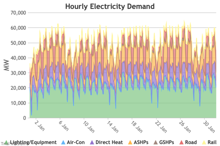
|
Image
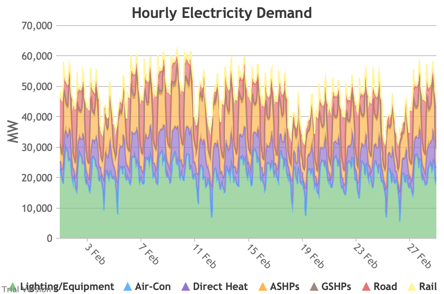
|
Image
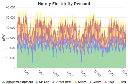
|
|
Image
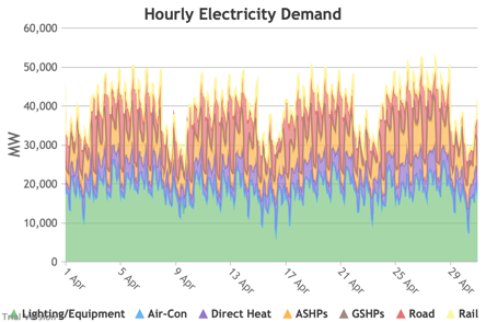
|
Image
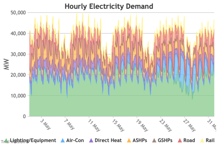
|
Image
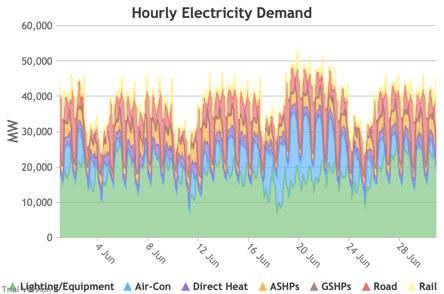
|
|
Image
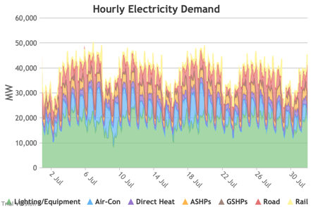
|
Image
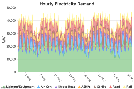
|
Image
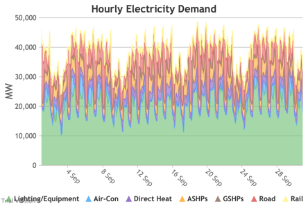
|
|
Image
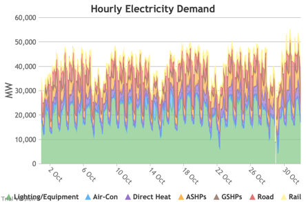
|
Image
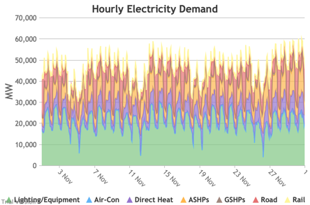
|
Image
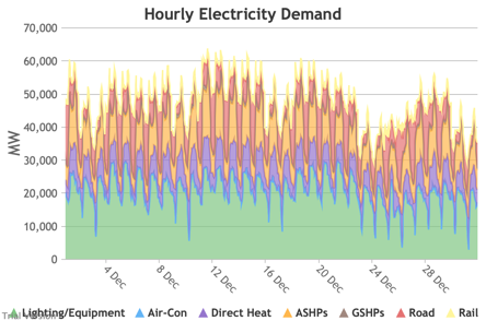
|
3.3.3 Wholesale electricity demand profile
3.3.3 Wholesale electricity demand profile Bruno Prior Tue, 15/12/2020 - 11:52The wholesale electricity demand profile is the sum of the hourly retail demand, adjusted for transmission and distribution losses, which tend to be higher when demand is lower, i.e. slightly reducing the variation in the previous charts, but also slightly increasing the total in each hour.
|
Image
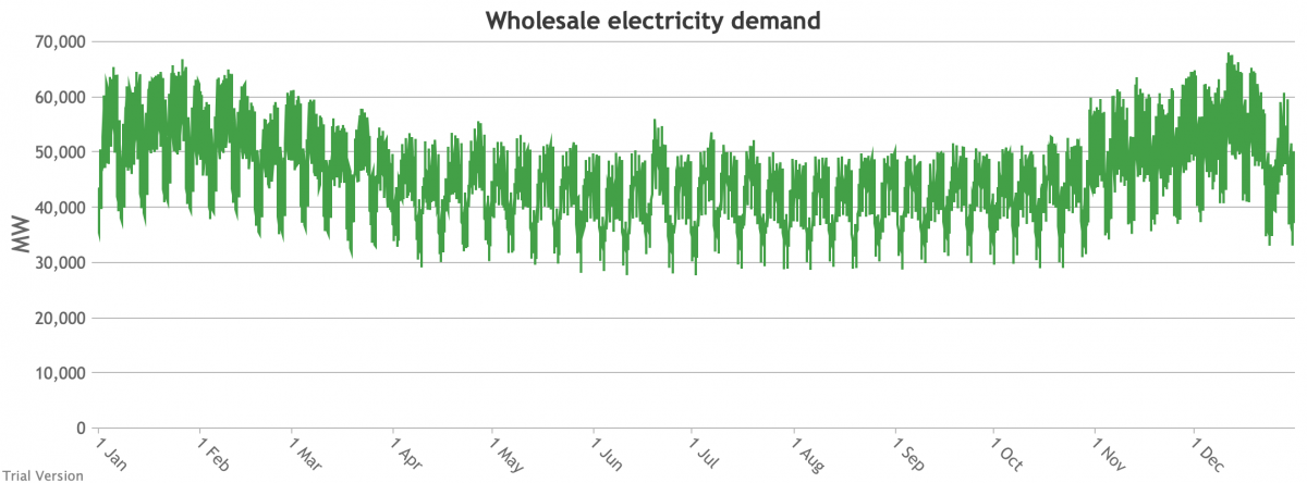
|
||
|
Image
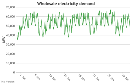
|
Image
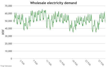
|
Image
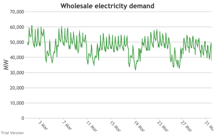
|
|
Image
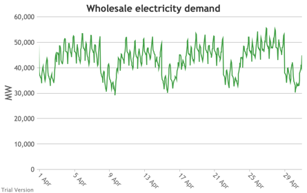
|
Image
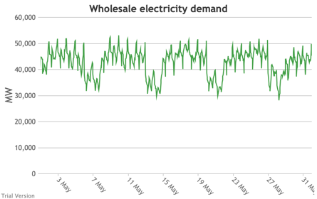
|
Image
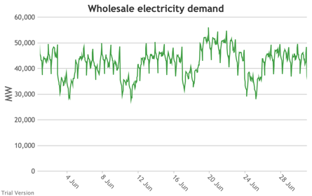
|
|
Image
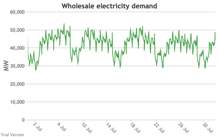
|
Image
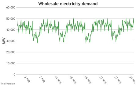
|
Image
|
|
Image
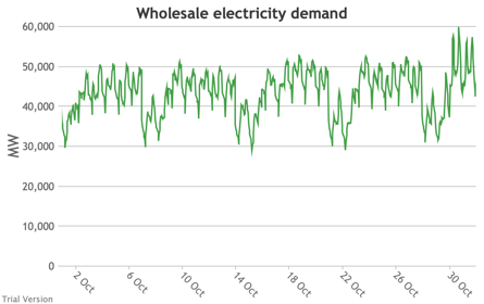
|
Image
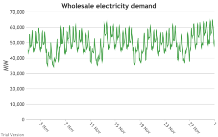
|
Image
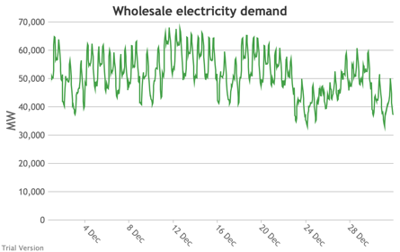
|
3.3.4 Wholesale demand profile vs output from inflexible generators
3.3.4 Wholesale demand profile vs output from inflexible generators Bruno Prior Tue, 15/12/2020 - 11:52These charts compare the wholesale electricity demand profile from the previous section with the output of the inflexible generation technologies (nuclear, biogas, solar, onshore wind and offshore wind).
|
Image
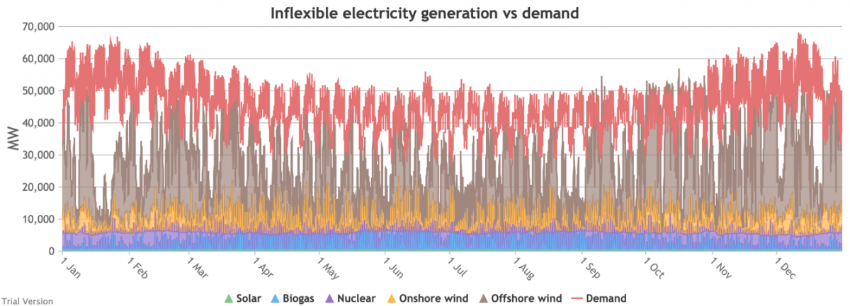
|
||
|
Image
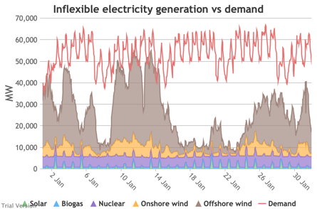
|
Image
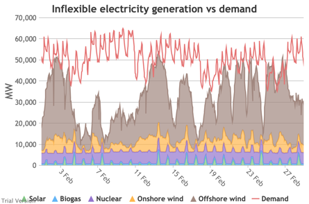
|
Image
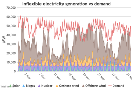
|
|
Image
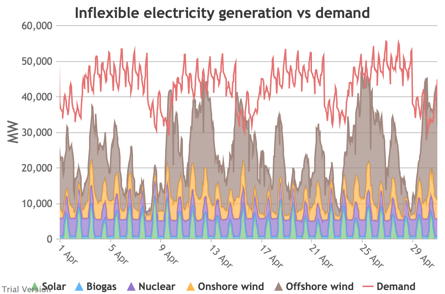
|
Image
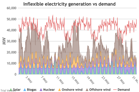
|
Image
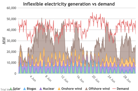
|
|
Image

|
Image
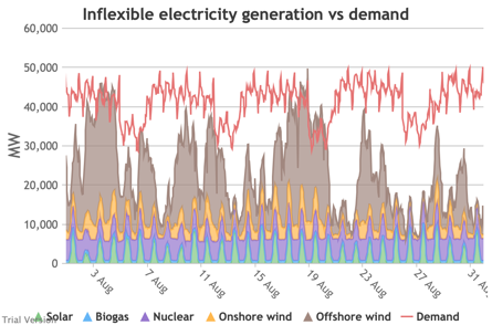
|
Image
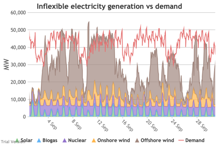
|
|
Image
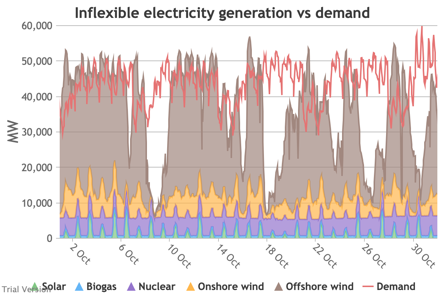
|
Image
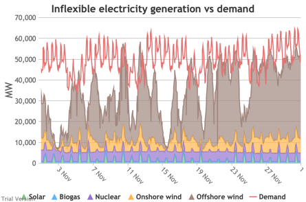
|
Image
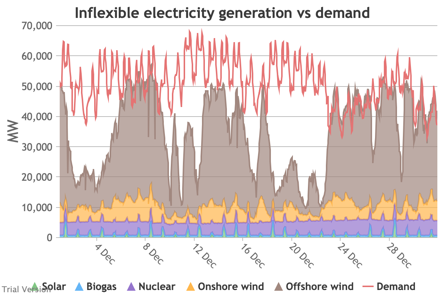
|
- This output is notional, as though there are there no constraints. Where the combined inflexible output exceeds demand, the excess may be stored or exported, and if not, it will be curtailed. So this does not necessarily indicate actual output. Curtailment is applied at a later stage. This is potential.
- This is the first step that illustrates some of the challenges of electrification:
- Even without gas, hydro, coal, oil or biomass, the inflexible technologies alone (wind, solar, biogas and nuclear) sometimes exceed total demand, even though that demand is boosted significantly by electrification. These increasing periods of excess production hurt their own load factors (and therefore costs) to some extent, and more significantly the load factors and costs of the flexible generating technologies.
- At other times, their combined output is negligible. Biogas and nuclear get a pass on this aspect – they are pretty reliable, just not very flexible (and that is more because of the incentives than because of the technology). But the combined output of onshore and offshore wind and solar is sometimes minimal. There is no regularity to it. There is little correlation with demand (solar correlates to some extent, wind not at all). It is sometimes for extended periods. Consequently, output gaps are sometimes during periods of high demand.
- Look more closely, for instance, at 16-24 January.
Demand ranges from 50-65 GW during the working week and 40-60 GW at the weekend. The combined output of wind and solar averages 7.8 GW, out of a combined capacity of 71 GW. If you want to address this with storage, you will need enough capacity to support around 40 GW of continuous discharge for over a week. You will need to recover a lot of the cost of that storage in that period, because that amount of storage will not be called on frequently. This is the problem with using storage to address irregular intermittency. It is a bad fit. Storage is most suitable for smoothing regular imbalances (e.g. adjusting flat electricity production to fit a regular daily profile of demand). It is not technically impossible, but it is economically inadvisable. We look at storage in more detail below.Image


3.3.5 Wholesale demand net of inflexible generation
3.3.5 Wholesale demand net of inflexible generation Bruno Prior Tue, 15/12/2020 - 11:52- These charts show the hourly balance from the previous section (wholesale demand minus the output of the inflexible generation technologies), to illustrate the challenge for the other technologies (flexible generation, storage, interconnectors and demand response). Negative periods reflect excess inflexible output (i.e. the output of inflexible generation alone is more than the total demand for electricity in that period, before we allow for any contribution from other technologies, e.g. for system services).
- The effect of subtracting an irregular profile from a largely-uncorrelated somewhat-regular profile is a highly irregular profile. The irregularity is a bigger issue than intermittency. Regular intermittency is amenable to solutions such as storage. Irregular intermittency is not.
|
Image
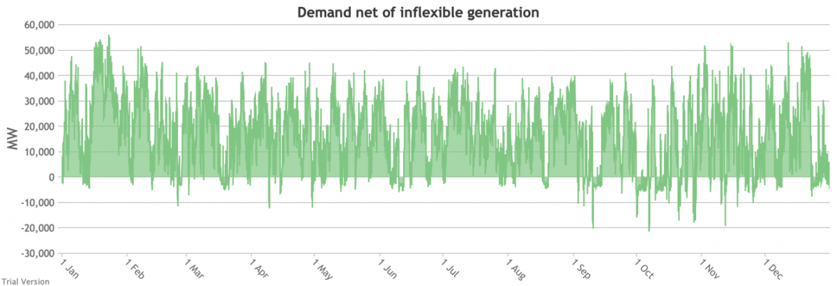
|
||
|
Image
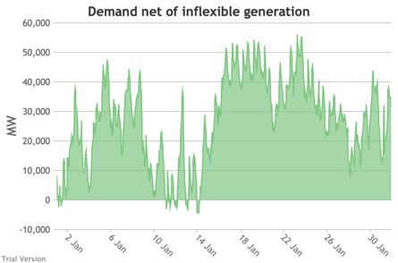
|
Image
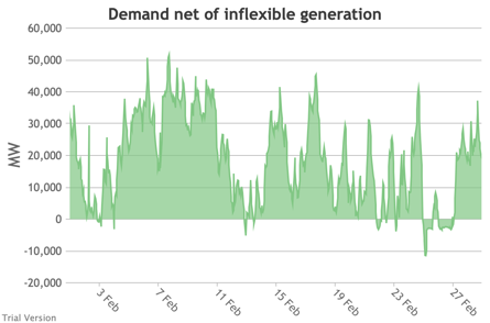
|
Image
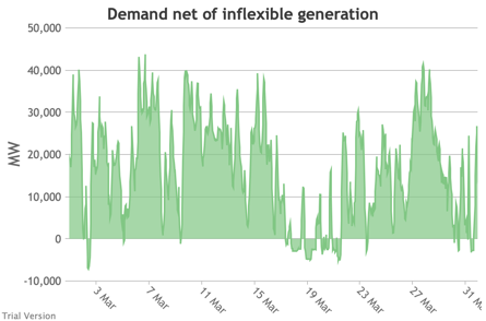
|
|
Image
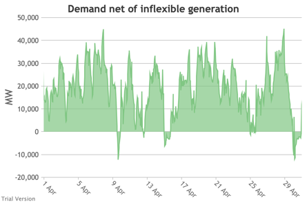
|
Image
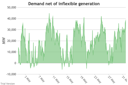
|
Image
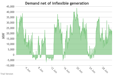
|
|
Image

|
Image
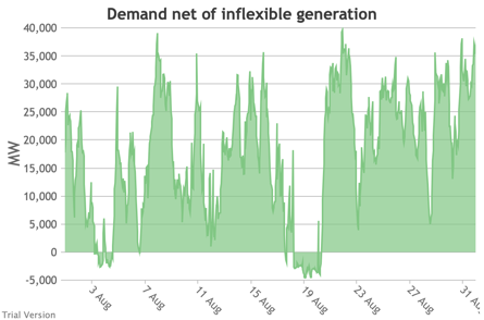
|
Image
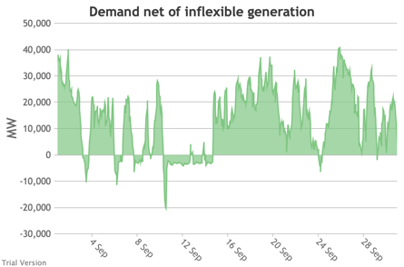
|
|
Image
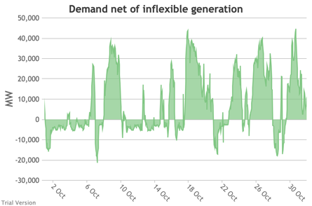
|
Image

|
Image
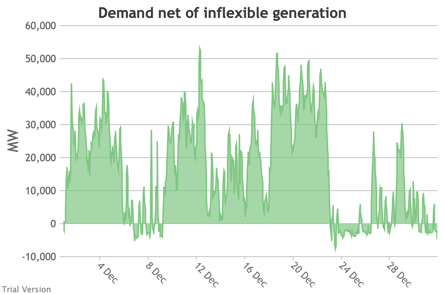
|
3.3.6 Electricity storage and level of charge
3.3.6 Electricity storage and level of charge Bruno Prior Tue, 15/12/2020 - 11:52These charts show the flows into and out of storage (the lines) and the level that they are charged to (the areas) in each period.
|
Image
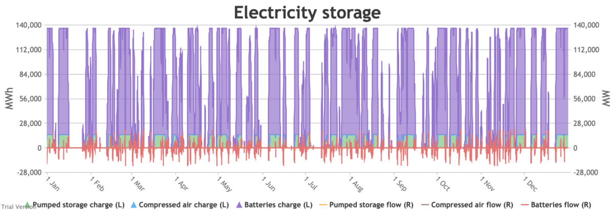
|
||
|
Image

|
Image
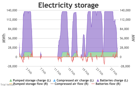
|
Image
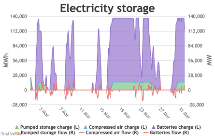
|
|
Image
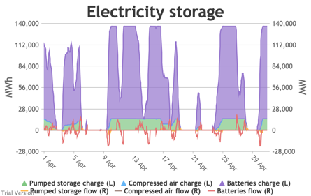
|
Image
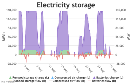
|
Image
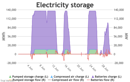
|
|
Image

|
Image
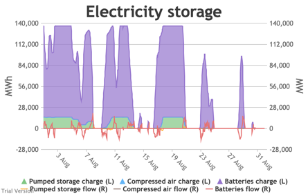
|
Image
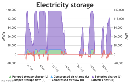
|
|
Image
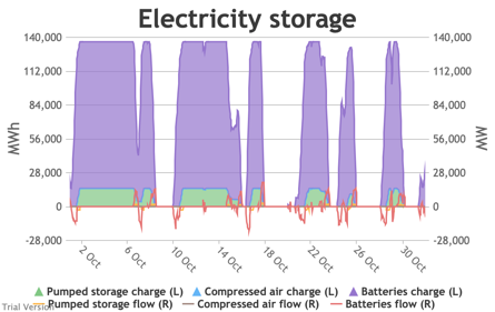
|
Image

|
Image
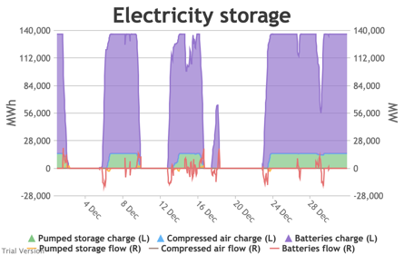
|
- We put 20 GW / 120 GWh of new battery storage into the model (on top of the modest existing pumped-hydro and battery storage) to test how it would handle these conditions. To maximise its value, the model assumes it is the first option for balancing, before interconnectors and flexible generation.
- This requires a bit more explanation than previous charts:
- Storage has two constraints: (a) the amount of energy (MWh) it can hold, and (b) the maximum rate (MW) at which that energy can flow into or out of the storage unit.
- is bounded by the energy capacity at one end, and zero at the other (i.e. can’t have less than no energy in it, nor more energy in it than it can hold).
- is roughly centred on zero, with flows into storage represented by negative numbers (i.e. this is from a system perspective, so flows into storage are flows out of the system), and flows out of storage represented by positive numbers (i.e. the storage is adding to the energy in the system).
- The model assumes that the storage units will take any of the excess from the previous section, limited by (a) the maximum flow-rate (to simplify things, we make the unsound assumption that the maximum inflow- and outflow-rates are the same), (b) the storage capacity (i.e. it stops taking electricity when it is full), and (c) an internal priority list between storage technologies, which assumes that batteries take priority over compressed air (because a key purpose of compressed air is to provide better economics for longer-term storage than batteries), and compressed air takes priority over pumped storage (because pumped-storage costs are largely sunk – this is not a strong generalisation and could well not be reflected in real-life operation). In this scenario, we have not yet assumed any compressed air storage, so the priority is simply that batteries take excess power in priority to pumped storage (which is anyway dwarfed by the assumed battery capacity).
- Conversely, the model assumes that the storage units will supply any net demand (from the previous section) in priority to interconnectors and flexible generation, limited (as before) by (a) the maximum flow-rate, (b) the storage capacity, and (c) the priority order between storage technologies. Again, these assumptions may not be reflected in real-life operation, where priority will be determined by commercial decisions.
- We have to take account of round-trip losses at some point. The model assumes that the storage capacity (MWh) reflects capacity after losses, and that the losses occur before the electricity is stored. For example, if the technology’s round-trip efficiency were 80% (i.e. 20% round-trip losses), its capacity were 100 MWh, and its maximum flow-rate were 10 MWh, it would take 12.5 hours at full flow to fully charge the unit, but only 10 hours to discharge. This is almost certainly not how it works in practice, but it is largely semantic and simplifies the calculations. The end result should be the same as if we had made a more specific allocation of losses before and after storage. The main difference would be the notional capacity.
- The chart shows the flows as discrete lines (with the scale on the right) and the stored energy as stacked areas (with the scale on the left vertical axis).
- Remember that we deliberately specified storage with a conventional ratio of capacity (MWh) to power (MW) designed for the economically-optimal operational profile of frequent, regular charge/discharge cycles (typically once or twice a day). That has produced a usage profile with reasonably-high frequency. But it is nowhere near the ideal frequency and regularity because it is responding to a highly-irregular supply/demand pattern.
- For example, the period of 16-24 Jan discussed above appears in the storage chart as a gap.
Image
Even 120 GWh of electricity storage is used up within a day on 15 Jan, as the wind dies down and the demand net of inflexibles becomes substantial. It remains substantial for 8 days. It cannot supply anything in that period because it is empty. It does not charge up again because there is pressure on the swing suppliers (flexible generators and interconnectors) and it would be counterproductive and expensive to buy electricity when marginal costs are high. So it waits until 26 Jan to start re-charging, when the wind has strengthened and net demand is lower. - Such circumstances are not uncommon. Theoretically, storage technologies could continue to charge and discharge if there is some supply margin between the flexible generators and interconnectors. But round-trip losses mean that storage loses money if there is not a material price gap between purchase and sale. Such a margin relies on material differences in the tightness of the market. It does not make sense for storage to charge and discharge when there is little difference in purchase and sale price because the tightness of the market is not varying sufficiently, even though it would be theoretically possible to do so. The frequency and scale of the swings in market tightness are a material difference between current conditions and the modelled conditions under heavy electrification. It is the effect of increased irregularity because of (a) the penetration of wind and (to a lesser extent) solar, and (b) the less-regular demand profile for heat.
- A marginal analysis shows the decreasing returns to scale.
Image

The storage capacity (in MWh, not MW) in this scenario is divided into notional tranches of 10 GWh (120 GWh of new battery storage, plus the modest existing capacity of pumped storage and batteries). If we had only installed 10 GWh of storage, the opportunities to charge/discharge would have amounted to annual sales of 1.35 TWh. Even that is significantly worse (equivalent to one full discharge just under every 3 days) than the almost-daily opportunities currently available to Dinorwig etc. But this falls quite sharply as we add capacity. The 4th tranche only has opportunities to discharge 891 GWh p.a., equivalent to one full discharge every 4 days. The last tranche is down to 256 GWh p.a., or one discharge every 14 days. - In reality, one would not install most of these tranches, unless the costs of storage were dramatically lower than they are currently, or the value of balancing services were dramatically higher. We estimate that the cost of battery storage at this scale is around £280/MWh, which is an order of magnitude more than it would generally be thought to be worth.
- And yet this is at a scale that can address only a small proportion of the discrepancy between demand and inflexible output, aiming to deal primarily with short-period variations. If we wanted to deal with longer-period variation (e.g. seasonality) through storage, the utilisation would be much lower than even the last tranche in the chart above. The cost would be in the thousands of pounds per MWh.
- Other technologies such as compressed air storage may lower that somewhat. They claim to reduce the capital cost per MWh of having a higher ratio of MWh to MW and thereby reduce the cost of somewhat longer-term storage. But it is noticeable that their example applications still hope (in the first instance) to be high frequency. They cannot overcome the fundamental relationship between frequency-of-use and economic return, just marginally reduce the impact of lower frequency.
- The reality of storage is that it is best-suited to high-frequency, regular patterns of use, and is ill-suited to addressing the irregular profiles generated by this scenario.


3.3.7 Electricity supply and demand by type
3.3.7 Electricity supply and demand by type Bruno Prior Tue, 15/12/2020 - 11:52These charts show the hourly balance of demand and supply, grouped by type of technology (inflexible and flexible generation, storage and interconnectors).
|
Image
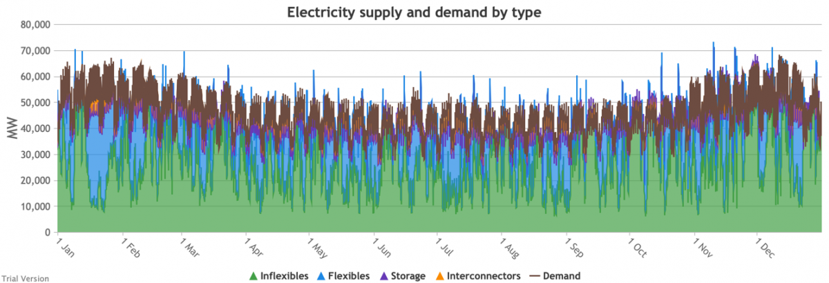
|
||
|
Image
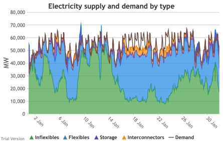
|
Image
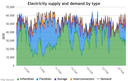
|
Image
|
|
Image
|
Image
|
Image
|
|
Image

|
Image
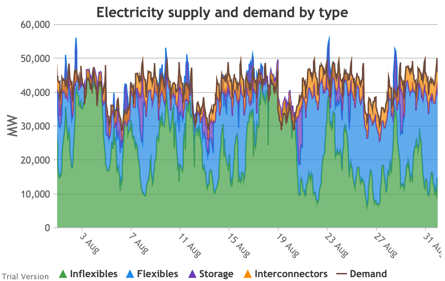
|
Image
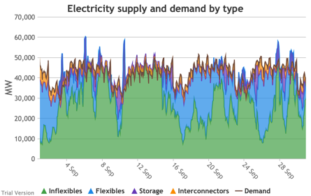
|
|
Image
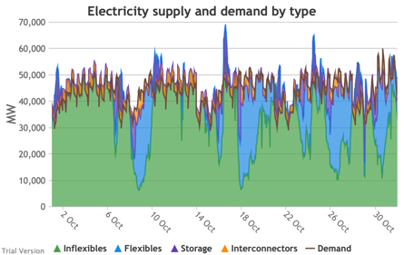
|
Image

|
Image
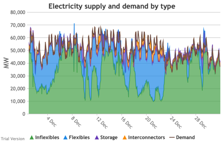
|
- That leaves interconnectors and flexible generation to do most of the heavy lifting. Flexible, of course, mostly means carbon-emitting. That is mostly true at the other end of the interconnectors as well. And interconnectors have other constraints that are often not recognised (see section 2.2.3.9 above). Our model assumes that they take priority over native flexible generation. This scenario assumes we have expanded their capacity to 9.5 GW. Grouping technologies by type, the net effect is:
- Let’s look more closely at January to highlight some details.
Image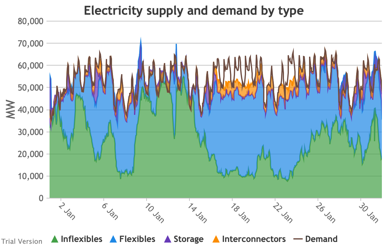
- The unshaded gaps between the Demand line and the stacked Supply bands from around 17th January are periods when the combination of inflexibles, flexibles, storage and interconnectors are unable to meet demand. These are inevitably periods when demand shedding would be required. They are relatively few in this scenario, because we have only partially electrified demand and only partially decarbonised supply.
- Ceteris paribus, full electrification and decarbonisation would see these gaps becoming intolerably large and frequent.
- Even at this intermediate point in the process, that’s over 10 GW needing to be shed when the wind doesn’t blow for sustained periods.
- The conditions sustain for over a week (in working days; weekends provide some relief through lower demand).
- 10 GW means more than just down-rating a few factories, and the duration and scale shows that this would have a serious impact on businesses if we assumed that they would be the focus of demand shedding.
- As we will see below, our model puts a relatively modest cost on demand shedding at this scale. The indirect effects of unreliable energy on the economy are probably much larger than our estimate of the direct costs.
- The other periods to note are when (for example the peak around 9 Jan) the stacked Supply bands exceed the Demand line. These areas are shaded purple for Storage, i.e. they are periods when storage is charging up. Purple areas below the Demand line are when Storage is discharging.
- The same applies to the Interconnectors. Orange shaded areas above the Demand line are when the Interconnectors are exporting (net; in practice, it is often the case that some are exporting while others are exporting). Orange shaded areas below the Demand line are when the Interconnectors are importing. It is noticeable that under this scenario, the model assumes that flows will be much more strongly biased than at present in favour of imports (other than the internal, Northern Ireland interconnector, which tends to flow from GB to NI, although even that has been reduced by the system pressures of this scenario). Given similar decarbonisation strategies across the continent, it is not safe to assume that, in practice, our neighbours would be able to spare the power we need when we need it.
- Sometimes the Storage and Interconnector areas overlap, giving a brownish area indicating (typically) Interconnectors importing (i.e. flowing into the system) while Storage is charging (i.e. flowing out of the system). These are not easily visible in the small monthly charts above, but several of these conditions can be seen in this chart of the week beginning 13 August.
Image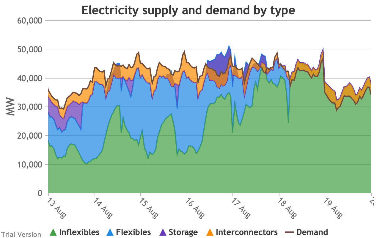
- The model does not take account of the system-stabilisation services provided by a spinning reserve of thermal generation. Profiles such as those illustrated above would require a substantial investment (not costed in the model) in STATCOMs (etc), in order for gas-fired generation to reduce to zero when inflexible generation approaches or exceeds demand.
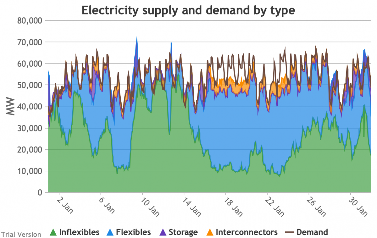

3.3.8 Electricity supply and demand by source
3.3.8 Electricity supply and demand by source Bruno Prior Tue, 15/12/2020 - 11:52These charts show the same aggregate profiles as the previous section, but in this case divided by technology rather than grouped types of technology.
|
Image
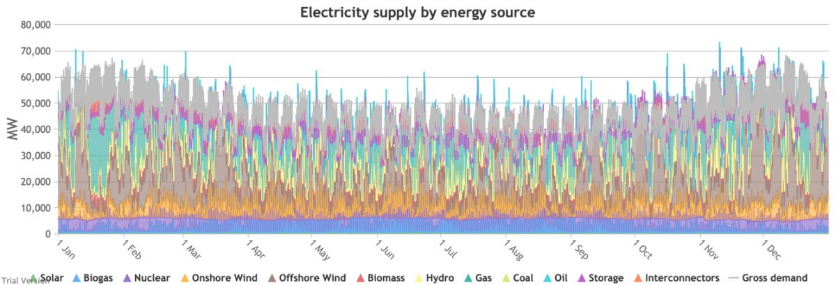
|
||
|
Image

|
Image
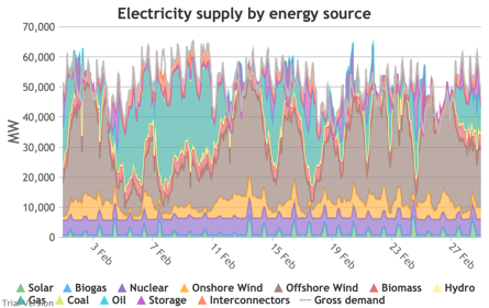
|
Image
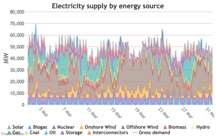
|
|
Image
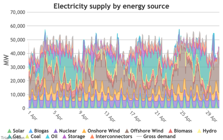
|
Image
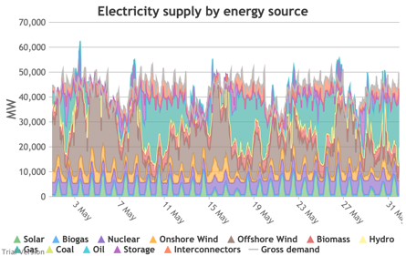
|
Image
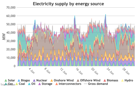
|
|
Image
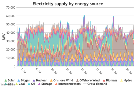
|
Image
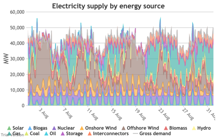
|
Image
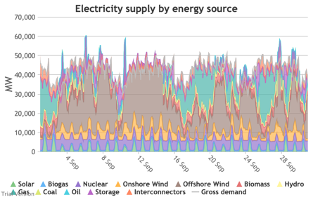
|
|
Image
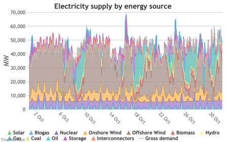
|
Image
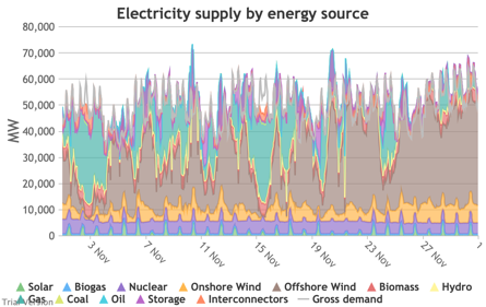
|
Image
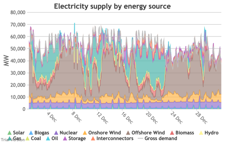
|
- Their annual contributions in this scenario (versus the status quo) look like:
Image
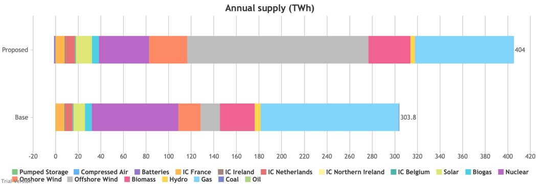
3.3.9 Electricity supply margin
3.3.9 Electricity supply margin Bruno Prior Tue, 15/12/2020 - 11:52- The supply margin is the excess capacity in green (or deficit between demand and total capacity as negative margin, i.e. demand shedding, in red) in each period.
|
Image
|
||
|
Image

|
Image
|
Image
|
|
Image
|
Image
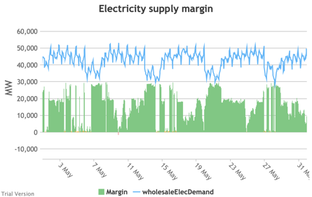
|
Image
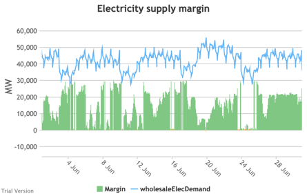
|
|
Image

|
Image
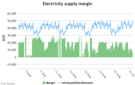
|
Image
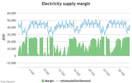
|
|
Image
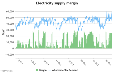
|
Image
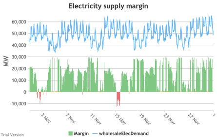
|
Image
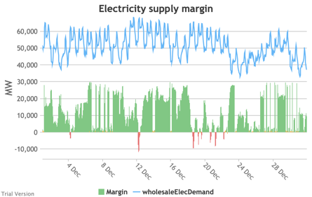
|
- The distribution of the margins over the year looks like:
Image
- The margin is negative for 232 hours in the year (2.6%). In another 1,335 hours (15% of the year), the margin is between zero and 5%. At the other extreme, the margin is over 50% for 1,872 hours in the year (21%). This is material inefficiency at both ends of the distribution. It means that too often (a) we are unable or close to being unable to meet the demand, or (b) a lot of capacity is standing idle (which will be reflected in the costs, as the fixed costs have to be covered by fewer MWh). You would prefer the distribution to be a tight bell curve centred around 30-40%, as it has been for the past decade.[1]
Image


[1] Chart from BEIS, UK Energy in Brief 2019, p.17. https://assets.publishing.service.gov.uk/government/uploads/system/uplo…
3.3.10 Electricity generation capacity utilisation (load factors)
3.3.10 Electricity generation capacity utilisation (load factors) Bruno Prior Thu, 17/12/2020 - 11:15
- Inflexibles like nuclear, solar and wind get priority and therefore are only curtailed for the periods (rare in this partially-electrified, partially-decarbonised scenario) when inflexible output exceeds demand. The increase in the load factors compared to the 2017 status quo, despite modestly more curtailment in this scenario, is because we assume higher load factors for the new wind and nuclear projects than for the existing units (in accordance with industry claims for wind, and reasonable expectations for new vs old plant for nuclear).[1]
- We assume hydro (because of low marginal operating costs) and biomass (because of its carbon value) are called before gas, and they therefore take less of a hit to their load factors from periods when they are not needed.
- We assume gas takes priority over oil (and coal, but this scenario includes no coal) because of its low cost and lower carbon footprint. The scenario only includes a small amount of oil (small-scale standby generation), so the bulk of the swing supply is covered by gas, which therefore experiences a significant hit to its load factor. Oil would show an even worse impact on its load factor, if there had been any transmission-connected oil to provide seed data in the base years.
- We can visualise the impact on each technology’s load factor depending on the installed capacity through a marginal analysis. In the following chart, we split each technology’s installed capacity in this scenario into GW chunks. The first points (left to right) indicate how much we would expect the first GW of that technology to generate over the year. The second points indicate how much we would expect from an extra GW, and so on. The solid lines indicate the performance under this scenario. The dotted lines indicate the technology’s performance under the status quo.
Image
- Don’t worry about the steep drops for the last GW of some technologies. This is simply a mathematical artefact, allocating the last GWh to the last GW. The reality would be more graduated, but it does flag the technologies with falling marginal utilisation levels.
- The obvious victim of this scenario is the utilisation of gas generation. The fact that it nevers hits zero (and that we have multiple periods with negative margin) shows that we still need all this capacity. But the increase in wind and solar dramatically hits the utilisation levels of gas generators, which will be reflected in the cost of gas generation per MWh. This is not (as is often portrayed by wind evangelists and reported in the media) gas becoming more expensive, neither absolutely nor relatively vs wind. It is the higher penetration of wind increasing the cost per MWh of the standby generation. It is absurd that this is often presented as a benefit of the intermittent technologies, and often discounted from the calculation of their cost to the system. It will be increasingly expensive to maintain a sufficient capacity margin as increasing intermittent capacity reduces the utilisation levels of the flexible technologies.
- You can see a similar effect to a lesser extent for hydro and biomass, and it would be worse for oil (let alone coal) if there were any significant capacity. What this is telling us is that, whilst you can always add capacity to balance intermittency if you are willing to pay for it, the marginal cost of that will head ever upwards. Because there will always be periods when neither the wind is blowing nor the sun is shining, and because those periods are not frequent/regular enough to justify storage capacity, additional intermittent capacity does not displace any of the marginal flexible capacity.
- What this means is that, on a true marginal-cost analysis of decarbonisation, unless carbon is hugely expensive (which would have ramifications across the model and for policy), the level of decarbonisation at which the marginal cost of additional decarbonisation exceeds the marginal value of that decarbonisation is almost certainly above Net Zero. Net Zero is economically incoherent as a policy.

[1] Nuclear’s capacity factor in the base scenario looks too high, but reflects Elexon data. It probably indicates that Elexon’s figures for nuclear capacity reflect reasonable operational expectations, not the theoretical maximum potential as constructed.
3.3.11 Carbon
3.3.11 Carbon Bruno Prior Thu, 17/12/2020 - 11:26-
This is our estimate of the impact of this scenario on the carbon emissions from the combustion of fuel for the generation of electricity. It is less than many people might imagine would be the effect of 40 GW of offshore wind, 13 GW of onshore wind and 18 GW of solar, for a number of reasons, including two in particular:Image

- British electricity has already been decarbonised more than many people realise. Not so long ago, the grid-average carbon intensity of electricity was roughly 2.5X the carbon intensity of gas, per unit of final energy. Now, they are roughly on a par. There are diminishing marginal returns from further decarbonisation, as new low-carbon capacity increasingly competes with existing low-carbon capacity as well as the modest residual fossil-fuelled output.
- The total amount of electricity generated has increased significantly under this partial-electrification scenario. So the 27% reduction in the absolute amount of carbon emitted from this source reflects a larger reduction in the carbon emissions per unit of final energy. This will be partly reflected in the carbon emissions from other sectors below, which show the opposite effect.
- This chart does not include the embodied carbon in the generation facilities. It indicates only the carbon emitted in the process of generating the electricity. We do not attempt to carry out a Lifecycle Assessment in this model. But we do estimate the embodied carbon in new infrastructure separately below.
-
To avoid double-counting the carbon emissions from the electricity used to power electric heat and transport, for these uses, we calculate only the carbon emissions from the non-electric systems. This chart shows that calculation for heat.Image

- The total carbon emissions from heat will have fallen less, because a significant proportion of the fall relates to the exclusion of electricity, which is a larger proportion in the Proposed column than the Base column.
- But there would still be a material reduction because:
- the carbon intensity of electricity would have fallen below the carbon intensity of gas (and other combustion fuels) in this scenario, and
- this scenario assumes most of the electric heating is heat pumps (compared to a minimal proportion at present), which significantly reduces the amount of electricity required to deliver a given amount of heat.
- The scenario also assumes that some efficiency improvements have reduced the total demand for heat, and consequently the carbon emissions from heat-production.
- Still, this illustrates the scale of the challenge to decarbonise the sector. There is a long way to go. We chose only one-third electrification as the starting point because of the system challenges of incorporating more (as we will examine in sensitivity analysis below).
- As for electricity, these figures reflect only the emissions from fuel combustion, and do not include the embodied carbon in the infrastructure. Unlike electricity, the model does not yet attempt to estimate the embodied carbon in our heating systems, and the impact of the scenario on that embodied carbon.
-
This is the impact of this scenario on carbon emissions from the combustion of transport fuel, excluding electricity. Not surprisingly, displacing half the internal combustion engines with electric vehicles has roughly halved the carbon emissions from road transport.Image

- The scenario also assumes further (but not complete) electrification of the rail network, whose carbon footprint consequently falls. But this illustrates the relative insignificance of this mode of transport.
- The scenario does not assume any electrification of air or water transport, and consequently does not project any significant reduction in their carbon footprint. No doubt efforts will continue to develop lower-carbon options for these modes of transport, but these options are too immature to assume anything in a base scenario. The chart illustrates the significance of air travel. Besides the technical difficulty of decarbonising air transport, it is an added problem that air is primarily about international travel, which muddies the waters both in terms of action and in terms of accounting.
-
Combining these uses, gives us the following picture of carbon emissions from the combustion of fuel. Again, this does not include carbon embodied in the infrastructure. It does not include carbon dioxide from non-energy sources. And it does not include other greenhouse gases, other than the small quantities included in the figures for the carbon intensity of energy technologies, expressed as carbon-dioxide-equivalent.Image

- In sum, the scenario reduces direct carbon emissions from the energy sector by just under one-third, relative to the position around 2017, which was already materially reduced from the turn of the century. But there is a long way to go still.
-
This is our estimate of the carbon embodied in the infastructure required to deliver this scenario in the electricity sector. It does not include the carbon embodied in the existing infrastructure (hence the non-existent Base bar).Image

- The main point to note is that this is relatively modest. It reflects the sum of all embodied emissions in the infrastructure developed to deliver this scenario, over whatever period one might assume (we have 2030 in mind for this scenario, but it is not specific). The previous charts are per annum. So the annual emissions from fuel consumption are significantly larger according to our model than the one-time emissions from constructing the infrastructure.
- Nevertheless, one should take account of the net effect of all emissions in calculating the true impact of the scenario. That would marginally reduce the carbon benefit indicated in the previous charts.


3.3.12 Costs
3.3.12 Costs Bruno Prior Thu, 17/12/2020 - 12:09-
Moving on to cost, this is our estimate of the annual cost of our electricity systems, comparing the status quo with this scenario.Image

- The costs for each technology include estimates of variable (primarily fuel) and fixed (e.g. maintenance and overheads) annual costs, and the amortized capital cost at the Weighted Average Cost of Capital assumed for this scenario (the default: 7%; just below the level used recently by the regulator).
- It also differentiates between existing and new capacity, using figures based on historic data for the existing capacity, and (typically somewhat reduced) figures claimed by technology advocates for new capacity, reflecting assumed learning curves. As explained above, even where contracted values appear to confirm significant cost reductions, until they are implemented and prove sustainable at that price for a few years, this assumption is not safe. But it is the least contentious available.
- A key point to appreciate about this significant increase in the costs of the electricity system is that a larger proportion of our energy is supplied by electricity in this scenario, so the impact on the cost per MWh is smaller, as we will see below.
- The labels indicate the sum of (a) Generation costs (“Gen”) and of all System costs (“Sys”) including generation, transmission/distribution, storage, supply, and demand-shedding, but excluding the social cost of carbon (the blue band at the top). The label at the top is all costs including the cost of carbon at the rate specified for the scenario (the default of £50/tCO2e in this case).
-
These charts show the effect of this scenario on the cost per unit of electricity (a) supplied (i.e. net of losses), and (b) generated (i.e. before distribution losses). These are the costs in the previous chart divided by total electricity supplied or generated. They are not the cost per MWh of each technology. Stacking the latter would not indicate anything useful. This allows you to view the shares of overall costs that can be attributed to each component of the electricity system, allowing for the fact that the total amount of electricity supplied has increased under this scenario.Image
, partial electrification/decarbonisation scenario")
-
The obvious headline from these charts is that the cost has increased not only in absolute terms, but also per unit of electricity. The hope is that economies of scale and learning curves reduce the cost of electricity per unit in an electrified energy system. We incorporate such assumptions into our model. But they are outweighed by:Image
, partial electrification/decarbonisation scenario")
- a switch from (on average) cheaper technologies to more expensive technologies (before taking externalities into account, see below), adding around £13/MWh,
- higher costs of storage and interconnection to mitigate the effects of a higher proportion of intermittent generation in the mix, adding about £7/MWh, and
- some demand shedding to deal with the periods when demand simply can’t be met, adding about £2/MWh.
There are also costs that are not included in this model, such as the STATCOMs needed to run without spinning reserve of thermal generation for sustained periods.
- These higher costs are somewhat offset by a lower cost of carbon from decarbonising the electricity system. Despite higher volumes of electricity, the absolute cost of carbon (at £50/tCO2e) falls from £2.5bn to £1.8bn. Adjusting for the quantity of electricity, this is reflected in a larger fall (proportionately) from £9 to £5 per MWh supplied. You may note that these savings in the social cost of carbon are worth nowhere near as much as the cost of the measures to achieve them. That is not an entirely fair comparison, because part of the purpose and effect of electrification could be to shift more of the carbon burden on to electricity. This can only be compared accurately across all our energy systems. We do that below.
- You may notice that the estimated cost of electricity in the base scenario is lower than it was in practice. That is mainly because our model does not incorporate the costs of government measures, whether subsidies or taxes. It is intended to analyse the underlying economics before it is distorted by interventions, partly to be able to assess the cost/value of those measures. As non-environmental taxes (e.g. VAT) fall very lightly on electricity in the UK, the discrepancy is mostly about the cost of environmental subsidies and the levies to fund them.
- One of the main arguments for the winner-picking approach to decarbonisation adopted by successive governments over three decades was that a carbon tax was too expensive, as it fell on the whole economy. Targeted measures would allow a better bang for the buck. The fallacy in that argument is exposed in these charts. The discrepancy between the cost of electricity with and without government impositions under the status quo is much greater than the cost of the carbon emitted, valued at £50/tCO2e. Either carbon is worth several multiples more than that, or the effect of government measures (both directly as levies and indirectly through the system impacts that are not attributed to decarbonisation in government assessments) has been more expensive than if we had simply put a price on the carbon.
- That is inevitable when one thinks about the intention of the winner-picking approach. The objective is to target higher levels of support at the “winners” whilst avoiding paying similar levels of support to technologies that the government does not favour. If the government’s winners were cost-competitive, they would not need to pick winners – their favourites would prosper under a technology-neutral regime. The “banding” that has been rife in energy policy is precisely a mechanism to pay high levels of support to expensive technologies favoured by government. If you pay more for expensive technologies and try to minimise support to cheaper technologies, you should not be surprised that you get more of the expensive technologies and less of the cheaper technologies. In sum, that means costs are higher than a system where higher levels of support were not directed to expensive technologies. We are now reaping the consequences of the denial of this inevitability, as high costs collide with increasing deployment.
- We are asked to believe that falling costs mañana and even greater deployment will justify this in the long run. They will have to “go some”, because the high costs and large capacities of existing projects are locked in to long-term contracts under the support schemes. The claim will only be credible when retail prices net of the shadow price of carbon fall materially, rather than increase as they have done inexorably over the past decade when we were being promised that these learning curves were bringing down the costs.
- Notice the narrow, orange band second from top on the right, and the absence of an equivalent on the left. This is the cost of demand-shedding, due to inadequate supply to meet demand at times. It is estimated in this scenario at £1.8bn, or £2/MWh. That is relatively modest, because it is needed for “only” 232 hours in the year. But remember that:
- we were on the edge for another 1,335 hours,
- the model assumes that costs ratchet as the frequency and scale of demand-shedding increases,
- this scenario is under relatively benign weather conditions, and
- it assumes a system that has been only partially electrified and decarbonised.
As we will see below when we do some sensitivity analysis, this element has the potential to become as economically destructive as it was in the 3-day weeks in the 1970s.
-
Turning to other uses of energy, this is the effect of this scenario on the costs of heat.Image

- A modest cost-saving excluding externalities is increased when one takes into account the cost of carbon.
- This is the cost of the heat systems. The effects of electrification on the electricity system are calculated outside this component, but are internalised in the model through the price charged to electric heating.
- The modest cost-saving comes primarily from assuming some of the extra heat pumps will displace direct electric heating, which is particularly cost-ineffective. We cannot assume much more displacement than this (around half of the existing direct electric heating) because a significant proportion of direct electric heat is not for building heat, but rather for industrial purposes for which alternatives will often not be able to replicate effectively the characteristics that electric heat provides.
- The displacement of some gas-, oil- and coal-fired heating by heat pumps has a negligible effect. On the basis of this integrated cost (of fuel, other running costs and amortized capital costs), heat pumps work out slightly cheaper than oil and slightly more expensive than gas and coal. When we include the cost of the carbon externality at £50/tCO2e, gas and heat pumps are roughly level-pegging, while oil and coal fall behind.
- This model does not attempt to tie the deployment of heat pumps to the efficiency of the buildings in which they are installed. It includes building efficiency separately (see sections 3.2.15 to 3.2.20 above). In this scenario, we assume the government has roughly implemented its current plans, which consist mostly of efficiency improvements rather than rebuild. It is arguable (based on the government’s own data for the effect of retrofit insulation measures) that for most existing buildings, such measures will not be adequate to make them suitable for heat pumps, given the inadequacy of the fabric of most British buildings. In reality, there are a few likely outcomes from a widespread roll-out of heat pumps into existing buildings with retrofitted efficiency measures, when property owners find their heat pump struggling to maintain the temperature in imperfectly-insulated buildings in the coldest periods:
- They try to invest in further efficiency improvements. These are likely to be problematic (e.g. requiring the sacrifice of internal space, and offering a relatively low bang for the buck);
- They invest in secondary heat sources, if they are still permitted (e.g. solid-fuel or electric stoves, assuming there would no longer be a gas supply for a secondary gas heater). Widespread deployment of electric stoves to supplement heat pumps in periods of peak demand would be highly problematic for the electricity system;
- They replace the heat pump with an alterative technology; or
- They get used to wearing extra layers of clothing in the house when it’s cold outside.
In Sweden, (b) was the most common solution. The Swedish wood-pellet industry saw its sales decline for a couple of years after the government began a big push to promote heat pumps. Sales then picked back up again, as people installed pellet stoves to back up their heat pumps, once they realised the heat pumps could not do it alone. Sweden obviously has colder temperatures than the UK (roughly double the number of heating degree-days), but it also has significantly more efficient buildings (thanks to much higher domestic-energy prices), which mean that its domestic energy consumption per property is only slightly higher than the UK despite the much colder weather.
- Most of the other technologies are not significant. Many of the reasons for these assumptions are given in section 2. Biomass is currently the most significant of the other technologies. We assume a modest increase in biomass boilers, but a larger decrease in wood fires and stoves, in accordance with government air-quality plans.
-
Transport costs increase under this scenario.Image

- We have assumed no material change to air and water transport, so the differences relate primarily to road transport, with smaller changes to rail (because rail is a smaller component of transport).
- Transport costs excluding externalities increase by nearly £14bn p.a. The carbon avoided through electrification saves £3bn in social costs, so the net effect is an increase (including externalities) of £11bn. Again, this can only be considered in the round, across all energy, because the system changes may displace cost and carbon from one sector to another. But prima facie, this is poor value.
- Road transport costs (excluding externalities) increase by over £13bn. Current road transport costs are distorted by the levels of tax and duty, which exceed the cost of the road network and externalities. This model ignores government interventions, so this increase is comparing the cost of current road transport excluding taxes and duties with a scenario where 50% has been electrified (also excluding taxes and duties). Obviously, the road network has to be paid for, and externalities have to be accounted for under both systems. But including current taxes does not help that comparison. As is currently under discussion in policy circles, something will have to substitute for fuel duties to pay for the roads, if electrification radically reduces revenues from fuel duties. The model assumes that the cost of the roads is mostly fixed (i.e. depending on the extent of the network, not invariable regardless of construction or abandonment), with a modest variable component for usage (e.g. lower maintenance for lower throughput). This scenario assumes no significant change to the road network and usage, but the electrification of 50% of that usage.
- Rail costs increase from £12.3bn to £12.7bn p.a. under the assumption that another 30% of energy consumption is electrified. Again, this measures energy costs without taxation, but the effect is less significant because rail uses red diesel, and the cost of the network and externalities is not being overcharged through taxes and duties. In fact, the effect of excluding government interventions is the other way round for rail, as the most significant intervention is the government grant. Our model attempts to estimate raw costs, ignoring such grants, in both the base and the proposed scenario. The modest change in this scenario assumes no significant change to the network, and a modest increase in operating costs because the cost of electricity (exc. tax) under this electrification scenario is greater than the cost of diesel (exc. tax) even allowing for the greater efficiency of electric motors. Including externalities, there would be little difference in cost, i.e. rail electrification is roughly worth the social benefit, according to the assumptions in this model.
-
The combined impact is to increase total energy system costs by over £15bn p.a. Carbon costs reduce by £5bn (at £50/tCO2e), so the net effect is an increase in costs of £10bn, i.e. not justified at <£150/tCO2e.Image


, partial electrification/decarbonisation scenario")
, partial electrification/decarbonisation scenario")


3.4 Sensitivities
3.4 Sensitivities Bruno Prior Tue, 15/12/2020 - 11:523.4.1 Random temporal variation
- Regardless of climate change, the weather changes randomly (effectively) from year to year. That affects not only temperatures, but also the profile and average intensity of wind and insolation. To a lesser extent, there are also small differences in human aggregate behaviour. To test this, we can check how this scenario would look under the conditions that pertained in 2016 and 2018 (our base scenario used 2017 conditions). All three years were slightly milder than average, but not exceptionally mild. They are adequate (and must be, given the constraints on the availability of real-world data) to test variations primarily in the timing rather than in the normality of the weather.
- Even with neighbouring years, there are some differences that make the data not perfectly comparable. In particular, wind and solar were being rolled out apace in this period. A fair amount of it was embedded. That means that embedded renewables had a bigger impact on electricity demand data in 2018 than in 2016. We use the demand data to estimate the profile rather than the amplitude, so it does not affect the totals. But embedded intermittents will have somewhat increased the apparent variations in demand in 2018 compared to 2016.
- As one would expect in years of non-exceptional weather, the temporal variation did not make much difference to the modelled aggregate electricity demand.
| 2016 | 2017 | 2018 |
|---|---|---|
|
Image
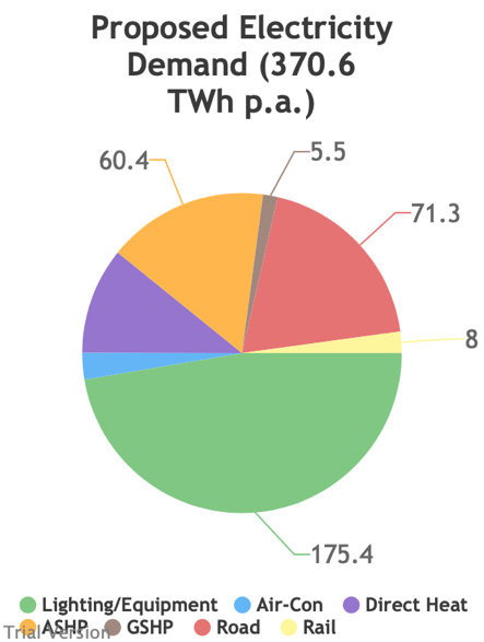
|
Image

|
Image

|
- The variation in the demand profile is not easy to spot without the supply side to compare with it.
- The comparison of inflexible generation with wholesale demand shows more variation.
| 2016 | 2017 | 2018 |
|---|---|---|
|
Image
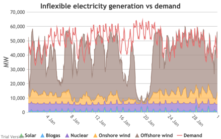
|
Image

|
Image
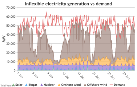
|
|
Image
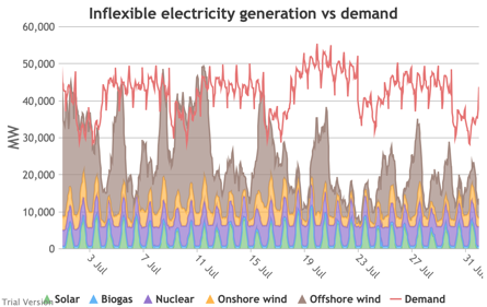
|
Image
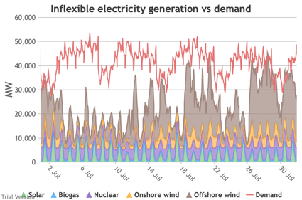
|
Image
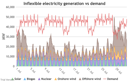
|
|
Image
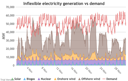
|
Image

|
Image
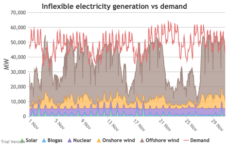
|
- That translates into significant variation in the demand net of inflexibles.
| 2016 | 2017 | 2018 |
|---|---|---|
|
Image
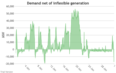
|
Image
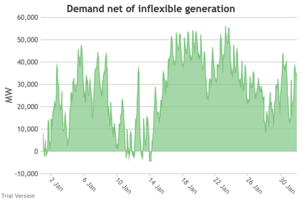
|
Image
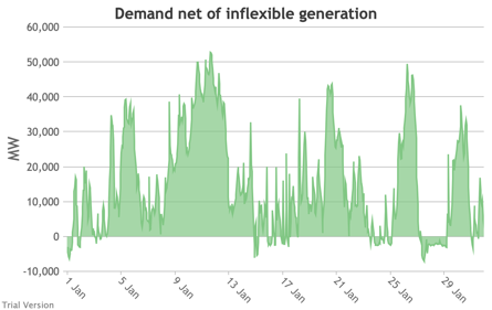
|
|
Image
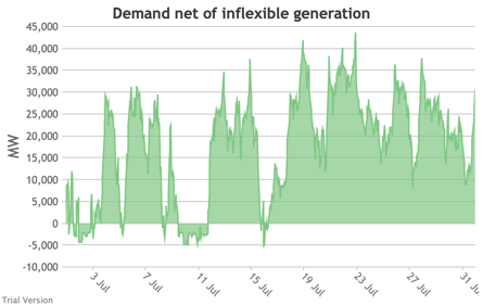
|
Image
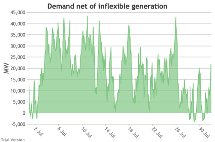
|
Image
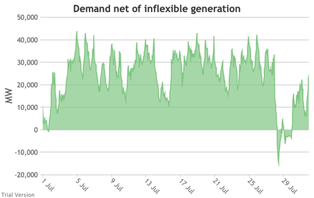
|
|
Image
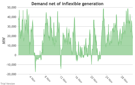
|
Image
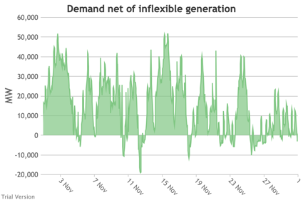
|
Image
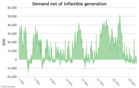
|
- That puts different strains on the storage capacity, and on its marginal use.
| 2016 | 2017 | 2018 |
|---|---|---|
|
Image
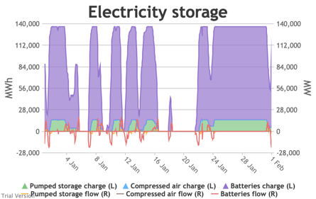
|
Image

|
Image
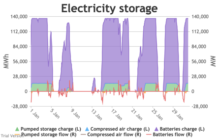
|
|
Image
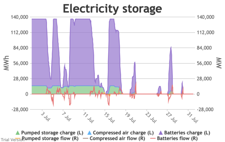
|
Image
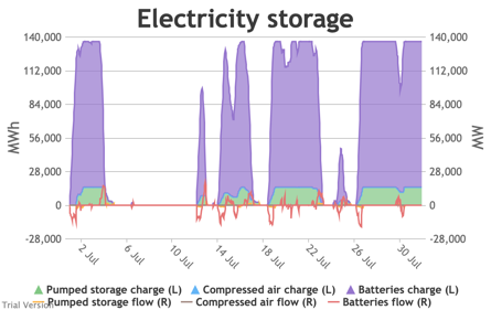
|
Image
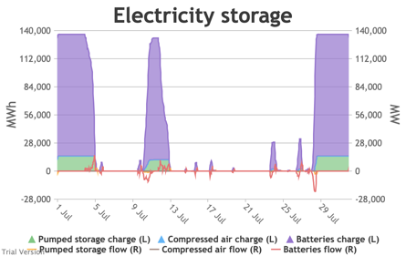
|
|
Image
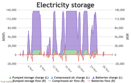
|
Image
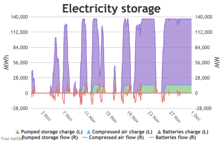
|
Image
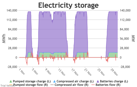
|
|
Image
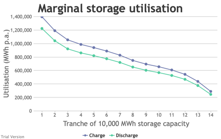
|
Image

|
Image
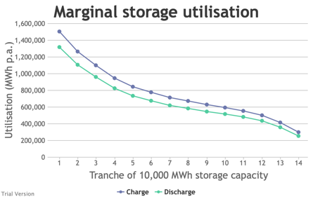
|
- Interconnector flows also have to vary. The net effect on supply by type is:
| 2016 | 2017 | 2018 |
|---|---|---|
|
Image
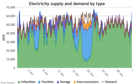
|
Image

|
Image
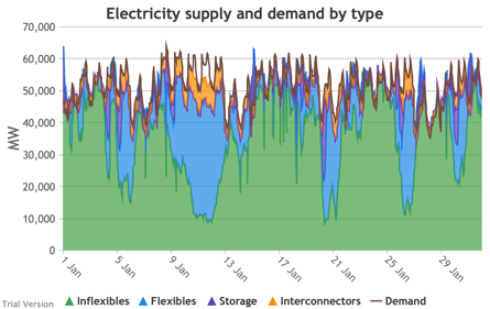
|
|
Image
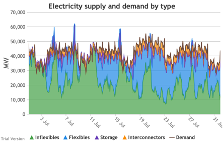
|
Image
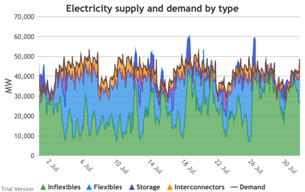
|
Image
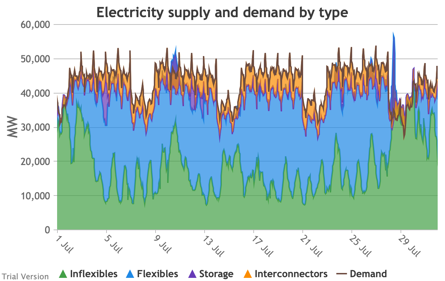
|
|
Image
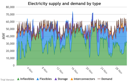
|
Image
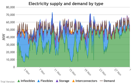
|
Image
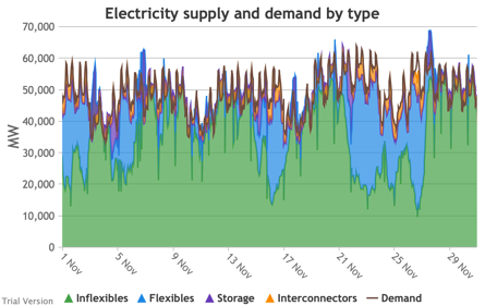
|
- Likewise, the net effect on supply by source (i.e. technology) is:
| 2016 | 2017 | 2018 |
|---|---|---|
|
Image
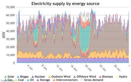
|
Image
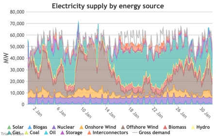
|
Image
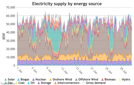
|
|
Image
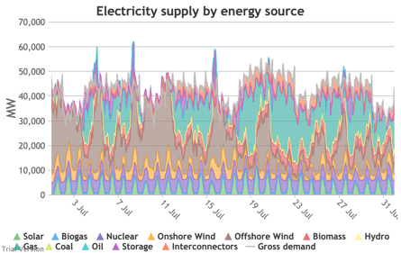
|
Image

|
Image
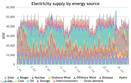
|
|
Image
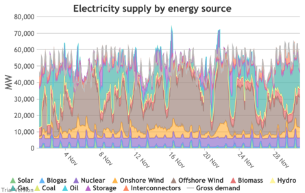
|
Image

|
Image
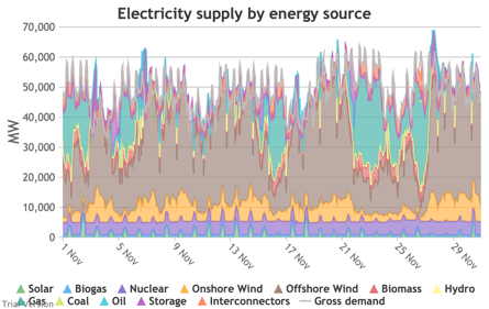
|
- That feeds through to the electricity supply margin.
| 2016 | 2017 | 2018 |
|---|---|---|
|
Image
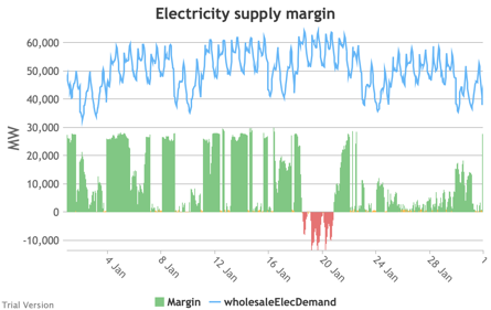
|
Image
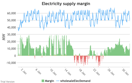
|
Image
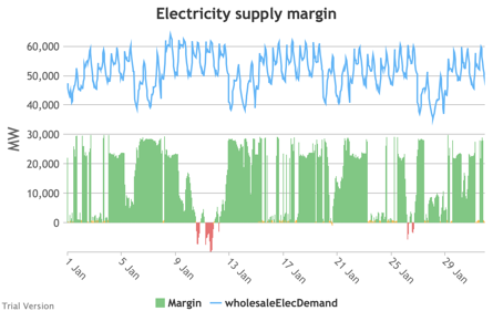
|
|
Image
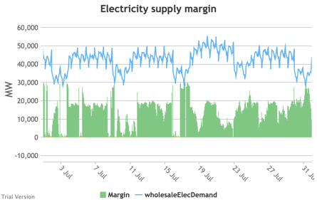
|
Image
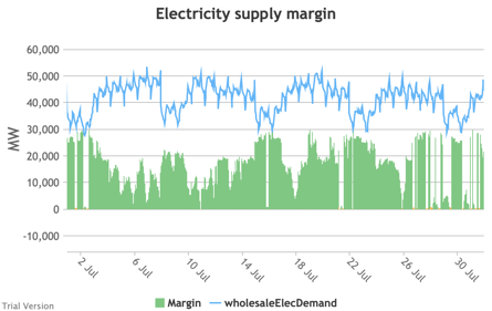
|
Image
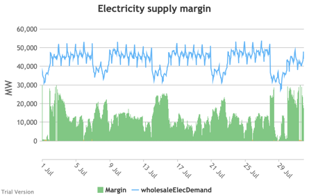
|
|
Image
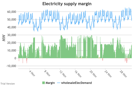
|
Image

|
Image
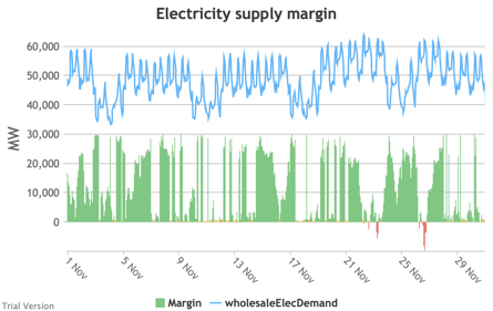
|
- This adds up to small differences in aggregate technology utilisation, but material differences at the margins.
| 2016 | 2017 | 2018 |
|---|---|---|
|
Image

|
Image

|
Image
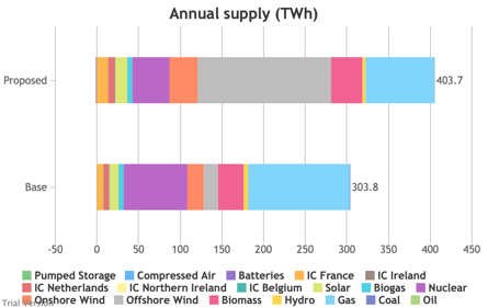
|
|
Image

|
Image
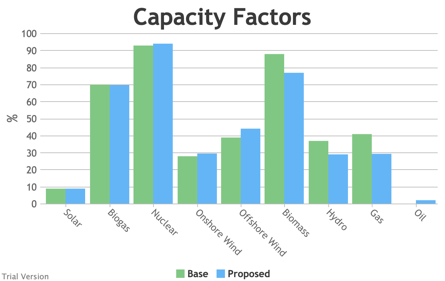
|
Image

|
|
Image
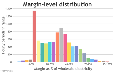
|
Image
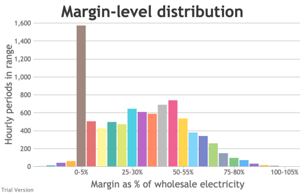
|
Image
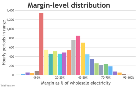
|
- Because this system still relies on fossil fuels to a significant extent, the carbon footprint of the energy system varies from year to year.
| 2016 | 2017 | 2018 |
|---|---|---|
|
Image
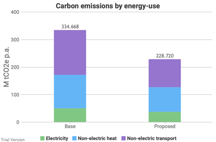
|
Image

|
Image
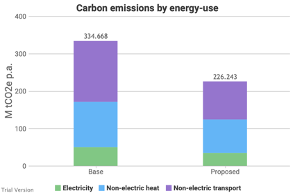
|
|
Image

|
Image
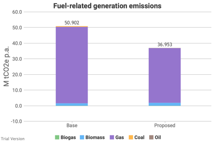
|
Image
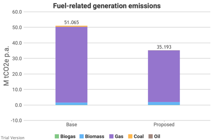
|
|
Image
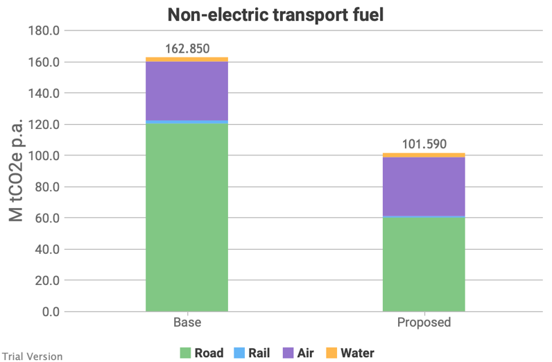
|
Image
|
Image
|
|
Image
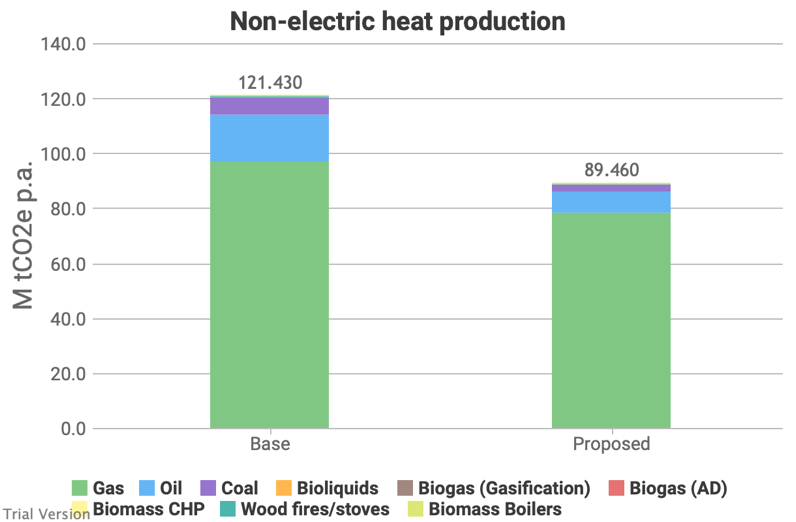
|
Image
|
Image
|
The differences are quite small, because the nature of this comparison is the same spread of technologies and roughly similar levels of aggregate demand in the various uses. The main change in the inputs is the profile, which has a bigger bearing operationally than on the cumulative outcome. In the case of non-electric heat and transport emissions, it’s an artefact of the model design that there is no difference between these projections without a change in the aggregate.
- 3.4.1.13 Costs also vary marginally from year to year depending on the impact of the weather on the profiles of supply and demand.
| 2016 | 2017 | 2018 |
|---|---|---|
|
Image

|
Image

|
Image

|
|
Image
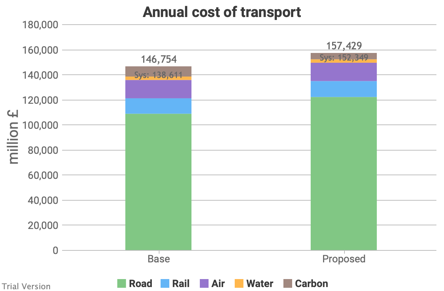
|
Image

|
Image
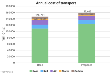
|
|
Image

|
Image

|
Image
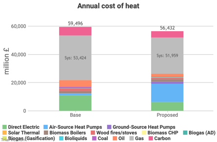
|
|
Image

|
Image

|
Image
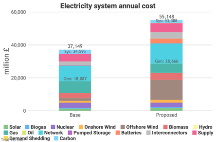
|
|
Image

|
Image
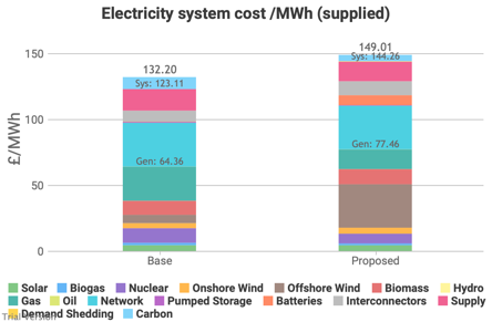
|
Image

|
|
Image

|
Image

|
Image
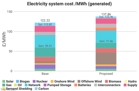
|
These changes are small enough that they are mainly useful as demonstration that the model is recalculating for the variations, but not over-reacting.
3.4.2 Weather-severity variation
3.4.2 Weather-severity variation Bruno Prior Tue, 15/12/2020 - 11:52- In the default datasets for 2016-18, we take the profiles affected by the weather (e.g. temperature, wind, insolation) as they were in those years. As already mentioned, these years were marginally above the average temperature, but not exceptional.
- The last exceptionally cold year in the UK was 2010, and even that was only exceptional to its surrounding decades, but not especially exceptional on a long-term comparison.
- Although many years have been above the long-term average recently, we have not had an exceptionally hot (in summer) / mild (in winter) year within the period for which granular data is easily accessible.
- The weather has many aspects that affect energy systems differently. Warmth in winter reduces energy demand (i.e. less heating required), but in summer it increases demand (more cooling). Wind, sunshine and rain can also affect demand, and their timing has a significant bearing on the availability of certain technologies. A windy year may be helpful (if the wind coincides with the periods of high demand) or unhelpful (if the wind coincides with the periods of low demand). We cannot test multiple factors simultaneously, so we focus on the effect of temperatures in these variations.
- The correlations are small (positive or negative) to non-existent. One cannot assume that a year whose weather is helpful or harmful in one regard will be helpful or harmful in others. They may cancel out, or they may amplify.
- For the purposes of testing sensitivities, we synthesise demand profiles based on the raw data for the three years 2016-2018 (e.g. peaks and troughs occur according to the timing in those years), but amplify the unhelpful extremes in the “severe” profile and dampen them in the “mild” profile. For example, the “severe” profile assumes it’s both a cold winter needing a lot of heat, and a hot summer needing a lot of cooling. The “mild” profile assumes the opposite. The amplification/damping is scaled to produce the levels of energy consumption seen in years with severe or mild winters and the temperatures seen in severe or mild summers.
- These are therefore artificial profiles and do not reflect conditions that actually happened. But, as they are a significant factor, it is important to test for the impact of weather extremes. And as actual granular data is not available, this was the least-bad solution that we were able to devise. It is hopefully a reasonable stress test, though not a set of conditions that have occurred nor are likely to occur in exactly this form.
- Temperatures make a material, but in this scenario not massive (±4%), difference to the annual demand for electricity. Remember, this scenario assumes only one-third of heat has been electrified.
| Mild | Normal | Severe |
|---|---|---|
|
Image

|
Image
|
Image
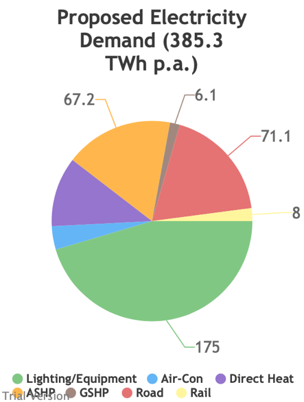
|
- You need to look closely to spot the differences in the comparison of inflexible generation with wholesale demand. The difference is primarily in the red line (demand), which is higher to the right.
| Mild | Normal | Severe |
|---|---|---|
|
Image
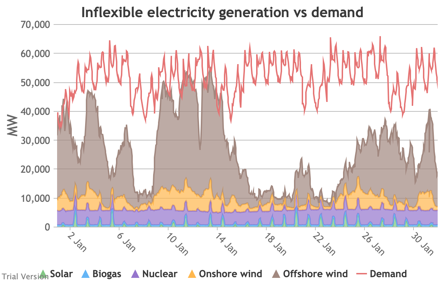
|
Image
|
Image
|
|
Image
|
Image
|
Image
|
|
Image
|
Image
|
Image
|
- The effect of the weather is more visible in the following charts of demand net of inflexibles. In the first row (Jan) for instance, the highest peaks are clearly higher on the right than the left, and the periods of negative demand (excess inflexible generation) are smaller on the right than the left.
- The system in this scenario needs to be able to cope with periods where we need 60 GW from storage, interconnectors and flexible generators, not just the 55 GW at which it maxes out in normal conditions. If the system is designed accordingly, then there will be more excess capacity in mild and normal years than would be the case if the system were designed to cope with no more than a typical year.
- Conversely, there is also a choice to be made between sufficient storage to absorb the excess even in mild years, or basing storage capacity on the needs of a normal year, in which case some excess output will be wasted in mild years, and not enough will be stored up for the extreme periods in severe years.
- The discrepancies are small in this scenario, but the diminishing marginal returns on these edge cases already illustrate the economic fallacy of aiming for Net Zero. They become severe as the system becomes exponentially more stressed as decarbonisation deepens.
| Mild | Normal | Severe |
|---|---|---|
|
Image
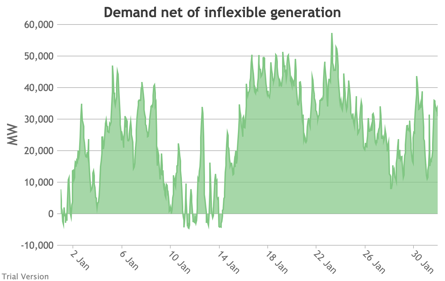
|
Image
|
Image
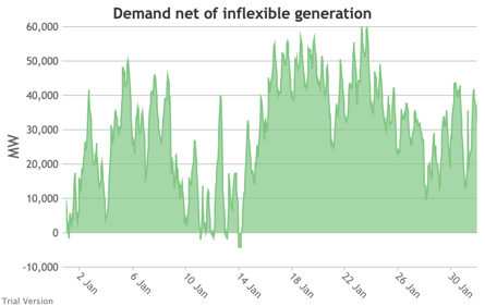
|
|
Image
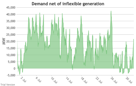
|
Image
|
Image
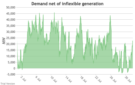
|
|
Image
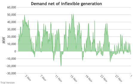
|
Image
|
Image
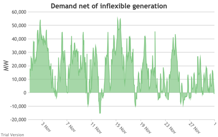
|
- The differences in the usage of the storage capacity are subtle. That is because this scenario deliberately chose a ratio of MW to MWh that implied high frequency, short-term storage, so the potential to store the bigger peaks or to keep supplying the longer shortfalls is very limited. Nevertheless, you can see small differences.
| Mild | Normal | Severe |
|---|---|---|
|
Image

|
Image
|
Image
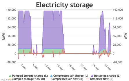
|
|
Image
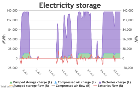
|
Image
|
Image

|
|
Image
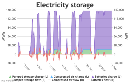
|
Image
|
Image
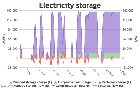
|
|
Image
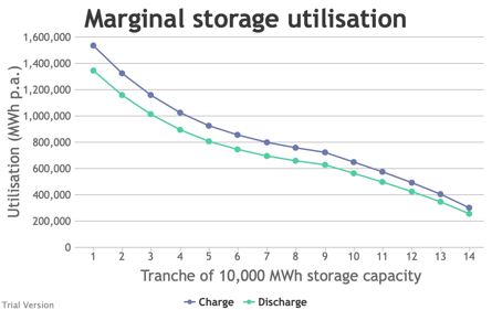
|
Image
|
Image

|
- Again, small differences are just about discernible in the charts of electricity supply by type. The deficit periods are clearly exacerbated in severe conditions.
| Mild | Normal | Severe |
|---|---|---|
|
Image
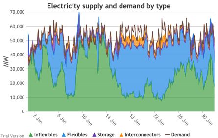
|
Image
|
Image
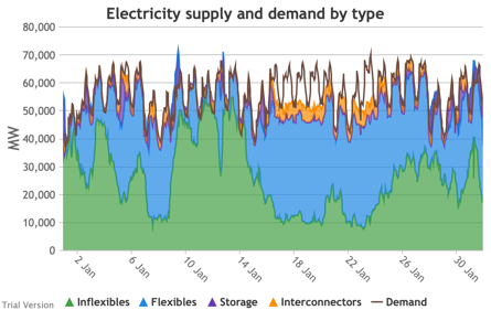
|
|
Image
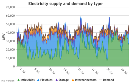
|
Image
|
Image
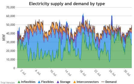
|
|
Image
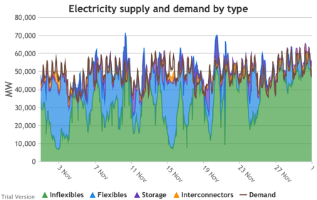
|
Image
|
Image
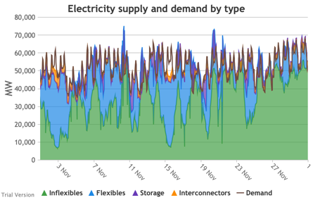
|
- Likewise for the charts of electricity supply by source (i.e. technology):
| Mild | Normal | Severe |
|---|---|---|
|
Image
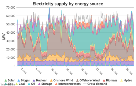
|
Image
|
Image
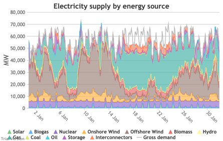
|
|
Image
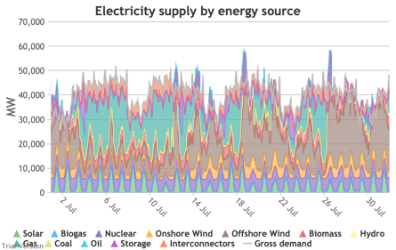
|
Image
|
Image
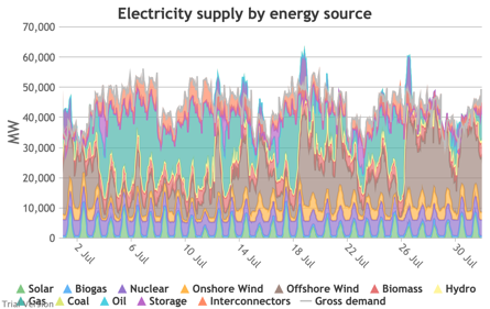
|
|
Image
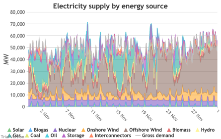
|
Image
|
Image
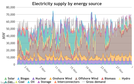
|
- That feeds through to the electricity supply margin.
| Mild | Normal | Severe |
|---|---|---|
|
Image
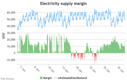
|
Image
|
Image
|
|
Image
|
Image
|
Image
|
|
Image
|
Image
|
Image
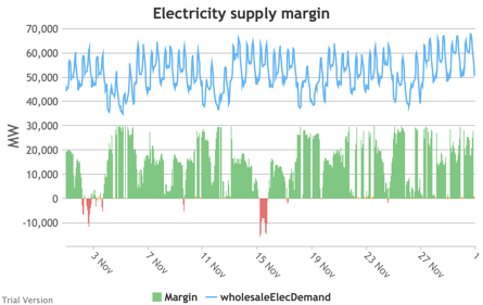
|
- The differences are also subtle but visible in the aggregate contributions of technologies and in the distribution of the electricity supply margin.
| Mild | Normal | Severe |
|---|---|---|
|
Image
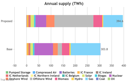
|
Image
|
Image

|
|
Image

|
Image
|
Image
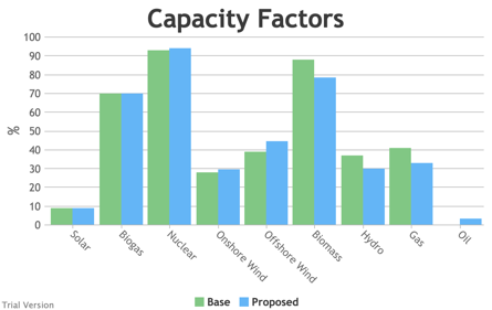
|
|
Image
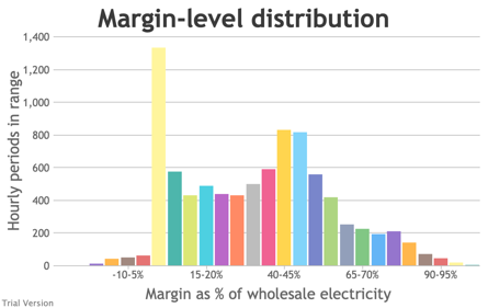
|
Image
|
Image
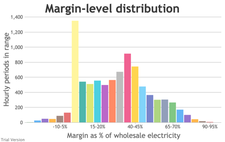
|
- Likewise, the differences in carbon impact are small. Of course, a cold winter and hot summer emit a little more carbon than a mild winter and summer, because we have not fully electrified and decarbonised in this scenario.
| Mild | Normal | Severe |
|---|---|---|
|
Image

|
Image
|
Image
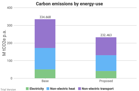
|
- The severity of the weather has a detectable impact on annual costs.
| Mild | Normal | Severe |
|---|---|---|
|
Image
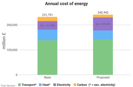
|
Image
|
Image
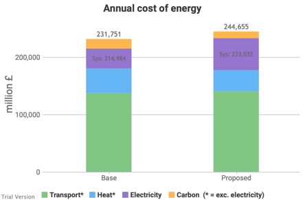
|
|
Image

|
Image
|
Image
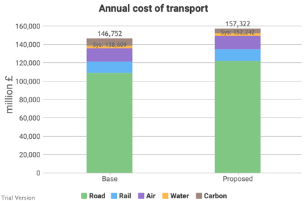
|
|
Image
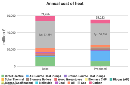
|
Image
|
Image

|
|
Image
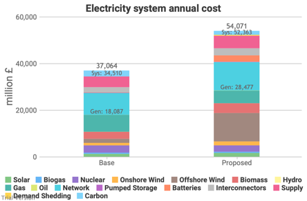
|
Image
|
Image
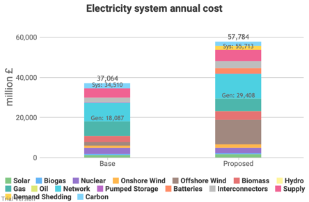
|
|
Image
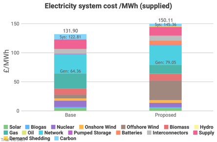
|
Image
|
Image
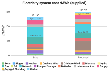
|
|
Image

|
Image
|
Image
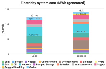
|
- Extreme weather (in both directions, severe or mild) increases the cost of energy. For severe weather, it increases the strains on the system and pushes at the supply margins. For mild weather, capacity is under-utilised, which increases the cost per unit, even though the total cost falls.
- Under no conditions is the increase in the overall cost justified by the reduction in the cost of carbon at £50/tCO2e. If these measures are justified, they imply a cost of carbon of around £150/tCO2e, in which case, what other measures would have been justified had we proceded by carbon-pricing rather than winner-picking?
- Significantly, the cost of demand-shedding increases from £378m in mild conditions, to £669m in normal conditions, to £2,011m in severe conditions. The system is fragile to unusual conditions, because margins are very tight. Tight margins give the impression of offering good value by avoiding under-utilised investment, but are a false economy if resilience is a significant consideration, as it should be for energy systems. The true cost of a resilient system at this level of decarbonisation would be higher. And it may involve more fossil-fired reserve (contrary to the intent of policy), as we will explore in the next sensitivities.