
C4CS analysis
Eurostat renewable energy map
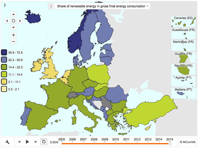
As the UK prepares to leave the EU, it is worth noting one of the few things that the EU does well. Its statistical arm - Eurostat - is an invaluable source of comparative data. For example, see their interactive map of renewable energy.
This image is just a screengrab. Follow the link to go to Eurostat's site where you can play with the interactive version (e.g. see how the shares have changed over time, and view renewable electricity shares instead of renewable energy shares).
Similar maps on many different energy data sets can be found at https://ec.europa.eu/energy/en/content/energy-modelling-interactive-graphs
As usual, this demonstrates the UK's incompetence on energy policy - huge costs to be one of the worst performers.
Two caveats:
1. This shows how much renewable energy each country has delivered, but not what it cost them. I am not aware that much work has been done on the relative economic efficiency of different countries' approaches to decarbonisation. It is something that we intend to focus on a lot.
2. Eurostat will not cease to be relevant to the UK, just because we are leaving the EU. Eurostat records statistics for many non-EU countries. Switzerland is the only significant European economy that is notable by its frequent absence from the figures (I don't know why). The UK could no doubt choose to continue to offer the statistics that Eurostat collects, and should do. This is analogous to many of the better aspects of the EU - we don't have to be a fully paid-up member of the club to choose to join in on the worthwhile bits.