3.3 Outputs
3.3 Outputs Bruno Prior Tue, 15/12/2020 - 11:433.3.1 Retail electricity demand (2017 base vs this scenario)
The retail electricity demand is the electricity consumed by users after distribution losses (not the electricity required by the network before losses, which is covered below under wholesale electricity demand).

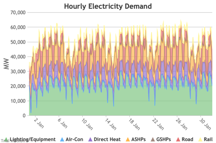
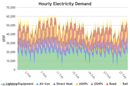
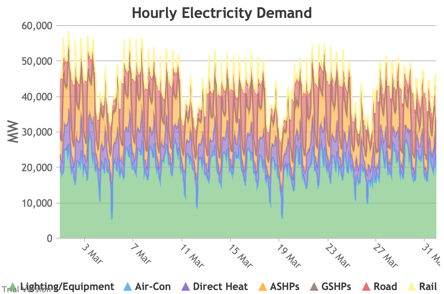
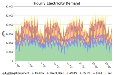
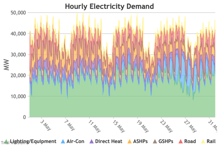
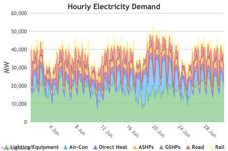
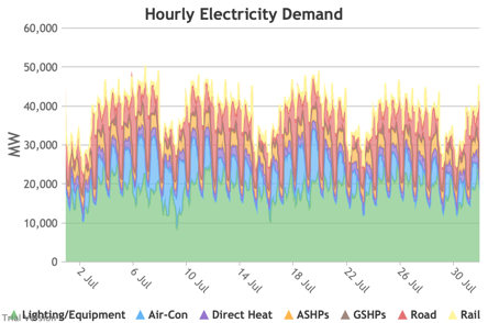
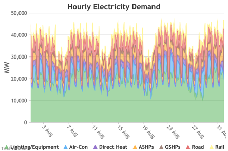
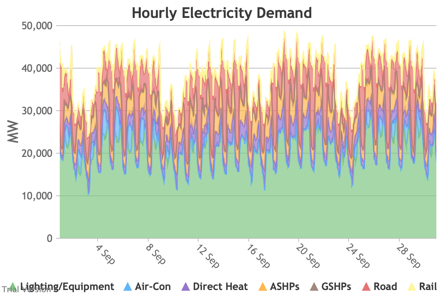
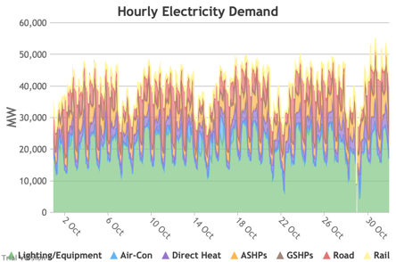
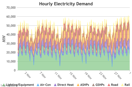
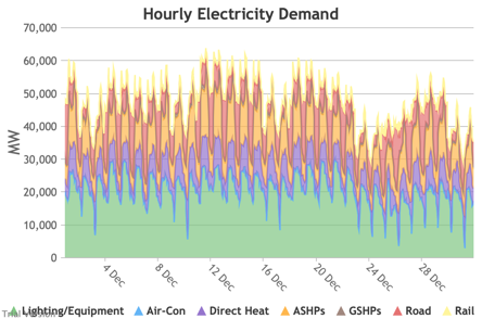
3.3.2 Retail electricity demand profile
3.3.2 Retail electricity demand profile Bruno Prior Tue, 15/12/2020 - 11:52The profile is the hourly components of the annual total. In this case, the retail electricity demand profile is the series of hourly demand figures that make up the annual retail electricity demand in the previous section.
|
Image

|
||
|
Image
|
Image
|
Image
|
|
Image
|
Image
|
Image
|
|
Image
|
Image
|
Image
|
|
Image
|
Image
|
Image
|
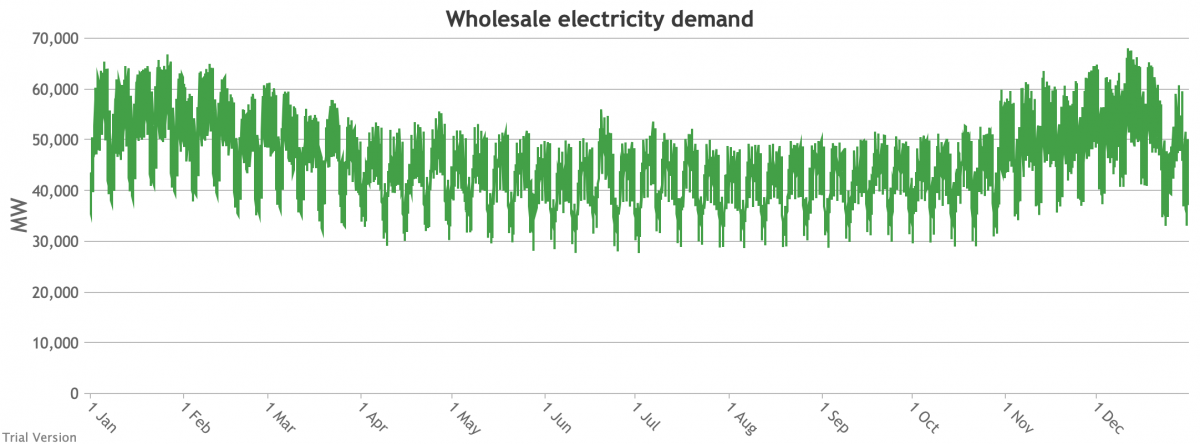
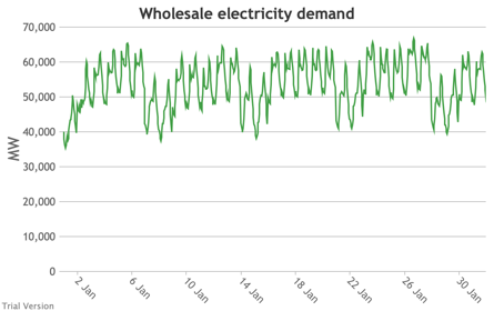
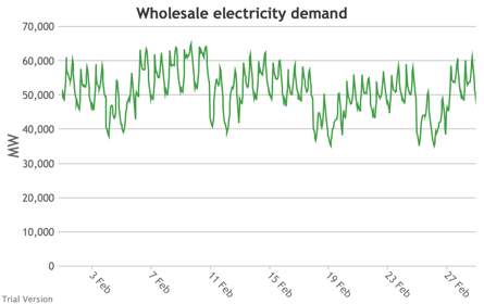
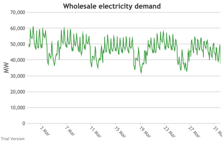
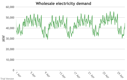
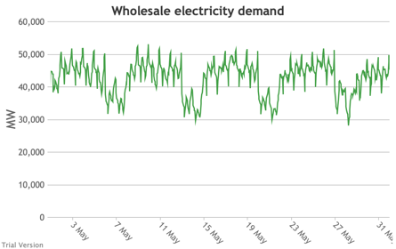
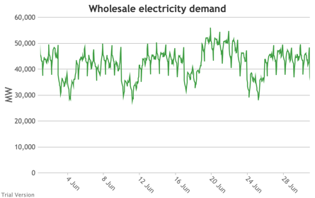
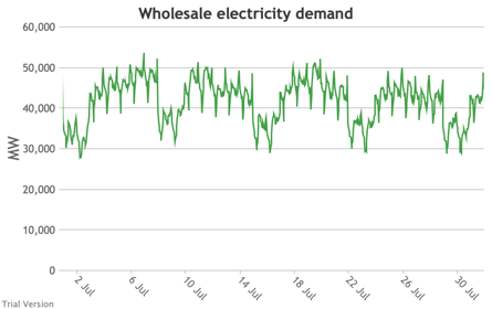
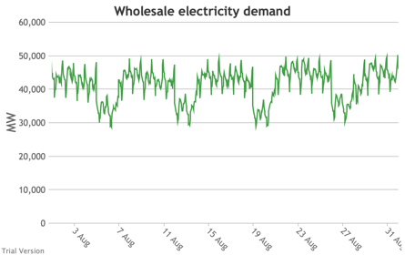
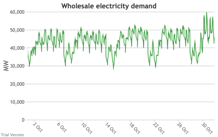
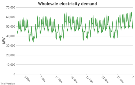
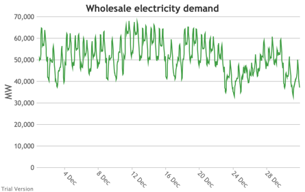
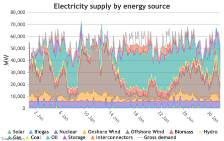
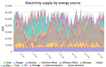
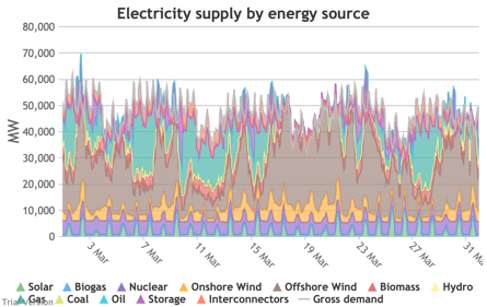
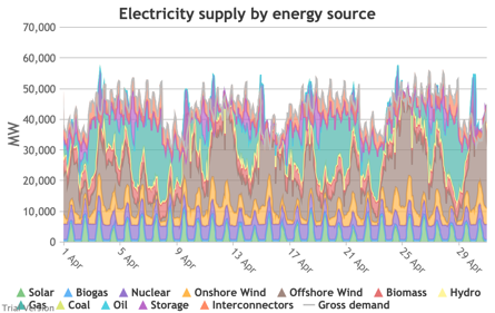
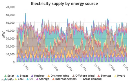
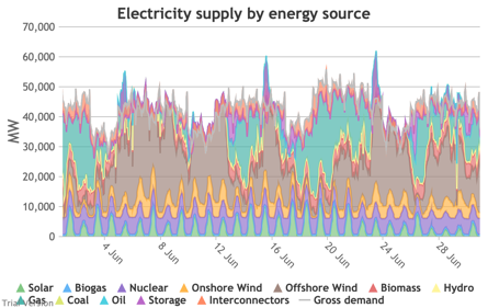
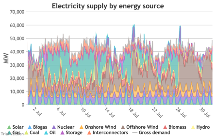
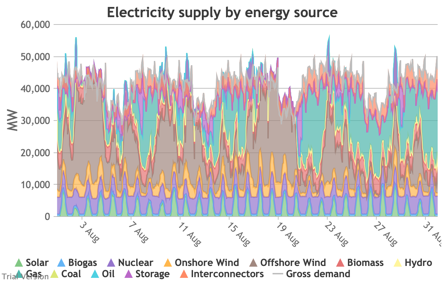
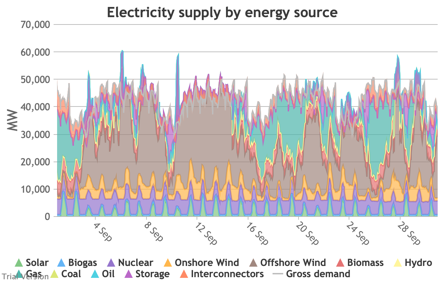
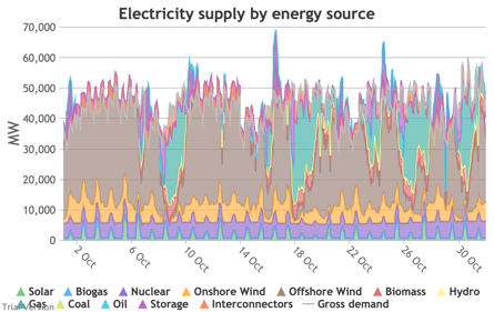
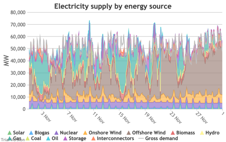
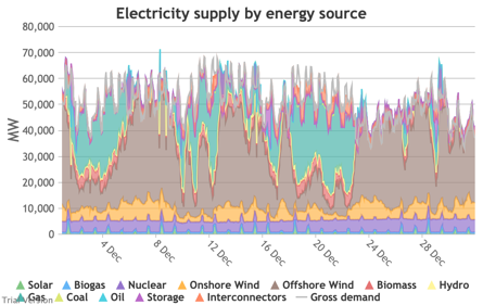
3.3.3 Wholesale electricity demand profile
3.3.3 Wholesale electricity demand profile Bruno Prior Tue, 15/12/2020 - 11:52The wholesale electricity demand profile is the sum of the hourly retail demand, adjusted for transmission and distribution losses, which tend to be higher when demand is lower, i.e. slightly reducing the variation in the previous charts, but also slightly increasing the total in each hour.
|
Image
|
||
|
Image
|
Image
|
Image
|
|
Image
|
Image
|
Image
|
|
Image
|
Image
|
Image
|
|
Image
|
Image
|
Image
|
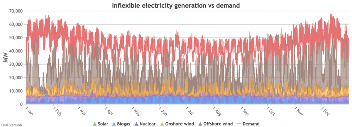
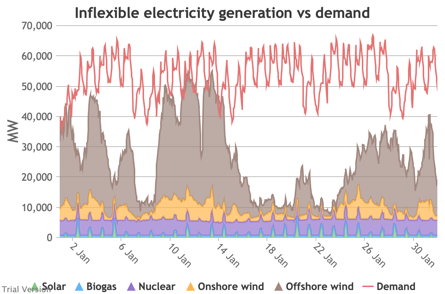
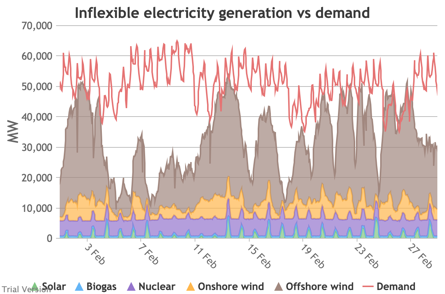
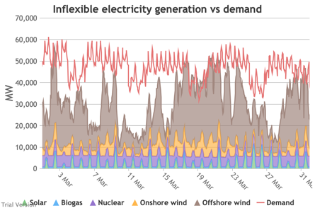
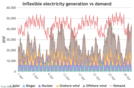
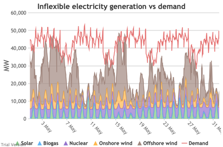
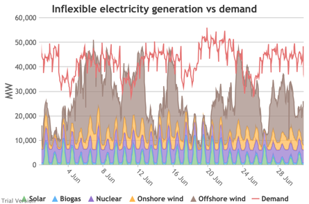
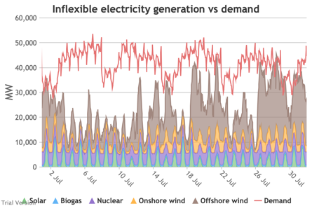
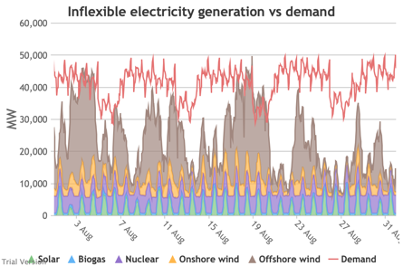
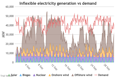
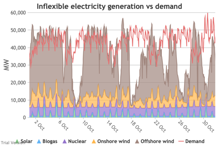
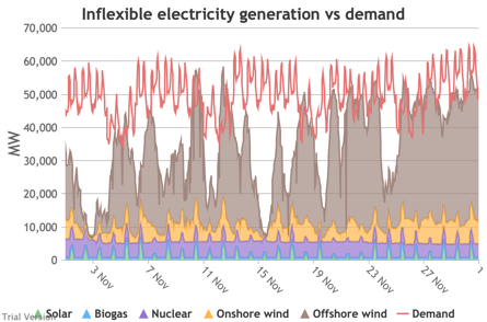
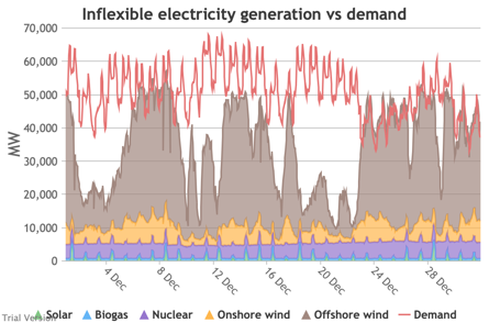
3.3.4 Wholesale demand profile vs output from inflexible generators
3.3.4 Wholesale demand profile vs output from inflexible generators Bruno Prior Tue, 15/12/2020 - 11:52These charts compare the wholesale electricity demand profile from the previous section with the output of the inflexible generation technologies (nuclear, biogas, solar, onshore wind and offshore wind).
|
Image
|
||
|
Image
|
Image
|
Image
|
|
Image
|
Image
|
Image
|
|
Image
|
Image
|
Image
|
|
Image
|
Image
|
Image
|
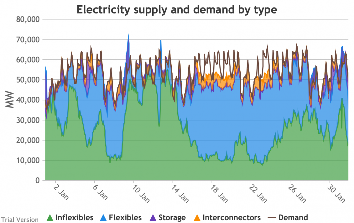
- This output is notional, as though there are there no constraints. Where the combined inflexible output exceeds demand, the excess may be stored or exported, and if not, it will be curtailed. So this does not necessarily indicate actual output. Curtailment is applied at a later stage. This is potential.
- This is the first step that illustrates some of the challenges of electrification:
- Even without gas, hydro, coal, oil or biomass, the inflexible technologies alone (wind, solar, biogas and nuclear) sometimes exceed total demand, even though that demand is boosted significantly by electrification. These increasing periods of excess production hurt their own load factors (and therefore costs) to some extent, and more significantly the load factors and costs of the flexible generating technologies.
- At other times, their combined output is negligible. Biogas and nuclear get a pass on this aspect – they are pretty reliable, just not very flexible (and that is more because of the incentives than because of the technology). But the combined output of onshore and offshore wind and solar is sometimes minimal. There is no regularity to it. There is little correlation with demand (solar correlates to some extent, wind not at all). It is sometimes for extended periods. Consequently, output gaps are sometimes during periods of high demand.
- Look more closely, for instance, at 16-24 January.
Demand ranges from 50-65 GW during the working week and 40-60 GW at the weekend. The combined output of wind and solar averages 7.8 GW, out of a combined capacity of 71 GW. If you want to address this with storage, you will need enough capacity to support around 40 GW of continuous discharge for over a week. You will need to recover a lot of the cost of that storage in that period, because that amount of storage will not be called on frequently. This is the problem with using storage to address irregular intermittency. It is a bad fit. Storage is most suitable for smoothing regular imbalances (e.g. adjusting flat electricity production to fit a regular daily profile of demand). It is not technically impossible, but it is economically inadvisable. We look at storage in more detail below.Image


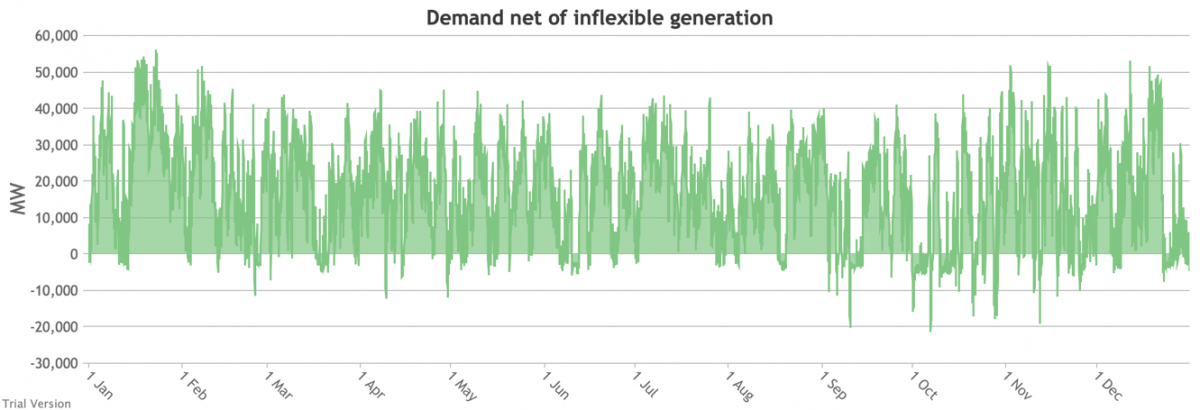
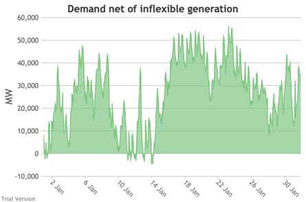
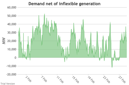
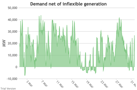
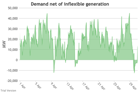
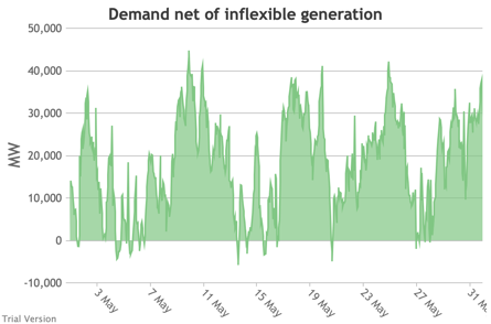
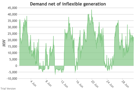
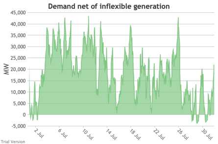
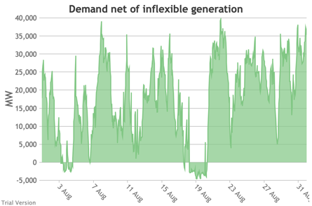
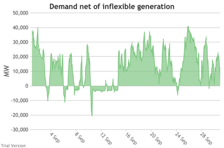
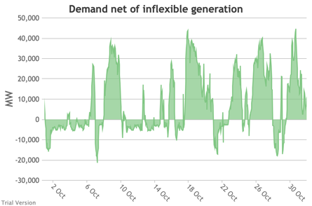
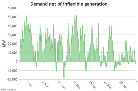
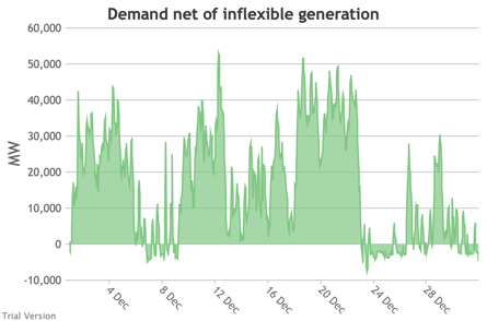
3.3.5 Wholesale demand net of inflexible generation
3.3.5 Wholesale demand net of inflexible generation Bruno Prior Tue, 15/12/2020 - 11:52- These charts show the hourly balance from the previous section (wholesale demand minus the output of the inflexible generation technologies), to illustrate the challenge for the other technologies (flexible generation, storage, interconnectors and demand response). Negative periods reflect excess inflexible output (i.e. the output of inflexible generation alone is more than the total demand for electricity in that period, before we allow for any contribution from other technologies, e.g. for system services).
- The effect of subtracting an irregular profile from a largely-uncorrelated somewhat-regular profile is a highly irregular profile. The irregularity is a bigger issue than intermittency. Regular intermittency is amenable to solutions such as storage. Irregular intermittency is not.
|
Image
|
||
|
Image
|
Image
|
Image
|
|
Image
|
Image
|
Image
|
|
Image
|
Image
|
Image
|
|
Image
|
Image
|
Image
|
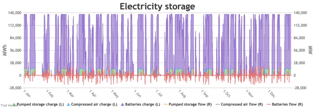
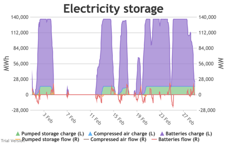
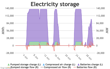
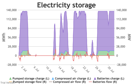
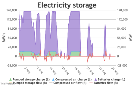
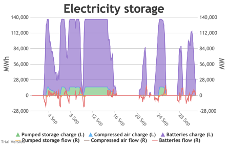
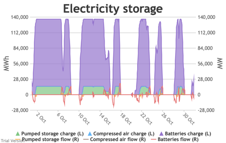
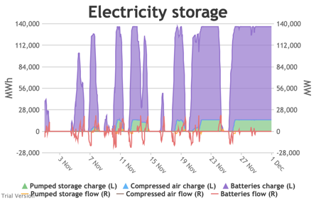
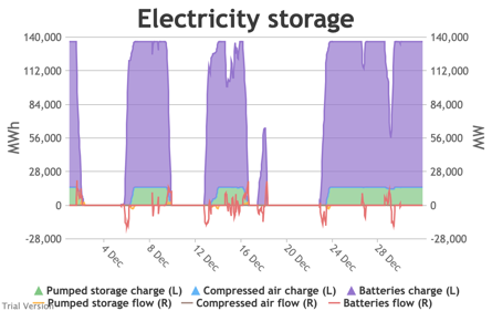
3.3.6 Electricity storage and level of charge
3.3.6 Electricity storage and level of charge Bruno Prior Tue, 15/12/2020 - 11:52These charts show the flows into and out of storage (the lines) and the level that they are charged to (the areas) in each period.
|
Image
|
||
|
Image
|
Image
|
Image
|
|
Image
|
Image
|
Image
|
|
Image
|
Image
|
Image
|
|
Image
|
Image
|
Image
|
- We put 20 GW / 120 GWh of new battery storage into the model (on top of the modest existing pumped-hydro and battery storage) to test how it would handle these conditions. To maximise its value, the model assumes it is the first option for balancing, before interconnectors and flexible generation.
- This requires a bit more explanation than previous charts:
- Storage has two constraints: (a) the amount of energy (MWh) it can hold, and (b) the maximum rate (MW) at which that energy can flow into or out of the storage unit.
- is bounded by the energy capacity at one end, and zero at the other (i.e. can’t have less than no energy in it, nor more energy in it than it can hold).
- is roughly centred on zero, with flows into storage represented by negative numbers (i.e. this is from a system perspective, so flows into storage are flows out of the system), and flows out of storage represented by positive numbers (i.e. the storage is adding to the energy in the system).
- The model assumes that the storage units will take any of the excess from the previous section, limited by (a) the maximum flow-rate (to simplify things, we make the unsound assumption that the maximum inflow- and outflow-rates are the same), (b) the storage capacity (i.e. it stops taking electricity when it is full), and (c) an internal priority list between storage technologies, which assumes that batteries take priority over compressed air (because a key purpose of compressed air is to provide better economics for longer-term storage than batteries), and compressed air takes priority over pumped storage (because pumped-storage costs are largely sunk – this is not a strong generalisation and could well not be reflected in real-life operation). In this scenario, we have not yet assumed any compressed air storage, so the priority is simply that batteries take excess power in priority to pumped storage (which is anyway dwarfed by the assumed battery capacity).
- Conversely, the model assumes that the storage units will supply any net demand (from the previous section) in priority to interconnectors and flexible generation, limited (as before) by (a) the maximum flow-rate, (b) the storage capacity, and (c) the priority order between storage technologies. Again, these assumptions may not be reflected in real-life operation, where priority will be determined by commercial decisions.
- We have to take account of round-trip losses at some point. The model assumes that the storage capacity (MWh) reflects capacity after losses, and that the losses occur before the electricity is stored. For example, if the technology’s round-trip efficiency were 80% (i.e. 20% round-trip losses), its capacity were 100 MWh, and its maximum flow-rate were 10 MWh, it would take 12.5 hours at full flow to fully charge the unit, but only 10 hours to discharge. This is almost certainly not how it works in practice, but it is largely semantic and simplifies the calculations. The end result should be the same as if we had made a more specific allocation of losses before and after storage. The main difference would be the notional capacity.
- The chart shows the flows as discrete lines (with the scale on the right) and the stored energy as stacked areas (with the scale on the left vertical axis).
- Remember that we deliberately specified storage with a conventional ratio of capacity (MWh) to power (MW) designed for the economically-optimal operational profile of frequent, regular charge/discharge cycles (typically once or twice a day). That has produced a usage profile with reasonably-high frequency. But it is nowhere near the ideal frequency and regularity because it is responding to a highly-irregular supply/demand pattern.
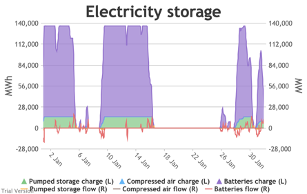
- For example, the period of 16-24 Jan discussed above appears in the storage chart as a gap.
Image
Even 120 GWh of electricity storage is used up within a day on 15 Jan, as the wind dies down and the demand net of inflexibles becomes substantial. It remains substantial for 8 days. It cannot supply anything in that period because it is empty. It does not charge up again because there is pressure on the swing suppliers (flexible generators and interconnectors) and it would be counterproductive and expensive to buy electricity when marginal costs are high. So it waits until 26 Jan to start re-charging, when the wind has strengthened and net demand is lower. - Such circumstances are not uncommon. Theoretically, storage technologies could continue to charge and discharge if there is some supply margin between the flexible generators and interconnectors. But round-trip losses mean that storage loses money if there is not a material price gap between purchase and sale. Such a margin relies on material differences in the tightness of the market. It does not make sense for storage to charge and discharge when there is little difference in purchase and sale price because the tightness of the market is not varying sufficiently, even though it would be theoretically possible to do so. The frequency and scale of the swings in market tightness are a material difference between current conditions and the modelled conditions under heavy electrification. It is the effect of increased irregularity because of (a) the penetration of wind and (to a lesser extent) solar, and (b) the less-regular demand profile for heat.
- A marginal analysis shows the decreasing returns to scale.
Image

The storage capacity (in MWh, not MW) in this scenario is divided into notional tranches of 10 GWh (120 GWh of new battery storage, plus the modest existing capacity of pumped storage and batteries). If we had only installed 10 GWh of storage, the opportunities to charge/discharge would have amounted to annual sales of 1.35 TWh. Even that is significantly worse (equivalent to one full discharge just under every 3 days) than the almost-daily opportunities currently available to Dinorwig etc. But this falls quite sharply as we add capacity. The 4th tranche only has opportunities to discharge 891 GWh p.a., equivalent to one full discharge every 4 days. The last tranche is down to 256 GWh p.a., or one discharge every 14 days. - In reality, one would not install most of these tranches, unless the costs of storage were dramatically lower than they are currently, or the value of balancing services were dramatically higher. We estimate that the cost of battery storage at this scale is around £280/MWh, which is an order of magnitude more than it would generally be thought to be worth.
- And yet this is at a scale that can address only a small proportion of the discrepancy between demand and inflexible output, aiming to deal primarily with short-period variations. If we wanted to deal with longer-period variation (e.g. seasonality) through storage, the utilisation would be much lower than even the last tranche in the chart above. The cost would be in the thousands of pounds per MWh.
- Other technologies such as compressed air storage may lower that somewhat. They claim to reduce the capital cost per MWh of having a higher ratio of MWh to MW and thereby reduce the cost of somewhat longer-term storage. But it is noticeable that their example applications still hope (in the first instance) to be high frequency. They cannot overcome the fundamental relationship between frequency-of-use and economic return, just marginally reduce the impact of lower frequency.
- The reality of storage is that it is best-suited to high-frequency, regular patterns of use, and is ill-suited to addressing the irregular profiles generated by this scenario.


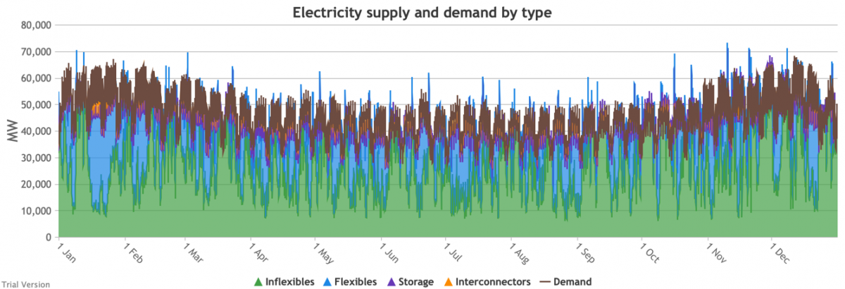
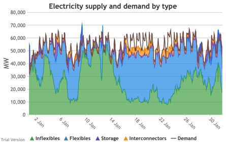
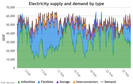
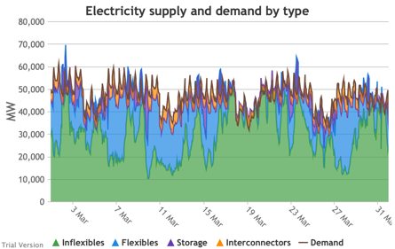
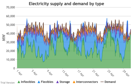
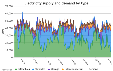
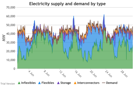
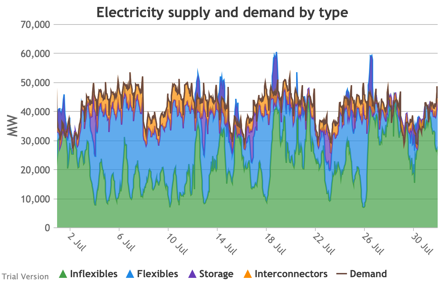
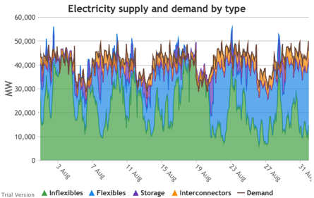
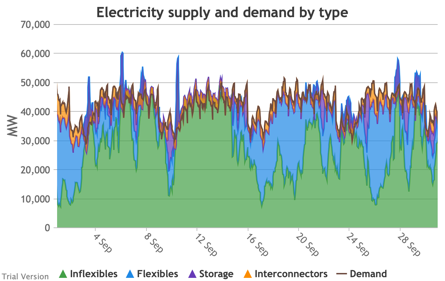
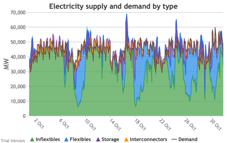
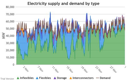
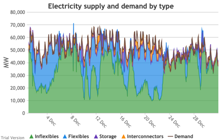
3.3.7 Electricity supply and demand by type
3.3.7 Electricity supply and demand by type Bruno Prior Tue, 15/12/2020 - 11:52These charts show the hourly balance of demand and supply, grouped by type of technology (inflexible and flexible generation, storage and interconnectors).
|
Image
|
||
|
Image
|
Image
|
Image
|
|
Image
|
Image
|
Image
|
|
Image
|
Image
|
Image
|
|
Image
|
Image
|
Image
|
- That leaves interconnectors and flexible generation to do most of the heavy lifting. Flexible, of course, mostly means carbon-emitting. That is mostly true at the other end of the interconnectors as well. And interconnectors have other constraints that are often not recognised (see section 2.2.3.9 above). Our model assumes that they take priority over native flexible generation. This scenario assumes we have expanded their capacity to 9.5 GW. Grouping technologies by type, the net effect is:
- Let’s look more closely at January to highlight some details.
Image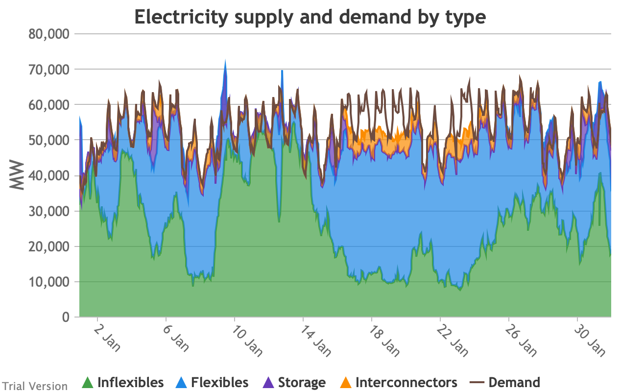
- The unshaded gaps between the Demand line and the stacked Supply bands from around 17th January are periods when the combination of inflexibles, flexibles, storage and interconnectors are unable to meet demand. These are inevitably periods when demand shedding would be required. They are relatively few in this scenario, because we have only partially electrified demand and only partially decarbonised supply.
- Ceteris paribus, full electrification and decarbonisation would see these gaps becoming intolerably large and frequent.
- Even at this intermediate point in the process, that’s over 10 GW needing to be shed when the wind doesn’t blow for sustained periods.
- The conditions sustain for over a week (in working days; weekends provide some relief through lower demand).
- 10 GW means more than just down-rating a few factories, and the duration and scale shows that this would have a serious impact on businesses if we assumed that they would be the focus of demand shedding.
- As we will see below, our model puts a relatively modest cost on demand shedding at this scale. The indirect effects of unreliable energy on the economy are probably much larger than our estimate of the direct costs.
- The other periods to note are when (for example the peak around 9 Jan) the stacked Supply bands exceed the Demand line. These areas are shaded purple for Storage, i.e. they are periods when storage is charging up. Purple areas below the Demand line are when Storage is discharging.
- The same applies to the Interconnectors. Orange shaded areas above the Demand line are when the Interconnectors are exporting (net; in practice, it is often the case that some are exporting while others are exporting). Orange shaded areas below the Demand line are when the Interconnectors are importing. It is noticeable that under this scenario, the model assumes that flows will be much more strongly biased than at present in favour of imports (other than the internal, Northern Ireland interconnector, which tends to flow from GB to NI, although even that has been reduced by the system pressures of this scenario). Given similar decarbonisation strategies across the continent, it is not safe to assume that, in practice, our neighbours would be able to spare the power we need when we need it.
- Sometimes the Storage and Interconnector areas overlap, giving a brownish area indicating (typically) Interconnectors importing (i.e. flowing into the system) while Storage is charging (i.e. flowing out of the system). These are not easily visible in the small monthly charts above, but several of these conditions can be seen in this chart of the week beginning 13 August.
Image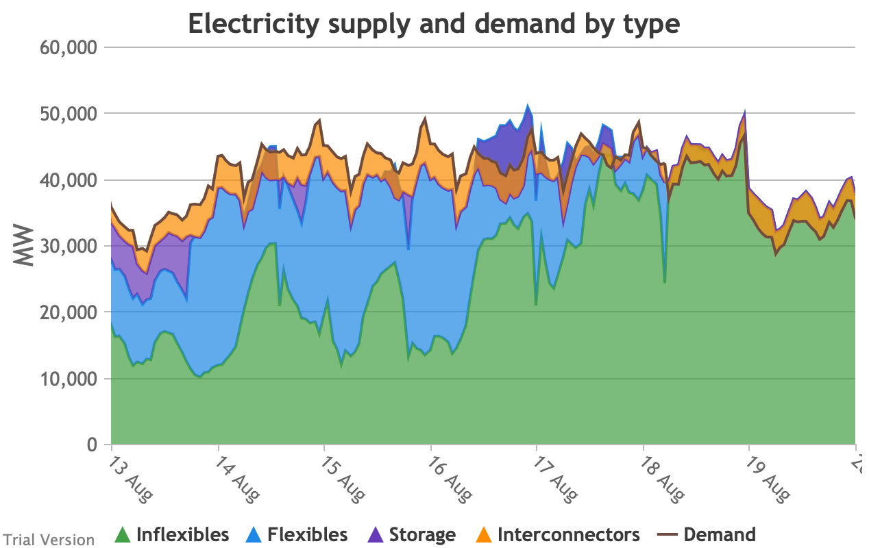
- The model does not take account of the system-stabilisation services provided by a spinning reserve of thermal generation. Profiles such as those illustrated above would require a substantial investment (not costed in the model) in STATCOMs (etc), in order for gas-fired generation to reduce to zero when inflexible generation approaches or exceeds demand.

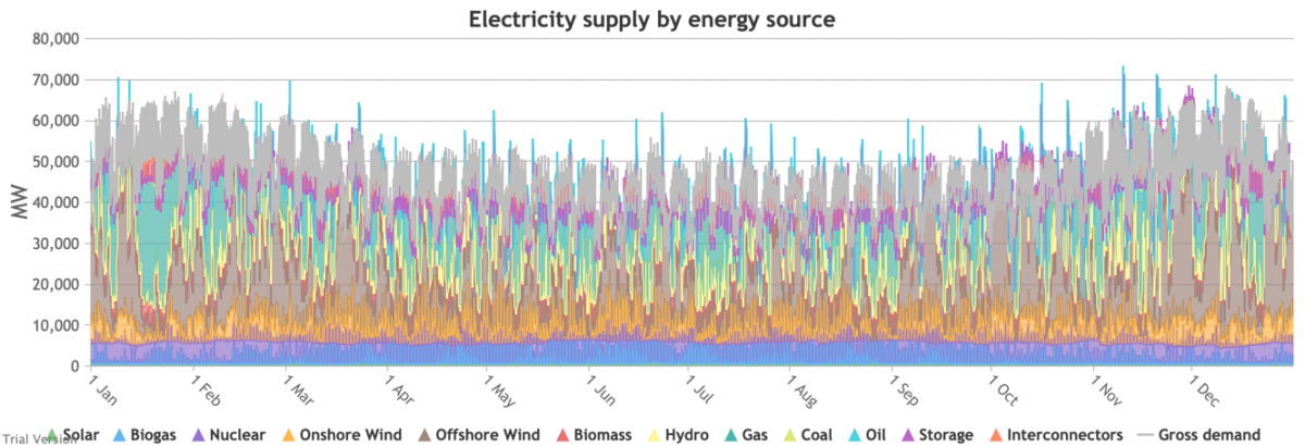
3.3.8 Electricity supply and demand by source
3.3.8 Electricity supply and demand by source Bruno Prior Tue, 15/12/2020 - 11:52These charts show the same aggregate profiles as the previous section, but in this case divided by technology rather than grouped types of technology.
|
Image
|
||
|
Image
|
Image
|
Image
|
|
Image
|
Image
|
Image
|
|
Image
|
Image
|
Image
|
|
Image
|
Image
|
Image
|
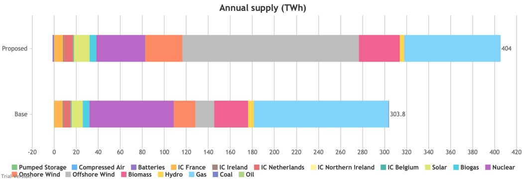
- Their annual contributions in this scenario (versus the status quo) look like:
Image
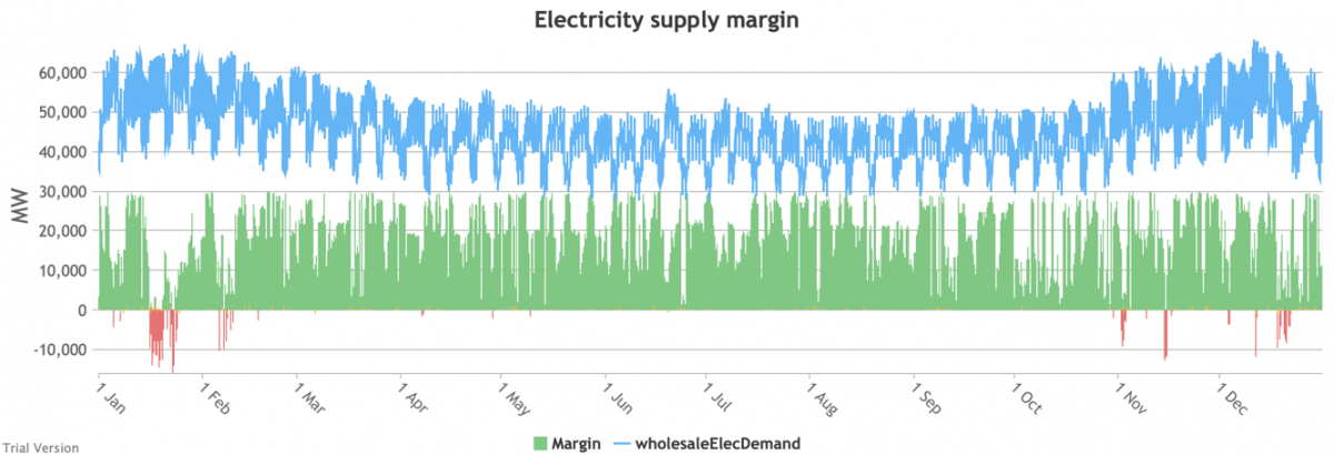
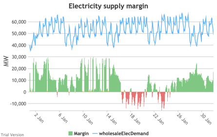
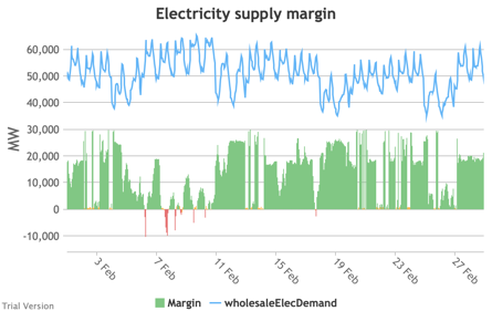
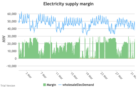
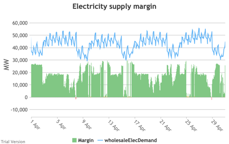
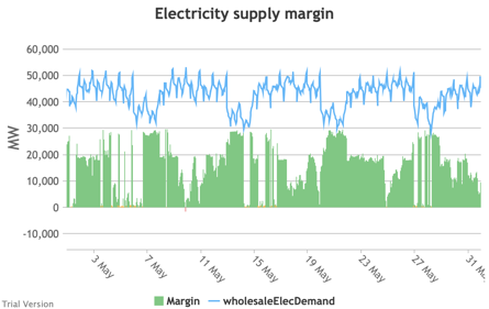
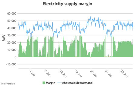
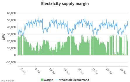
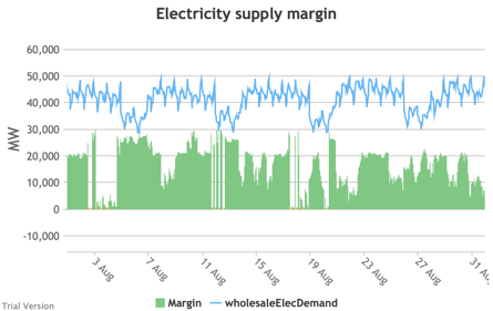
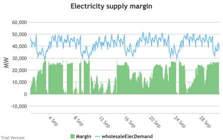
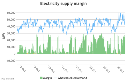
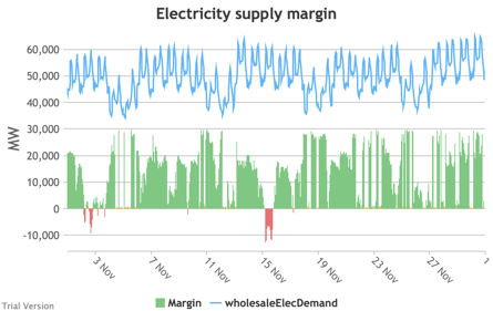
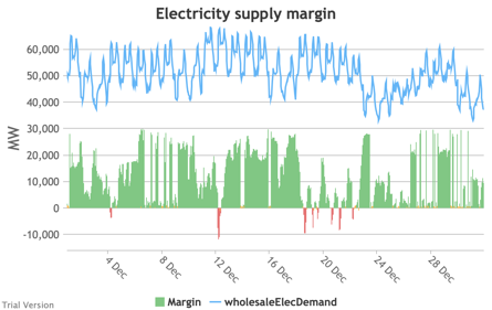
3.3.9 Electricity supply margin
3.3.9 Electricity supply margin Bruno Prior Tue, 15/12/2020 - 11:52- The supply margin is the excess capacity in green (or deficit between demand and total capacity as negative margin, i.e. demand shedding, in red) in each period.
|
Image
|
||
|
Image
|
Image
|
Image
|
|
Image
|
Image
|
Image
|
|
Image
|
Image
|
Image
|
|
Image
|
Image
|
Image
|
- The distribution of the margins over the year looks like:
Image
- The margin is negative for 232 hours in the year (2.6%). In another 1,335 hours (15% of the year), the margin is between zero and 5%. At the other extreme, the margin is over 50% for 1,872 hours in the year (21%). This is material inefficiency at both ends of the distribution. It means that too often (a) we are unable or close to being unable to meet the demand, or (b) a lot of capacity is standing idle (which will be reflected in the costs, as the fixed costs have to be covered by fewer MWh). You would prefer the distribution to be a tight bell curve centred around 30-40%, as it has been for the past decade.[1]
Image


[1] Chart from BEIS, UK Energy in Brief 2019, p.17. https://assets.publishing.service.gov.uk/government/uploads/system/uplo…
3.3.10 Electricity generation capacity utilisation (load factors)
3.3.10 Electricity generation capacity utilisation (load factors) Bruno Prior Thu, 17/12/2020 - 11:15
- Inflexibles like nuclear, solar and wind get priority and therefore are only curtailed for the periods (rare in this partially-electrified, partially-decarbonised scenario) when inflexible output exceeds demand. The increase in the load factors compared to the 2017 status quo, despite modestly more curtailment in this scenario, is because we assume higher load factors for the new wind and nuclear projects than for the existing units (in accordance with industry claims for wind, and reasonable expectations for new vs old plant for nuclear).[1]
- We assume hydro (because of low marginal operating costs) and biomass (because of its carbon value) are called before gas, and they therefore take less of a hit to their load factors from periods when they are not needed.
- We assume gas takes priority over oil (and coal, but this scenario includes no coal) because of its low cost and lower carbon footprint. The scenario only includes a small amount of oil (small-scale standby generation), so the bulk of the swing supply is covered by gas, which therefore experiences a significant hit to its load factor. Oil would show an even worse impact on its load factor, if there had been any transmission-connected oil to provide seed data in the base years.
- We can visualise the impact on each technology’s load factor depending on the installed capacity through a marginal analysis. In the following chart, we split each technology’s installed capacity in this scenario into GW chunks. The first points (left to right) indicate how much we would expect the first GW of that technology to generate over the year. The second points indicate how much we would expect from an extra GW, and so on. The solid lines indicate the performance under this scenario. The dotted lines indicate the technology’s performance under the status quo.
Image
- Don’t worry about the steep drops for the last GW of some technologies. This is simply a mathematical artefact, allocating the last GWh to the last GW. The reality would be more graduated, but it does flag the technologies with falling marginal utilisation levels.
- The obvious victim of this scenario is the utilisation of gas generation. The fact that it nevers hits zero (and that we have multiple periods with negative margin) shows that we still need all this capacity. But the increase in wind and solar dramatically hits the utilisation levels of gas generators, which will be reflected in the cost of gas generation per MWh. This is not (as is often portrayed by wind evangelists and reported in the media) gas becoming more expensive, neither absolutely nor relatively vs wind. It is the higher penetration of wind increasing the cost per MWh of the standby generation. It is absurd that this is often presented as a benefit of the intermittent technologies, and often discounted from the calculation of their cost to the system. It will be increasingly expensive to maintain a sufficient capacity margin as increasing intermittent capacity reduces the utilisation levels of the flexible technologies.
- You can see a similar effect to a lesser extent for hydro and biomass, and it would be worse for oil (let alone coal) if there were any significant capacity. What this is telling us is that, whilst you can always add capacity to balance intermittency if you are willing to pay for it, the marginal cost of that will head ever upwards. Because there will always be periods when neither the wind is blowing nor the sun is shining, and because those periods are not frequent/regular enough to justify storage capacity, additional intermittent capacity does not displace any of the marginal flexible capacity.
- What this means is that, on a true marginal-cost analysis of decarbonisation, unless carbon is hugely expensive (which would have ramifications across the model and for policy), the level of decarbonisation at which the marginal cost of additional decarbonisation exceeds the marginal value of that decarbonisation is almost certainly above Net Zero. Net Zero is economically incoherent as a policy.

[1] Nuclear’s capacity factor in the base scenario looks too high, but reflects Elexon data. It probably indicates that Elexon’s figures for nuclear capacity reflect reasonable operational expectations, not the theoretical maximum potential as constructed.
3.3.11 Carbon
3.3.11 Carbon Bruno Prior Thu, 17/12/2020 - 11:26-
This is our estimate of the impact of this scenario on the carbon emissions from the combustion of fuel for the generation of electricity. It is less than many people might imagine would be the effect of 40 GW of offshore wind, 13 GW of onshore wind and 18 GW of solar, for a number of reasons, including two in particular:Image

- British electricity has already been decarbonised more than many people realise. Not so long ago, the grid-average carbon intensity of electricity was roughly 2.5X the carbon intensity of gas, per unit of final energy. Now, they are roughly on a par. There are diminishing marginal returns from further decarbonisation, as new low-carbon capacity increasingly competes with existing low-carbon capacity as well as the modest residual fossil-fuelled output.
- The total amount of electricity generated has increased significantly under this partial-electrification scenario. So the 27% reduction in the absolute amount of carbon emitted from this source reflects a larger reduction in the carbon emissions per unit of final energy. This will be partly reflected in the carbon emissions from other sectors below, which show the opposite effect.
- This chart does not include the embodied carbon in the generation facilities. It indicates only the carbon emitted in the process of generating the electricity. We do not attempt to carry out a Lifecycle Assessment in this model. But we do estimate the embodied carbon in new infrastructure separately below.
-
To avoid double-counting the carbon emissions from the electricity used to power electric heat and transport, for these uses, we calculate only the carbon emissions from the non-electric systems. This chart shows that calculation for heat.Image

- The total carbon emissions from heat will have fallen less, because a significant proportion of the fall relates to the exclusion of electricity, which is a larger proportion in the Proposed column than the Base column.
- But there would still be a material reduction because:
- the carbon intensity of electricity would have fallen below the carbon intensity of gas (and other combustion fuels) in this scenario, and
- this scenario assumes most of the electric heating is heat pumps (compared to a minimal proportion at present), which significantly reduces the amount of electricity required to deliver a given amount of heat.
- The scenario also assumes that some efficiency improvements have reduced the total demand for heat, and consequently the carbon emissions from heat-production.
- Still, this illustrates the scale of the challenge to decarbonise the sector. There is a long way to go. We chose only one-third electrification as the starting point because of the system challenges of incorporating more (as we will examine in sensitivity analysis below).
- As for electricity, these figures reflect only the emissions from fuel combustion, and do not include the embodied carbon in the infrastructure. Unlike electricity, the model does not yet attempt to estimate the embodied carbon in our heating systems, and the impact of the scenario on that embodied carbon.
-
This is the impact of this scenario on carbon emissions from the combustion of transport fuel, excluding electricity. Not surprisingly, displacing half the internal combustion engines with electric vehicles has roughly halved the carbon emissions from road transport.Image

- The scenario also assumes further (but not complete) electrification of the rail network, whose carbon footprint consequently falls. But this illustrates the relative insignificance of this mode of transport.
- The scenario does not assume any electrification of air or water transport, and consequently does not project any significant reduction in their carbon footprint. No doubt efforts will continue to develop lower-carbon options for these modes of transport, but these options are too immature to assume anything in a base scenario. The chart illustrates the significance of air travel. Besides the technical difficulty of decarbonising air transport, it is an added problem that air is primarily about international travel, which muddies the waters both in terms of action and in terms of accounting.
-
Combining these uses, gives us the following picture of carbon emissions from the combustion of fuel. Again, this does not include carbon embodied in the infrastructure. It does not include carbon dioxide from non-energy sources. And it does not include other greenhouse gases, other than the small quantities included in the figures for the carbon intensity of energy technologies, expressed as carbon-dioxide-equivalent.Image

- In sum, the scenario reduces direct carbon emissions from the energy sector by just under one-third, relative to the position around 2017, which was already materially reduced from the turn of the century. But there is a long way to go still.
-
This is our estimate of the carbon embodied in the infastructure required to deliver this scenario in the electricity sector. It does not include the carbon embodied in the existing infrastructure (hence the non-existent Base bar).Image

- The main point to note is that this is relatively modest. It reflects the sum of all embodied emissions in the infrastructure developed to deliver this scenario, over whatever period one might assume (we have 2030 in mind for this scenario, but it is not specific). The previous charts are per annum. So the annual emissions from fuel consumption are significantly larger according to our model than the one-time emissions from constructing the infrastructure.
- Nevertheless, one should take account of the net effect of all emissions in calculating the true impact of the scenario. That would marginally reduce the carbon benefit indicated in the previous charts.


3.3.12 Costs
3.3.12 Costs Bruno Prior Thu, 17/12/2020 - 12:09-
Moving on to cost, this is our estimate of the annual cost of our electricity systems, comparing the status quo with this scenario.Image

- The costs for each technology include estimates of variable (primarily fuel) and fixed (e.g. maintenance and overheads) annual costs, and the amortized capital cost at the Weighted Average Cost of Capital assumed for this scenario (the default: 7%; just below the level used recently by the regulator).
- It also differentiates between existing and new capacity, using figures based on historic data for the existing capacity, and (typically somewhat reduced) figures claimed by technology advocates for new capacity, reflecting assumed learning curves. As explained above, even where contracted values appear to confirm significant cost reductions, until they are implemented and prove sustainable at that price for a few years, this assumption is not safe. But it is the least contentious available.
- A key point to appreciate about this significant increase in the costs of the electricity system is that a larger proportion of our energy is supplied by electricity in this scenario, so the impact on the cost per MWh is smaller, as we will see below.
- The labels indicate the sum of (a) Generation costs (“Gen”) and of all System costs (“Sys”) including generation, transmission/distribution, storage, supply, and demand-shedding, but excluding the social cost of carbon (the blue band at the top). The label at the top is all costs including the cost of carbon at the rate specified for the scenario (the default of £50/tCO2e in this case).
-
These charts show the effect of this scenario on the cost per unit of electricity (a) supplied (i.e. net of losses), and (b) generated (i.e. before distribution losses). These are the costs in the previous chart divided by total electricity supplied or generated. They are not the cost per MWh of each technology. Stacking the latter would not indicate anything useful. This allows you to view the shares of overall costs that can be attributed to each component of the electricity system, allowing for the fact that the total amount of electricity supplied has increased under this scenario.Image
, partial electrification/decarbonisation scenario")
-
The obvious headline from these charts is that the cost has increased not only in absolute terms, but also per unit of electricity. The hope is that economies of scale and learning curves reduce the cost of electricity per unit in an electrified energy system. We incorporate such assumptions into our model. But they are outweighed by:Image
, partial electrification/decarbonisation scenario")
- a switch from (on average) cheaper technologies to more expensive technologies (before taking externalities into account, see below), adding around £13/MWh,
- higher costs of storage and interconnection to mitigate the effects of a higher proportion of intermittent generation in the mix, adding about £7/MWh, and
- some demand shedding to deal with the periods when demand simply can’t be met, adding about £2/MWh.
There are also costs that are not included in this model, such as the STATCOMs needed to run without spinning reserve of thermal generation for sustained periods.
- These higher costs are somewhat offset by a lower cost of carbon from decarbonising the electricity system. Despite higher volumes of electricity, the absolute cost of carbon (at £50/tCO2e) falls from £2.5bn to £1.8bn. Adjusting for the quantity of electricity, this is reflected in a larger fall (proportionately) from £9 to £5 per MWh supplied. You may note that these savings in the social cost of carbon are worth nowhere near as much as the cost of the measures to achieve them. That is not an entirely fair comparison, because part of the purpose and effect of electrification could be to shift more of the carbon burden on to electricity. This can only be compared accurately across all our energy systems. We do that below.
- You may notice that the estimated cost of electricity in the base scenario is lower than it was in practice. That is mainly because our model does not incorporate the costs of government measures, whether subsidies or taxes. It is intended to analyse the underlying economics before it is distorted by interventions, partly to be able to assess the cost/value of those measures. As non-environmental taxes (e.g. VAT) fall very lightly on electricity in the UK, the discrepancy is mostly about the cost of environmental subsidies and the levies to fund them.
- One of the main arguments for the winner-picking approach to decarbonisation adopted by successive governments over three decades was that a carbon tax was too expensive, as it fell on the whole economy. Targeted measures would allow a better bang for the buck. The fallacy in that argument is exposed in these charts. The discrepancy between the cost of electricity with and without government impositions under the status quo is much greater than the cost of the carbon emitted, valued at £50/tCO2e. Either carbon is worth several multiples more than that, or the effect of government measures (both directly as levies and indirectly through the system impacts that are not attributed to decarbonisation in government assessments) has been more expensive than if we had simply put a price on the carbon.
- That is inevitable when one thinks about the intention of the winner-picking approach. The objective is to target higher levels of support at the “winners” whilst avoiding paying similar levels of support to technologies that the government does not favour. If the government’s winners were cost-competitive, they would not need to pick winners – their favourites would prosper under a technology-neutral regime. The “banding” that has been rife in energy policy is precisely a mechanism to pay high levels of support to expensive technologies favoured by government. If you pay more for expensive technologies and try to minimise support to cheaper technologies, you should not be surprised that you get more of the expensive technologies and less of the cheaper technologies. In sum, that means costs are higher than a system where higher levels of support were not directed to expensive technologies. We are now reaping the consequences of the denial of this inevitability, as high costs collide with increasing deployment.
- We are asked to believe that falling costs mañana and even greater deployment will justify this in the long run. They will have to “go some”, because the high costs and large capacities of existing projects are locked in to long-term contracts under the support schemes. The claim will only be credible when retail prices net of the shadow price of carbon fall materially, rather than increase as they have done inexorably over the past decade when we were being promised that these learning curves were bringing down the costs.
- Notice the narrow, orange band second from top on the right, and the absence of an equivalent on the left. This is the cost of demand-shedding, due to inadequate supply to meet demand at times. It is estimated in this scenario at £1.8bn, or £2/MWh. That is relatively modest, because it is needed for “only” 232 hours in the year. But remember that:
- we were on the edge for another 1,335 hours,
- the model assumes that costs ratchet as the frequency and scale of demand-shedding increases,
- this scenario is under relatively benign weather conditions, and
- it assumes a system that has been only partially electrified and decarbonised.
As we will see below when we do some sensitivity analysis, this element has the potential to become as economically destructive as it was in the 3-day weeks in the 1970s.
-
Turning to other uses of energy, this is the effect of this scenario on the costs of heat.Image

- A modest cost-saving excluding externalities is increased when one takes into account the cost of carbon.
- This is the cost of the heat systems. The effects of electrification on the electricity system are calculated outside this component, but are internalised in the model through the price charged to electric heating.
- The modest cost-saving comes primarily from assuming some of the extra heat pumps will displace direct electric heating, which is particularly cost-ineffective. We cannot assume much more displacement than this (around half of the existing direct electric heating) because a significant proportion of direct electric heat is not for building heat, but rather for industrial purposes for which alternatives will often not be able to replicate effectively the characteristics that electric heat provides.
- The displacement of some gas-, oil- and coal-fired heating by heat pumps has a negligible effect. On the basis of this integrated cost (of fuel, other running costs and amortized capital costs), heat pumps work out slightly cheaper than oil and slightly more expensive than gas and coal. When we include the cost of the carbon externality at £50/tCO2e, gas and heat pumps are roughly level-pegging, while oil and coal fall behind.
- This model does not attempt to tie the deployment of heat pumps to the efficiency of the buildings in which they are installed. It includes building efficiency separately (see sections 3.2.15 to 3.2.20 above). In this scenario, we assume the government has roughly implemented its current plans, which consist mostly of efficiency improvements rather than rebuild. It is arguable (based on the government’s own data for the effect of retrofit insulation measures) that for most existing buildings, such measures will not be adequate to make them suitable for heat pumps, given the inadequacy of the fabric of most British buildings. In reality, there are a few likely outcomes from a widespread roll-out of heat pumps into existing buildings with retrofitted efficiency measures, when property owners find their heat pump struggling to maintain the temperature in imperfectly-insulated buildings in the coldest periods:
- They try to invest in further efficiency improvements. These are likely to be problematic (e.g. requiring the sacrifice of internal space, and offering a relatively low bang for the buck);
- They invest in secondary heat sources, if they are still permitted (e.g. solid-fuel or electric stoves, assuming there would no longer be a gas supply for a secondary gas heater). Widespread deployment of electric stoves to supplement heat pumps in periods of peak demand would be highly problematic for the electricity system;
- They replace the heat pump with an alterative technology; or
- They get used to wearing extra layers of clothing in the house when it’s cold outside.
In Sweden, (b) was the most common solution. The Swedish wood-pellet industry saw its sales decline for a couple of years after the government began a big push to promote heat pumps. Sales then picked back up again, as people installed pellet stoves to back up their heat pumps, once they realised the heat pumps could not do it alone. Sweden obviously has colder temperatures than the UK (roughly double the number of heating degree-days), but it also has significantly more efficient buildings (thanks to much higher domestic-energy prices), which mean that its domestic energy consumption per property is only slightly higher than the UK despite the much colder weather.
- Most of the other technologies are not significant. Many of the reasons for these assumptions are given in section 2. Biomass is currently the most significant of the other technologies. We assume a modest increase in biomass boilers, but a larger decrease in wood fires and stoves, in accordance with government air-quality plans.
-
Transport costs increase under this scenario.Image

- We have assumed no material change to air and water transport, so the differences relate primarily to road transport, with smaller changes to rail (because rail is a smaller component of transport).
- Transport costs excluding externalities increase by nearly £14bn p.a. The carbon avoided through electrification saves £3bn in social costs, so the net effect is an increase (including externalities) of £11bn. Again, this can only be considered in the round, across all energy, because the system changes may displace cost and carbon from one sector to another. But prima facie, this is poor value.
- Road transport costs (excluding externalities) increase by over £13bn. Current road transport costs are distorted by the levels of tax and duty, which exceed the cost of the road network and externalities. This model ignores government interventions, so this increase is comparing the cost of current road transport excluding taxes and duties with a scenario where 50% has been electrified (also excluding taxes and duties). Obviously, the road network has to be paid for, and externalities have to be accounted for under both systems. But including current taxes does not help that comparison. As is currently under discussion in policy circles, something will have to substitute for fuel duties to pay for the roads, if electrification radically reduces revenues from fuel duties. The model assumes that the cost of the roads is mostly fixed (i.e. depending on the extent of the network, not invariable regardless of construction or abandonment), with a modest variable component for usage (e.g. lower maintenance for lower throughput). This scenario assumes no significant change to the road network and usage, but the electrification of 50% of that usage.
- Rail costs increase from £12.3bn to £12.7bn p.a. under the assumption that another 30% of energy consumption is electrified. Again, this measures energy costs without taxation, but the effect is less significant because rail uses red diesel, and the cost of the network and externalities is not being overcharged through taxes and duties. In fact, the effect of excluding government interventions is the other way round for rail, as the most significant intervention is the government grant. Our model attempts to estimate raw costs, ignoring such grants, in both the base and the proposed scenario. The modest change in this scenario assumes no significant change to the network, and a modest increase in operating costs because the cost of electricity (exc. tax) under this electrification scenario is greater than the cost of diesel (exc. tax) even allowing for the greater efficiency of electric motors. Including externalities, there would be little difference in cost, i.e. rail electrification is roughly worth the social benefit, according to the assumptions in this model.
-
The combined impact is to increase total energy system costs by over £15bn p.a. Carbon costs reduce by £5bn (at £50/tCO2e), so the net effect is an increase in costs of £10bn, i.e. not justified at <£150/tCO2e.Image


, partial electrification/decarbonisation scenario")
, partial electrification/decarbonisation scenario")


